Fnord
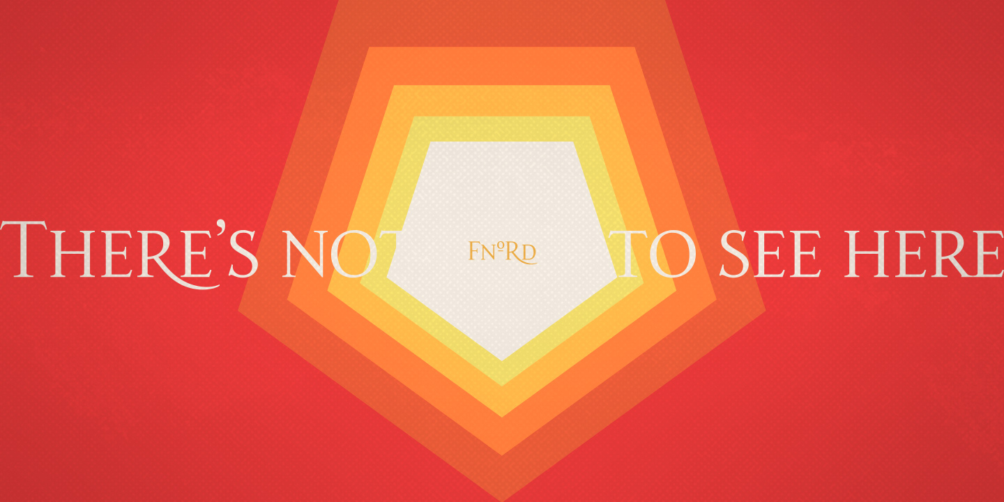
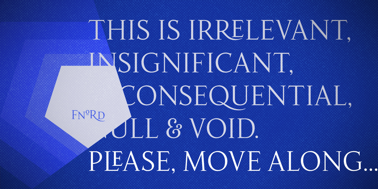
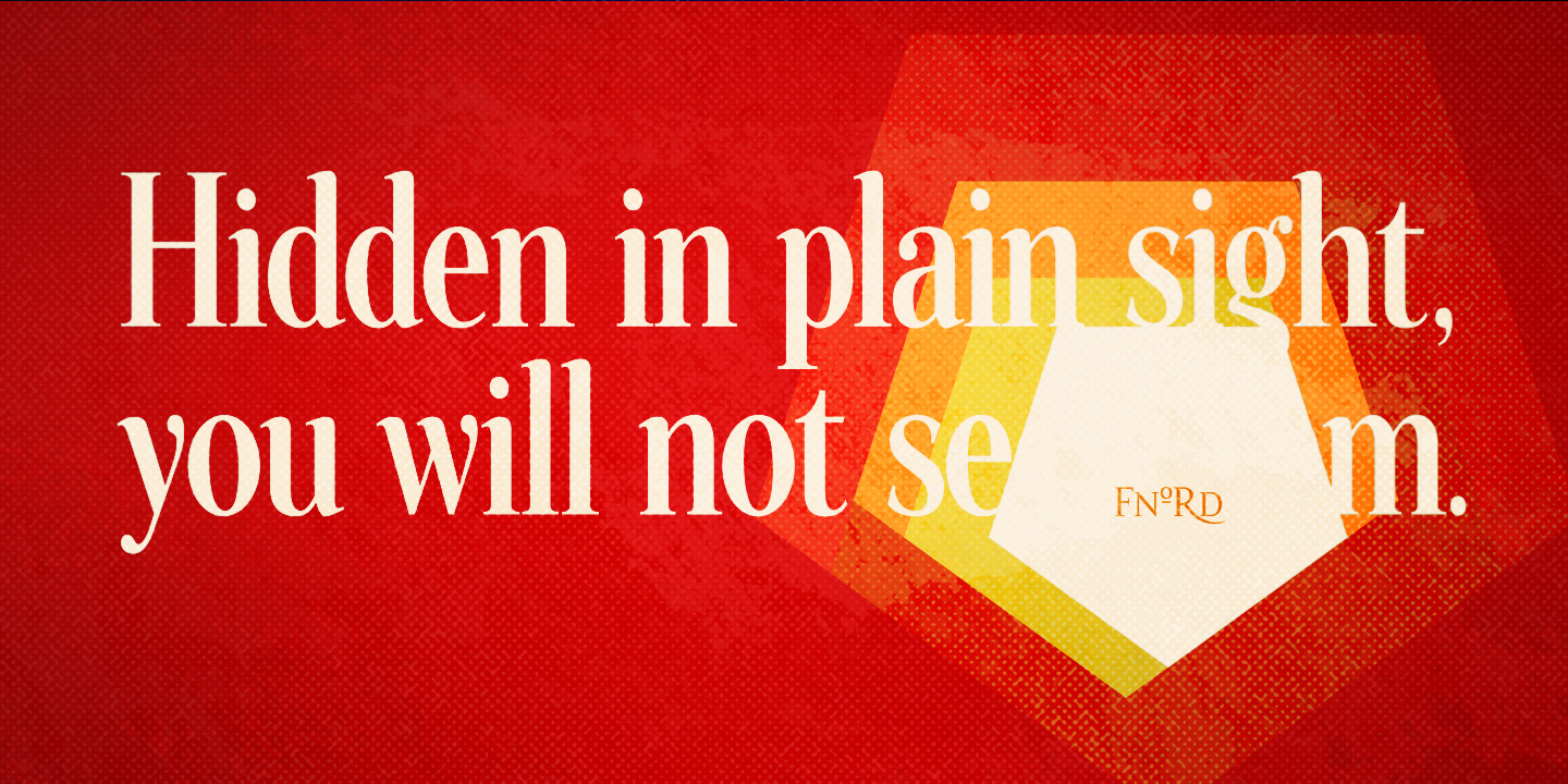
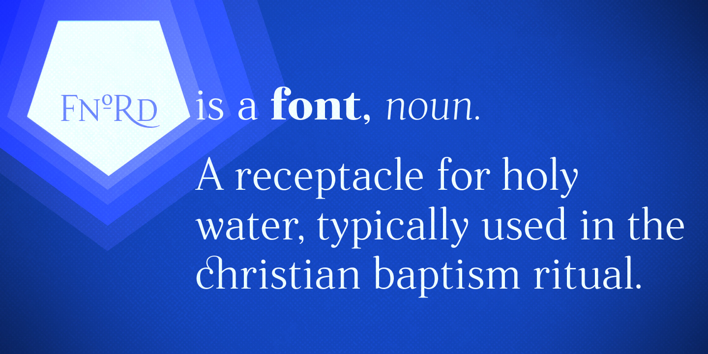
A contemporary humanist typeface with a mischievous streak...

This typeface is part of The Monotype Library.
The design process for Fnord has been greatly influenced by the writings of Robert Anton Wilson and Robert Shea. While sketching the basics for this typeface I was re-reading their Illuminatus! Trilogy and discovered that my drawings were synchronising with some of the concepts explored within the two Roberts’ epic story.
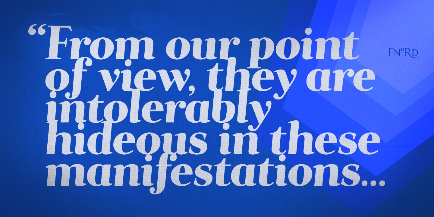
The word fnord itself is referred to throughout the novel—originally coined by Kerry Thornley in his 1963 work, Principia Discordia, it is a fictional concept where “The Powers That Be” educate the population to ignore the word fnord within written work, yet, simultaneously it subliminally induces fear and paranoia within the reader. This makes fnord placement particularly effective (for TPTB) within newspaper articles, but never in advertising… In order to “see the fnords”, one must become illuminated.
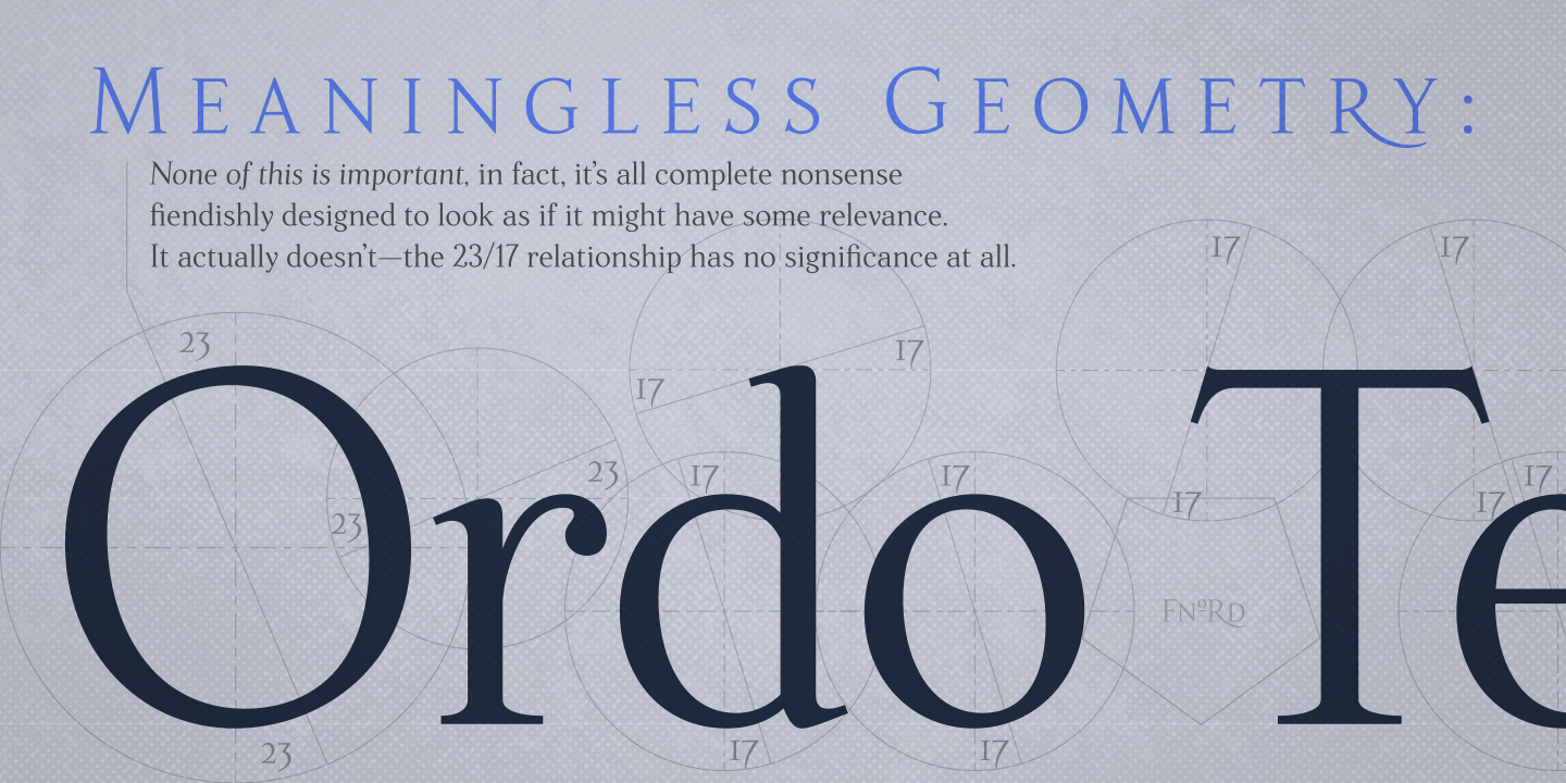
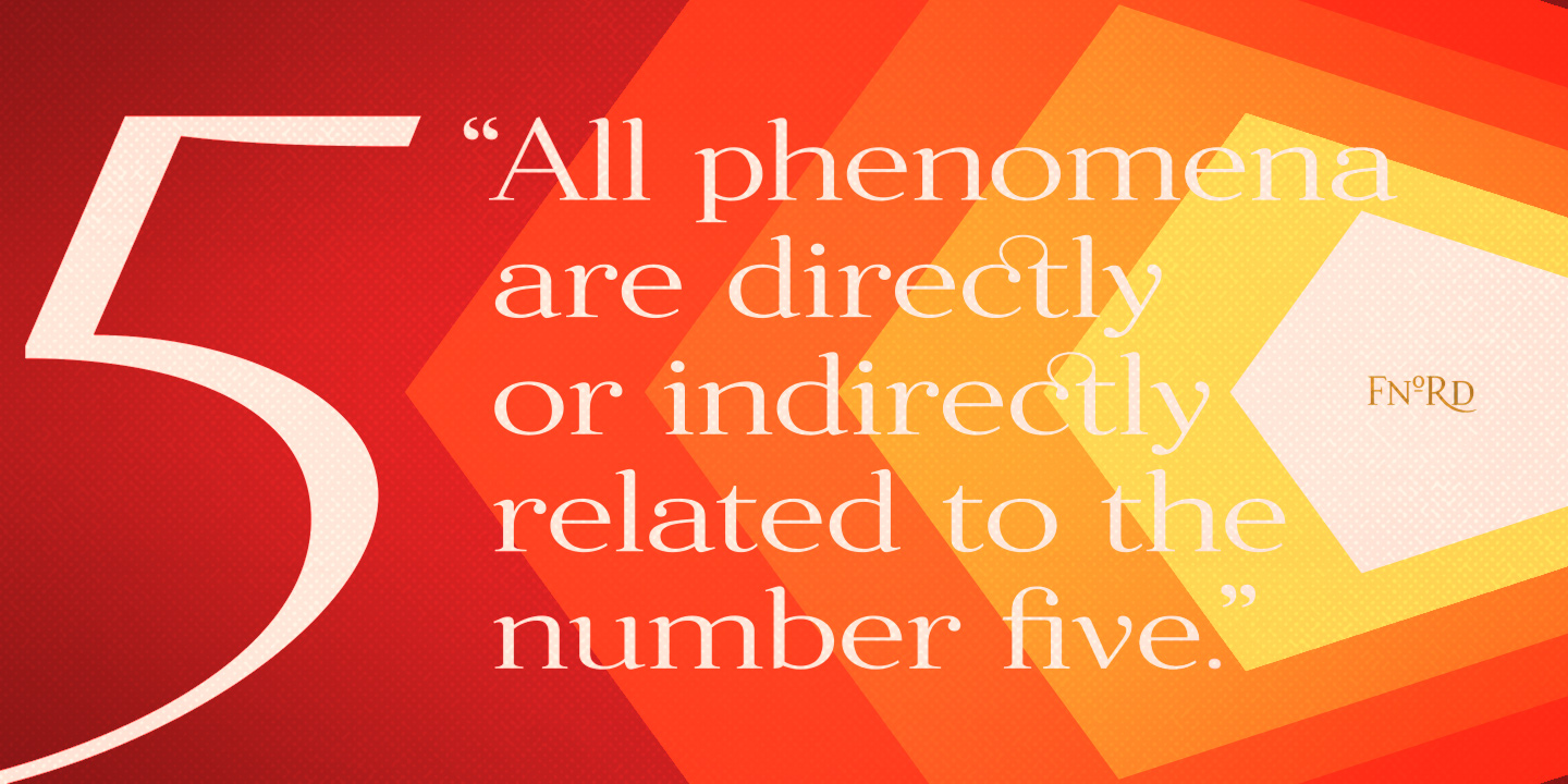
Another theme explored throughout Illuminatus! is the “23/17 Phenomenon” and the “Law of Fives”. I found that my drawings were coincidentally falling into shape along axes and proportions that were influenced by the numbers 5, 17 and 23. For instance, the upper case ‘O’ was drawn on an axis of 23°, whereas the lowercase ‘o’ was on a 17° axis. Angles for serifs also fell into the 23/17 principle. It was kind of weird…
Anyway, perhaps it is all meaningless and trivial, or maybe it gives some gravitas to the final typeface design? Probably not!
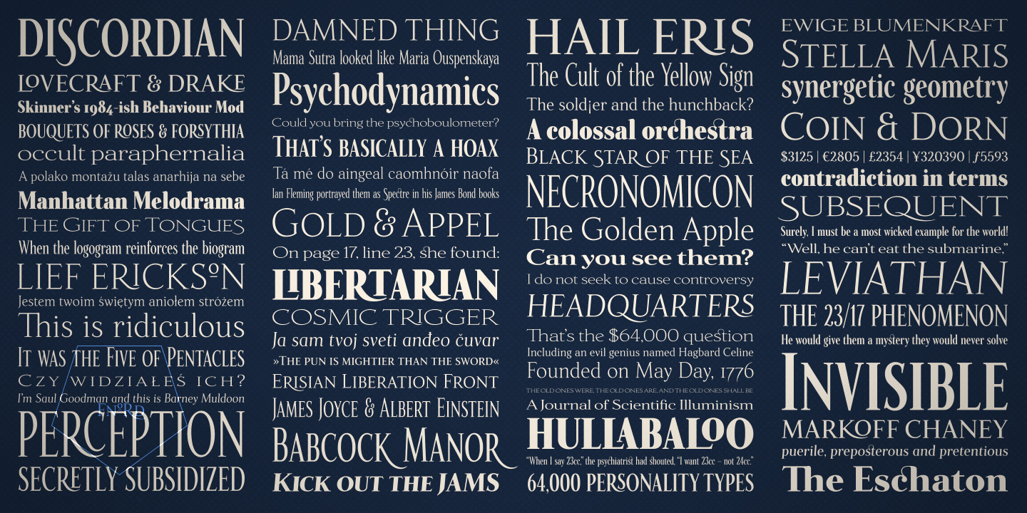
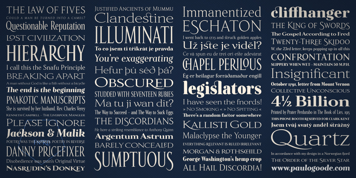
Fnord is available in roman, italic, condensed, extended and 3 additional styles in one weight, namely, engraved, inline and woodcut – making it a twenty-three font family. Each variant has 680 glyphs for you to type words with. Hopefully you’ll create some interesting and pleasing results with it. I would suggest that these fonts are best suited for branding purposes.
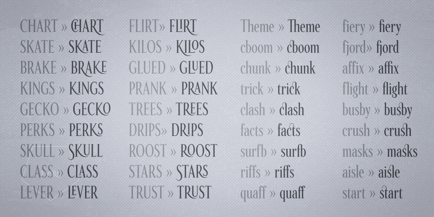
I have included small caps too as well as integrating some pretty cool Open Type alternates and ligatures that you can access to make your typography even more unique.
See the fnords and become illuminated!
If you’re not interested in Fnord, take a look at Eschaton and Immanent as possible alternatives that were also inspired by the Illuminatus Trilogy.
SUGGESTED FONT PAIRING: Fnord and Immanent.
| Release Date | September 2016 |
| Classification | Humanist Serif |
| No. of Fonts | 23 |
| Weights & Styles | Five, Seventeen, Twenty-Three, Forty and Ninety-Three (in Regular, Italic, Condensed & Extended). plus three display fonts – Engraved, Inline & Woodcut. |
| Alternates | 10 |
| Ligatures | 44 |
| Small Caps | Yes |
| No. of Glyphs | 680 |
| European Languages | Yes (no Cyrillic) |


