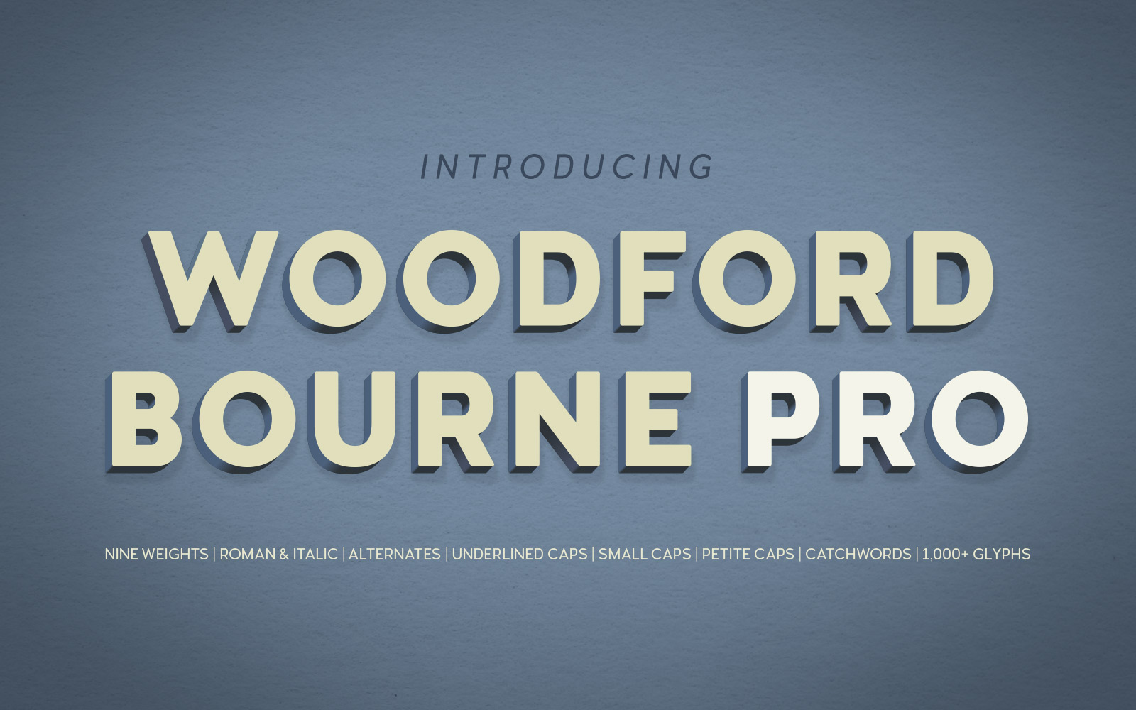
Woodford Bourne PRO
Refined and expanded to include lots of new features.
![]()
This typeface is part of The Monotype Library.
| Release Date | v.2 June 2016 v.3 July 2021 |
| Classification | Vintage Grotesque Sans Serif |
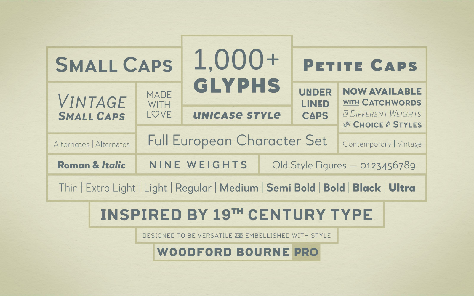
| No. of Fonts | 18 |
| Weights & Styles | Thin, Extra Light, Light, Regular, Medium, SemiBold, Bold, Black & Ultra in Roman & Italic |
| Alternates | Stylistic set 1 – vintage style characters Stylistic set 2 – petite caps Stylistic set 3 – vintage petite caps Stylistic set 4 – underlined caps Stylistic set 5 – vintage underlined caps Stylistic set 6 – catchwords set 1 Stylistic set 7 – catchwords set 2 Stylistic set 8 – discretionary ligatures Stylistic set 9 – vintage discretionary ligatures |
| Small Caps | Yes |
| Petite Caps | Yes |
| Underlined Caps | Yes |
| No. of Glyphs | 1000+ |
| European Language Support | Yes (Latin only) |
ABOUT Woodford Bourne PRO
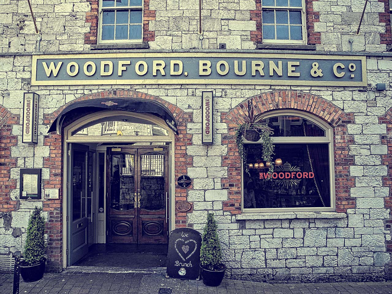
Surprise, surprise, Woodford Bourne PRO is the evolution of my original Woodford Bourne typeface. It was inspired by the iconic stone cast letters on the façades of the former Woodford, Bourne & Co. buildings in Cork City, Ireland. You can read all about that here… so what’s new?
Having used the fonts (a lot!) in my own graphic design work, I found myself yearning for small caps and so I set about creating a set. Then I thought it’d be great to have petite caps that harmonise with the lowercase character set so you could play with some unicase typography—as has been successful in both Pseudonym and Eponymous—so I added those too. Then what about underlined caps, they’d be useful too wouldn’t they? And catchwords as well – there are two sets of those in WBPRO. Then there are some discretionary ligatures that help to make Woodford Bourne PRO even more versatile, for instance, there’s now a special “www” ligature for adding a stylish touch to your URLs.
On top of adding 500+ additional glyphs, I also set about improving the design of each character—revising the form and spacing, I also kerned the whole font more efficiently. Many of the improvements are very subtle, but some glyphs were completely redrawn. The result is a massively improved font family, with extended functionality and distinctive aesthetics—I am sure you will enjoy using the fonts in your own work.
 I see Woodford Bourne PRO as primarily a display typeface for titles/headlines in printed materials. I would also love to see Woodford Bourne being used for branding, packaging and promotional material, the lighter weights can work very well for body copy. Designers, if you’ve used WBPRO in your work, please let me know so that I can compile a gallery for “Woodford Bourne PRO in use”. Thank you!
An update to WBPRO was released July 2021. Italics were improved along with language additions and a rebalanced /S/s/ was drawn.