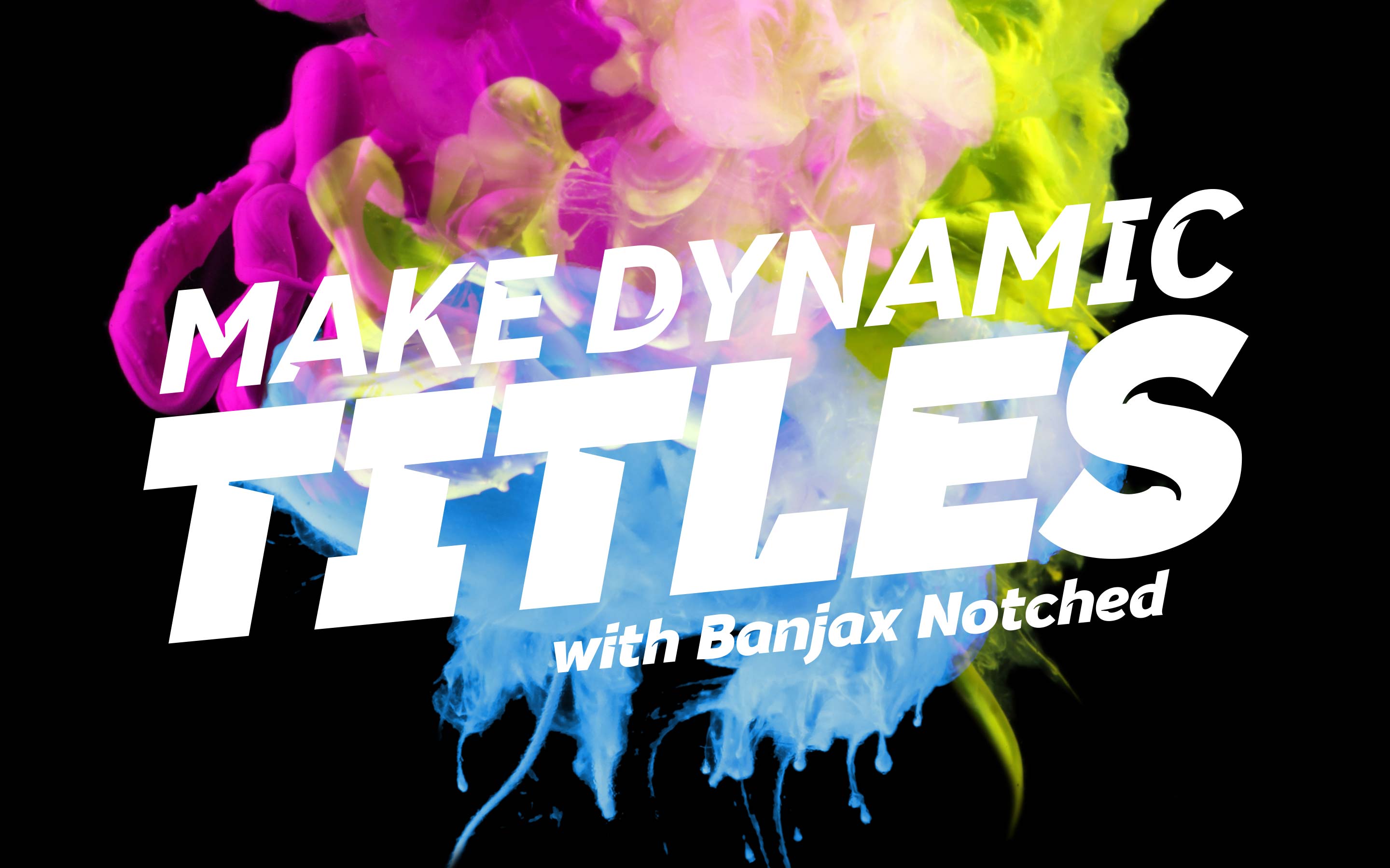
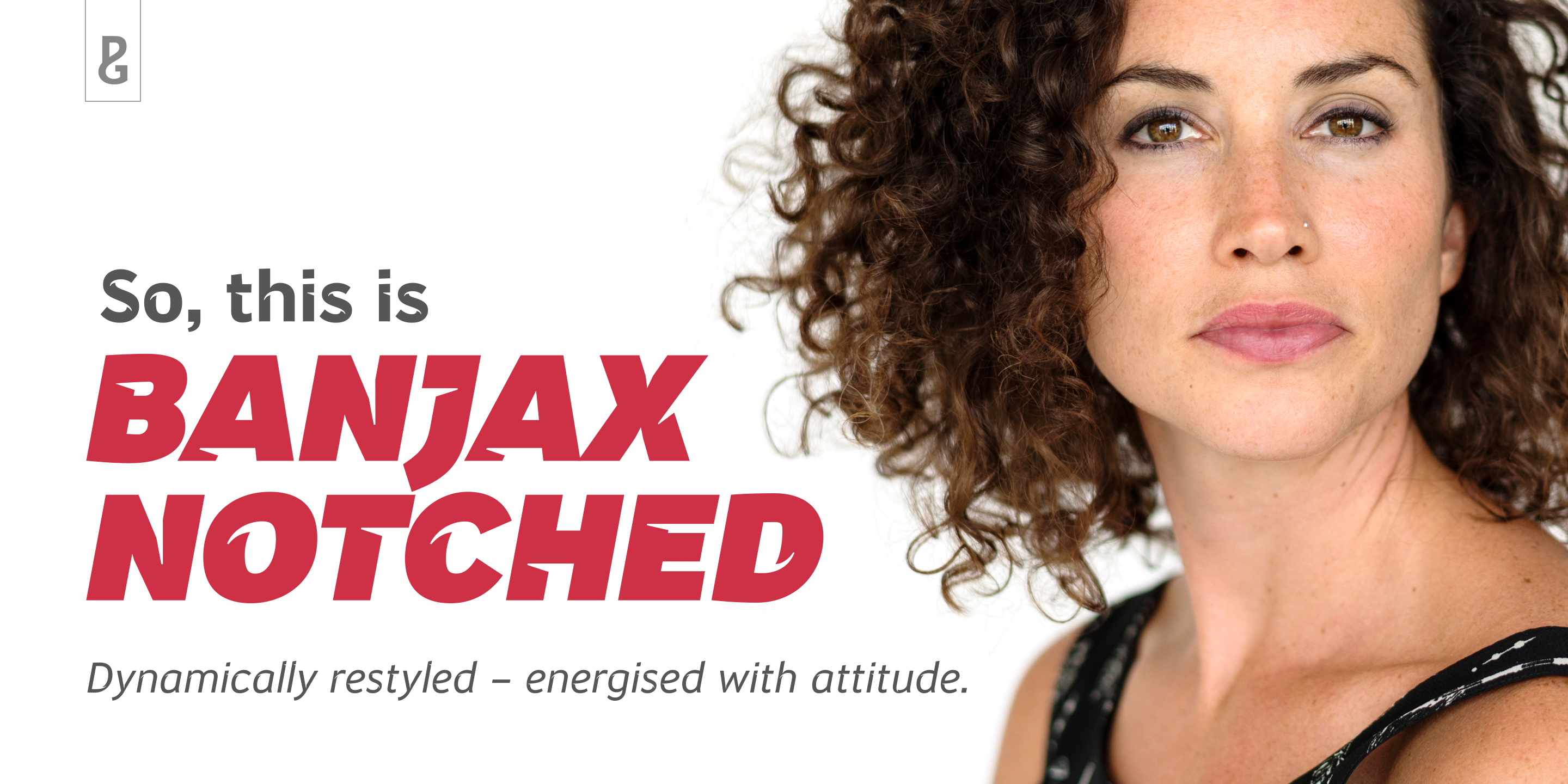
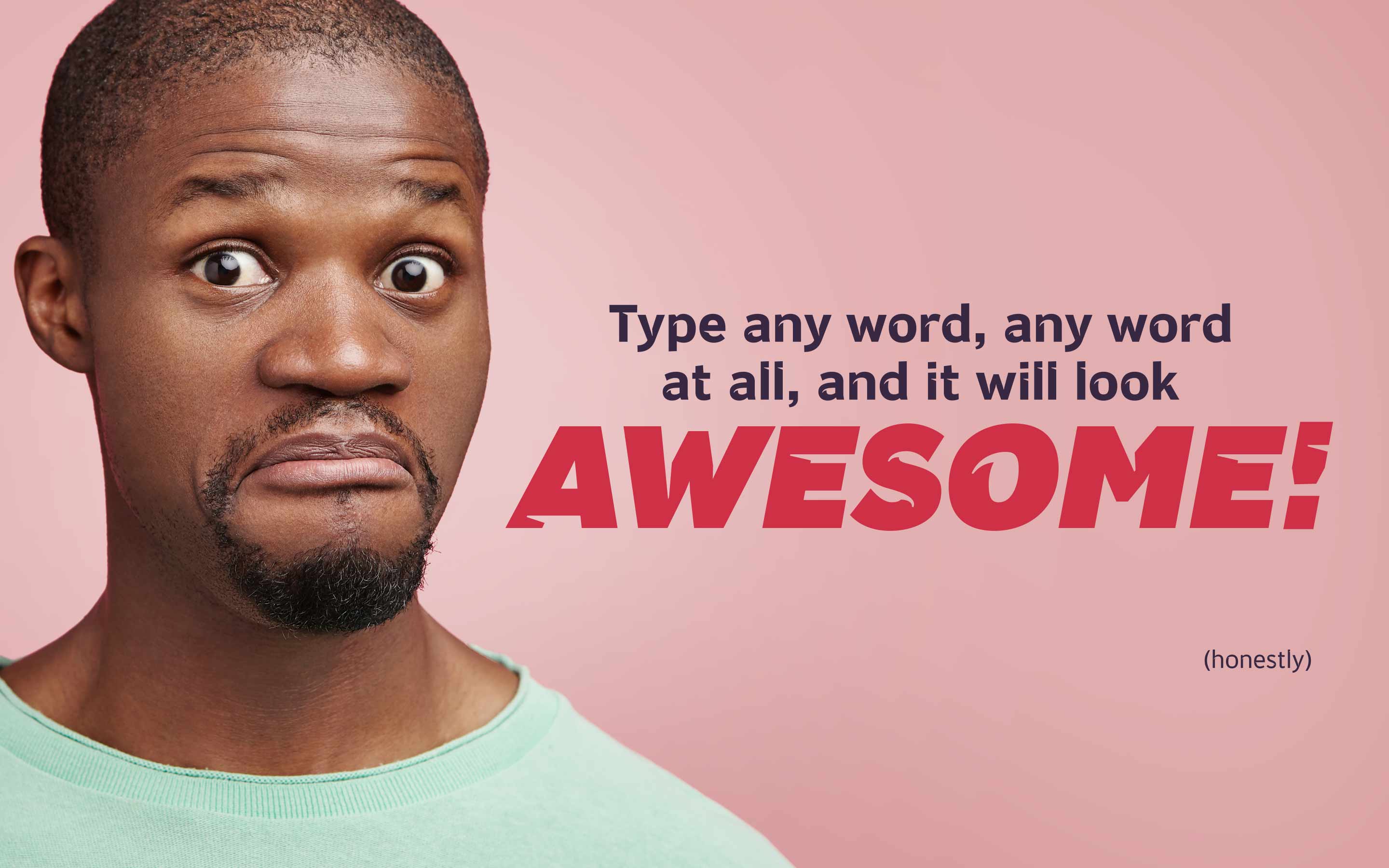
Banjax Notched
It’s still banjaxed, just dynamically restyled...
![]()
This typeface is part of The Monotype Library.
Banjax Notched is a more dynamic interpretation of my original Banjax fonts. As the name suggests, the glyphs are notched – these precise incisions create a more energetic aesthetic.
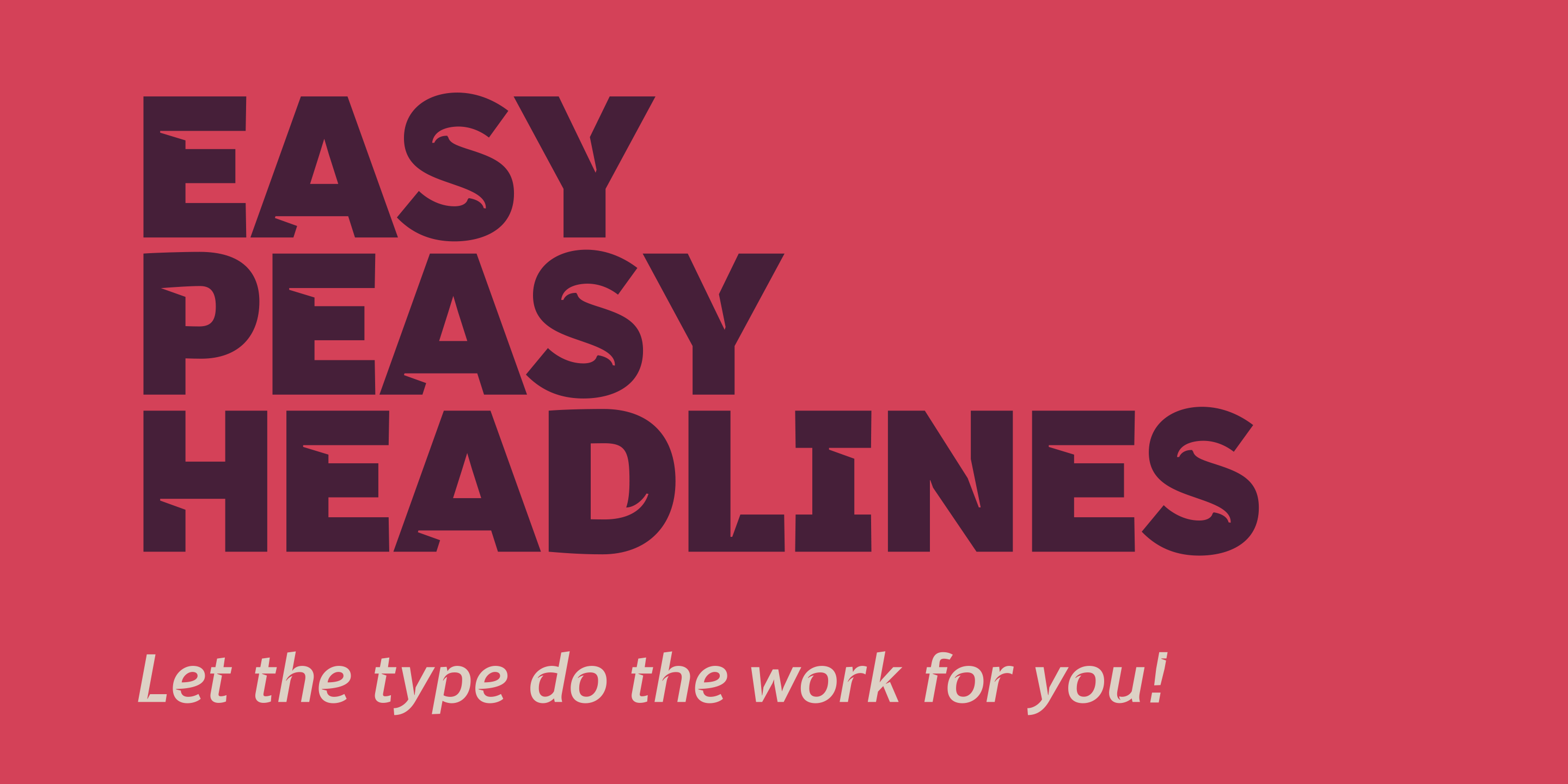
The sense of drama the fonts evoke would be ideal for titling, headlines, branding and corporate identities. I feel they are particularly suited for use on book covers, magazines, film posters and all related advertising, as well as for promoting sporting and musical events.
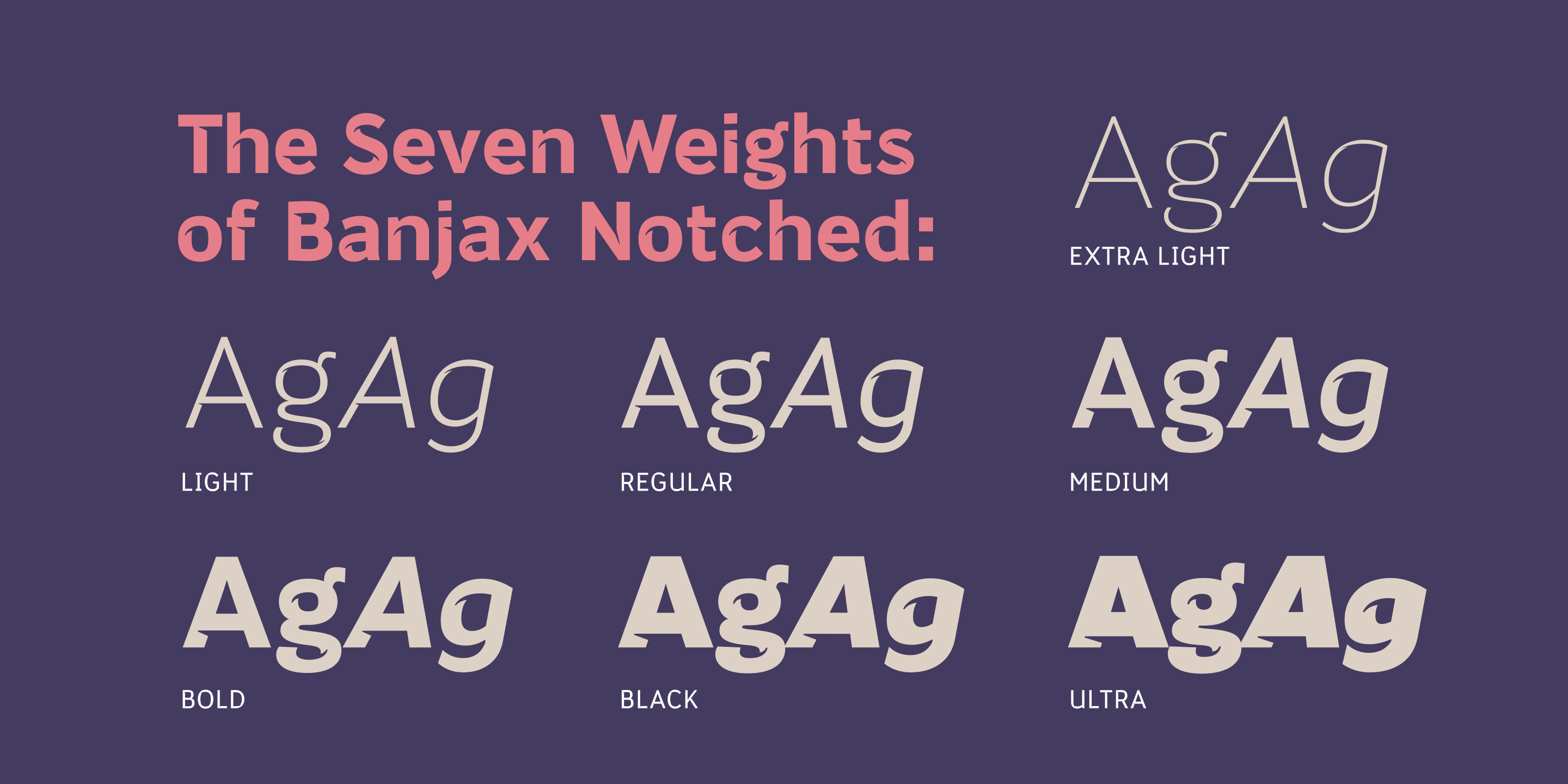
As with Banjax, distinguishing features include a large x-height, short descenders, distinctive asymmetrical contrast, angled terminals, squared dots and punctuation, and, of course, those notches which enhance this typeface’s personality. Overall, Banjax Notched makes for a pleasant reading experience with enough nuances to make it an ideal choice for branding purposes – particularly when paired with regular Banjax.
SUGGESTED FONT PAIRING: Banjax Notched and Mutable.
| Release Date | February 2018 |
| Classification | Humanist Sans |
| No. of Fonts | 14 |
| Weights & Styles |
|
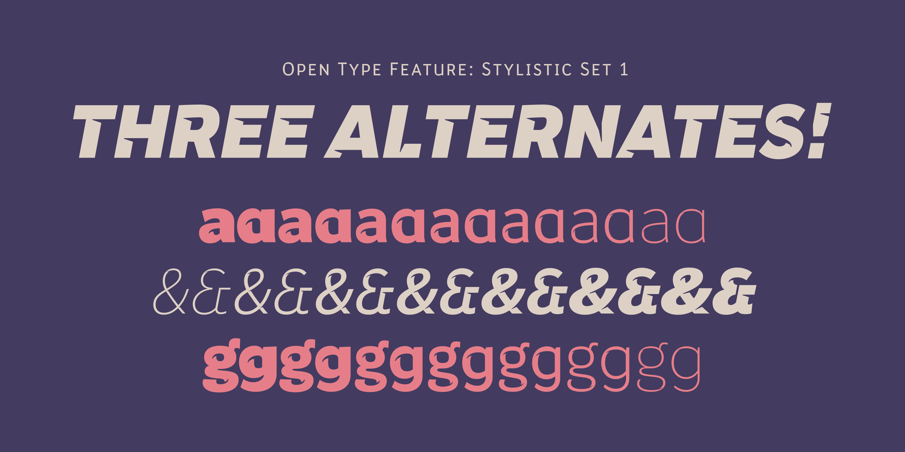
| Alternates | 3 |
| Ligatures | 4 |
| Small Caps | Yes |
| Petite Caps | Yes |
| No. of Glyphs | 1100 |
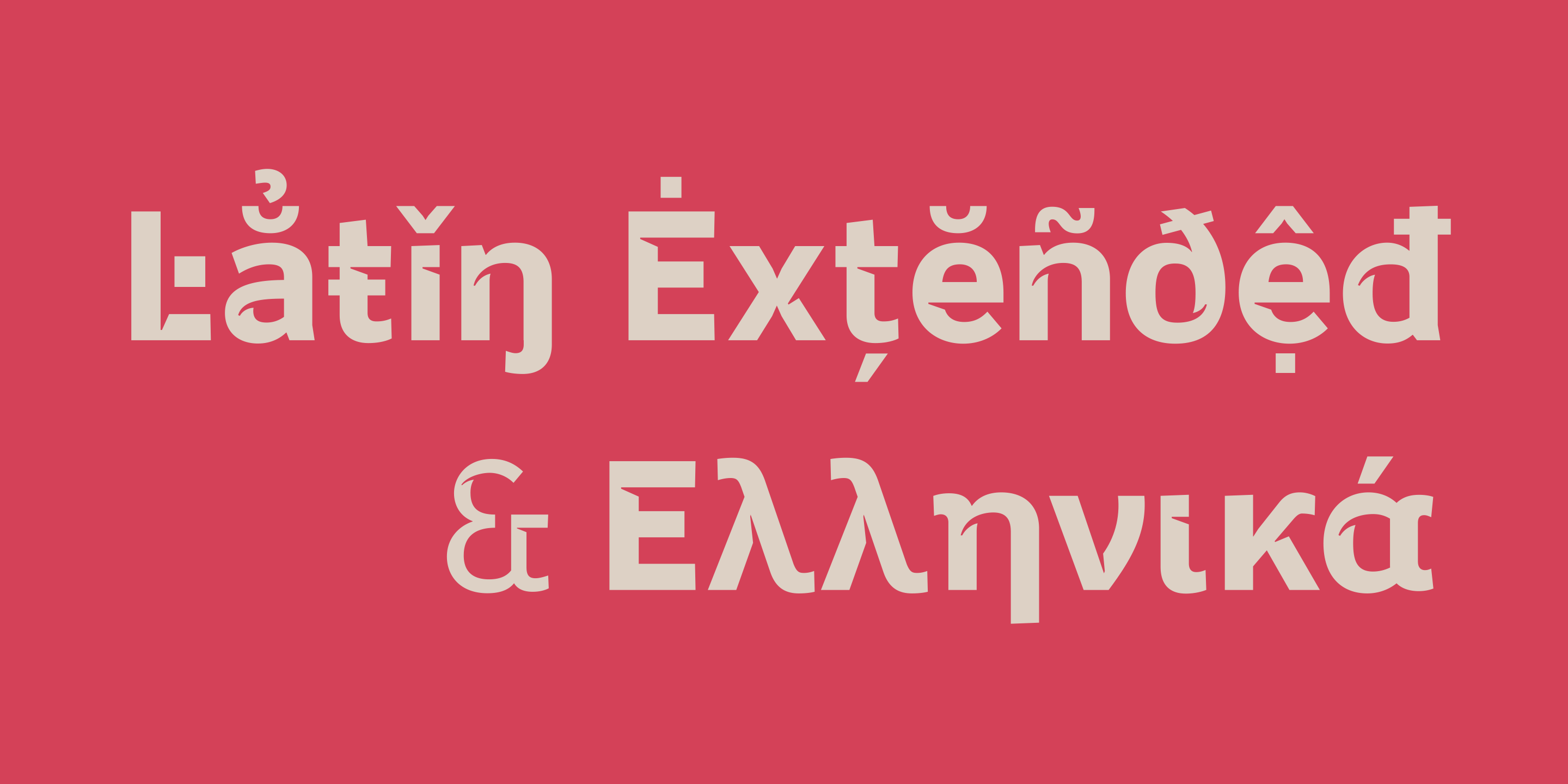
| Language Support | Latin Extended & Basic Greek |