Woodford Bourne
A 19th Century Grotesque

This typeface is part of The Monotype Library.
| Release Date | v1 – August 2015 v2 – April 2021 |
| Classification | Vintage Grotesque Sans Serif |
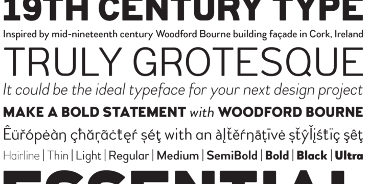
| No. of Fonts | 18 |
| Weights & Styles | Hairline, Thin, Light, Regular, Medium, SemiBold, Bold, Black & Ultra in Roman & Italic |
| Alternates | Stylistic Set 1 – Vintage Alternates |
| Small Caps | None |
| Petite Caps | None |
| No. of Glyphs | 500+ |
| European Language Support | Yes (no Cyrillic) |
ABOUT Woodford Bourne
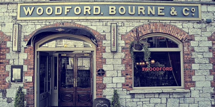
Inspired by the iconic type on the façades of the former Woodford, Bourne & Co. buildings in Cork City, Ireland. I had long admired these distinctive stone cast letters and jumped at the opportunity to interpret this genuine 19th century grotesque.
While creating this font family, it became apparent that it would also be a great idea to have an alternative contemporary style to complement the vintage style. So that’s exactly what I created. So, one of this font’s features is the ability to change the style in one click using an Open Type feature called “Stylistic Sets”. You can change from contemporary-styled characters to a more vintage look by activating Stylistic Set 1.
INFLUENCES & DESIGN STYLE
Naturally, the influences for the origins of Woodford Bourne are clear enough, however, I do feel it is important that I reference the work of Tobias Frere-Jones and Mark Simonson in particular for creating Gotham and Proxima Nova. Both have been an influence for Woodford Bourne’s contemporary character forms.
I have added very subtle rounded corners to my letterforms, I believe this takes the edge off the “industrial harshness” of these grotesques and, as a consequence, is a more friendly face to use.
USING WOODFORD BOURNE
I see Woodford Bourne as primarily a display typeface for titles/headlines in printed materials. I would also love to see Woodford Bourne being used for branding, packaging and promotional material and am keen to hear from designers who use it in their own work.
v2.0 update released April 2021 – redrawn and re-spaced.
Please also check out
Woodford Bourne PRO
Selected as one of Luc Devroye’s Best of 2015 (Sans Typefaces).

