Fonts in Use
These are examples of my fonts that have left the nest and found their wings in the real world.
If you have used my fonts in your own projects, please do let me know, I’d love to hear from you.
MAKE CONTACT
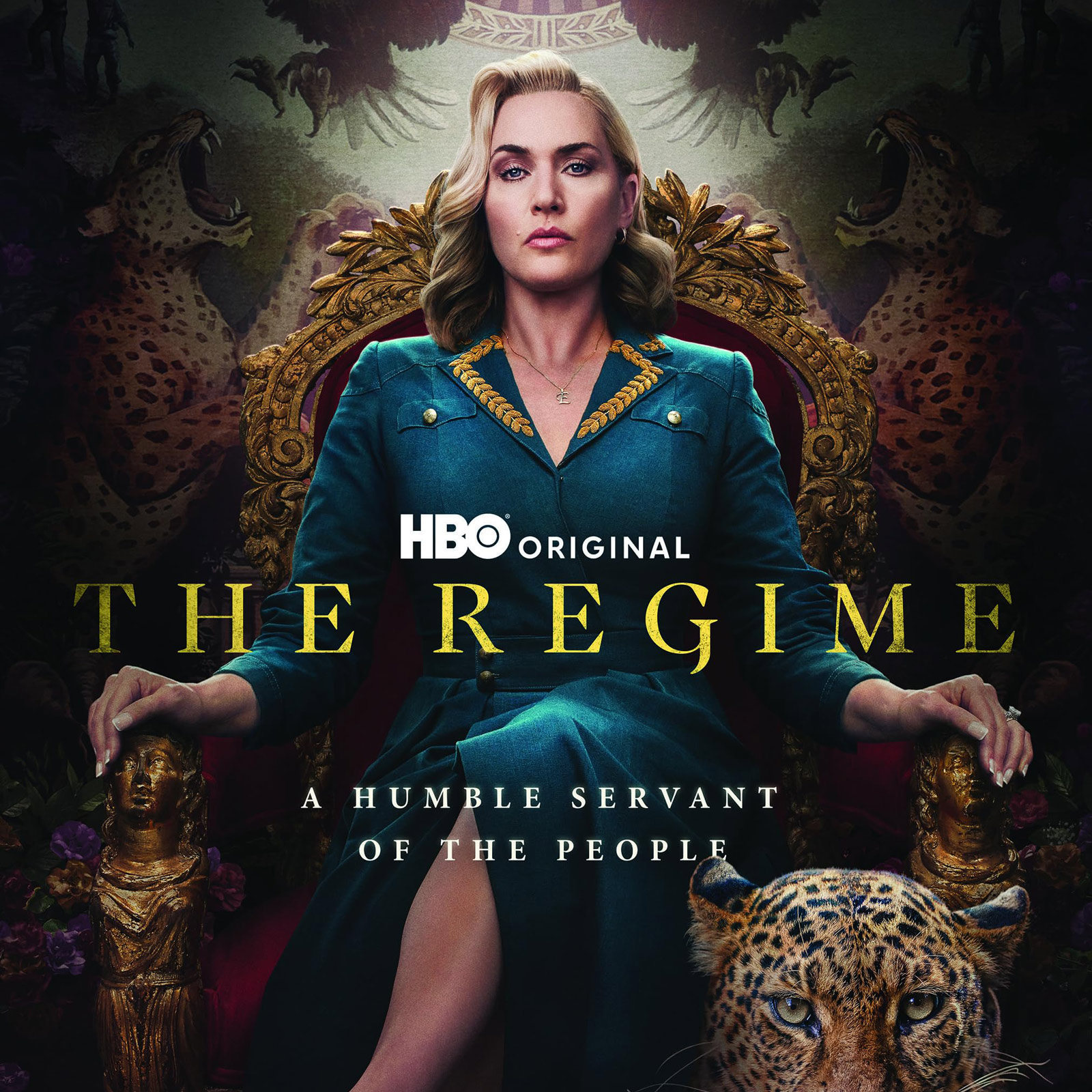
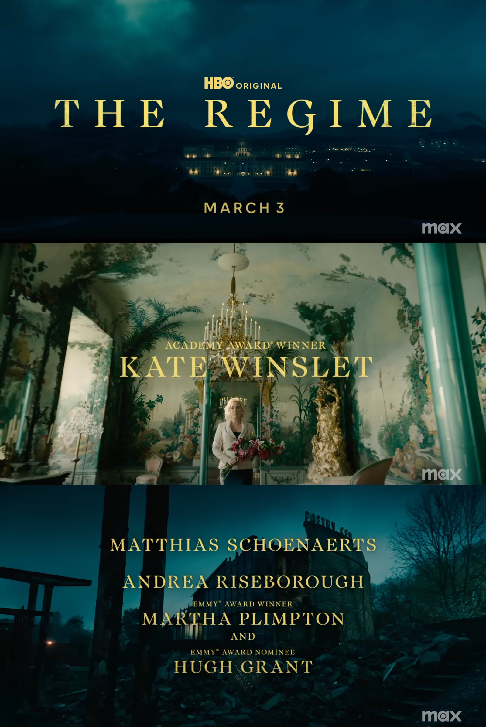
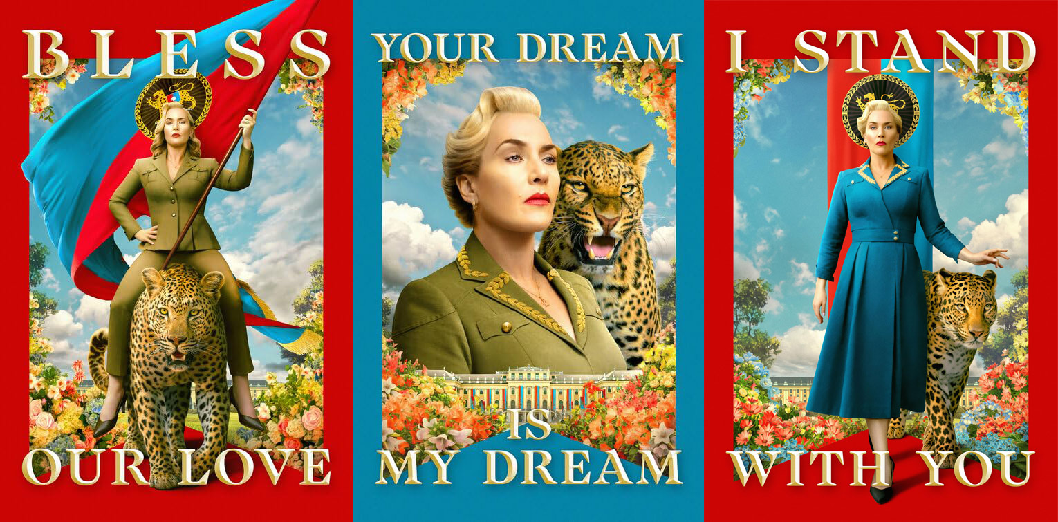
FONT IN USE: Audacious
CLIENT: HBO Max
DESIGN CREDIT: Not Known
The Regime uses Audacious as its signature typeface. It’s nice to see an alternate being used in the main title (‘G’ in ‘REGIME’) and delightful to see extensive use of Audacious for titles, posters and all end credits in the show.
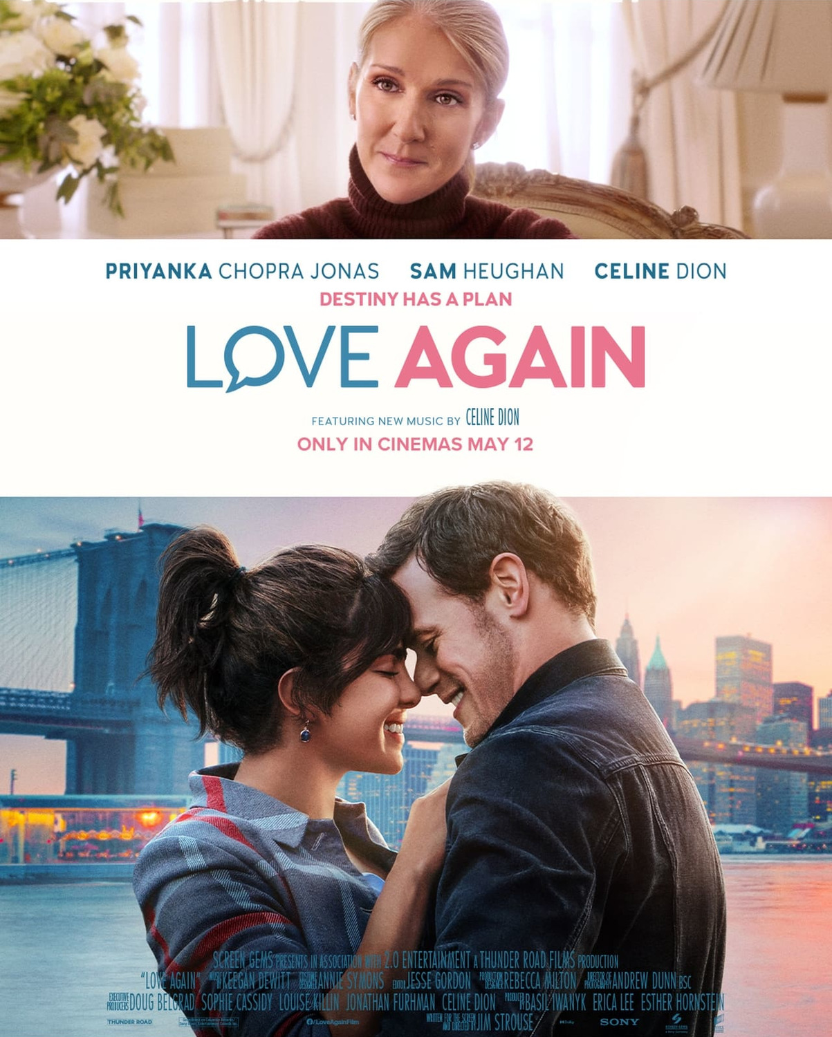
FONT IN USE: Woodford Bourne Pro
CLIENT: Screen Gems
DESIGN CREDIT: BLT Communications
If a film featuring Celine Dion wasn’t bad enough, they’ve only chosen Woodford Bourne Pro to compound the misery on this poster for Love Again 😆😆😆. The weights used are Regular, Medium, and Bold from v.2 of this typeface (2016).
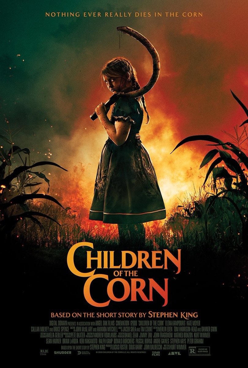
FONT IN USE: Majesty
CLIENT: RLJE Films
DESIGN CREDIT: Not Known
Majesty Medium and Bold are the fonts used for this poster to promote a remake of Children of the Corn. Title fonts have been condensed by 95%, they opted for the Eng glyph to emphasise the scythe motif, and chose the alternate swash K for “King”.
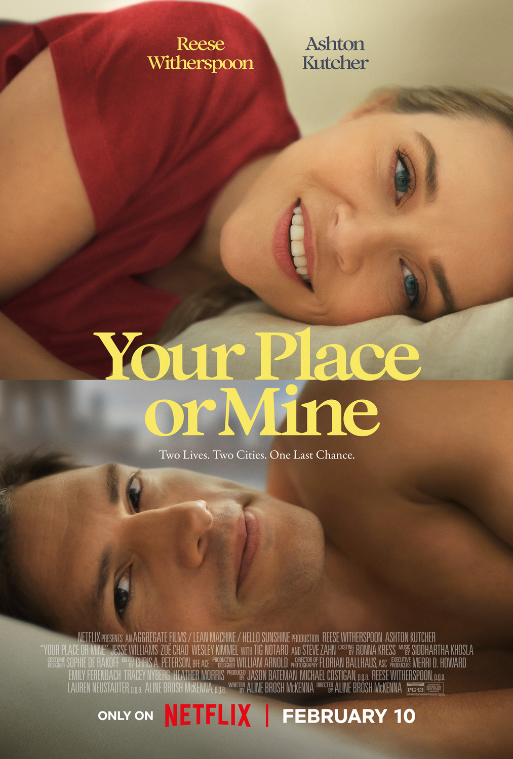


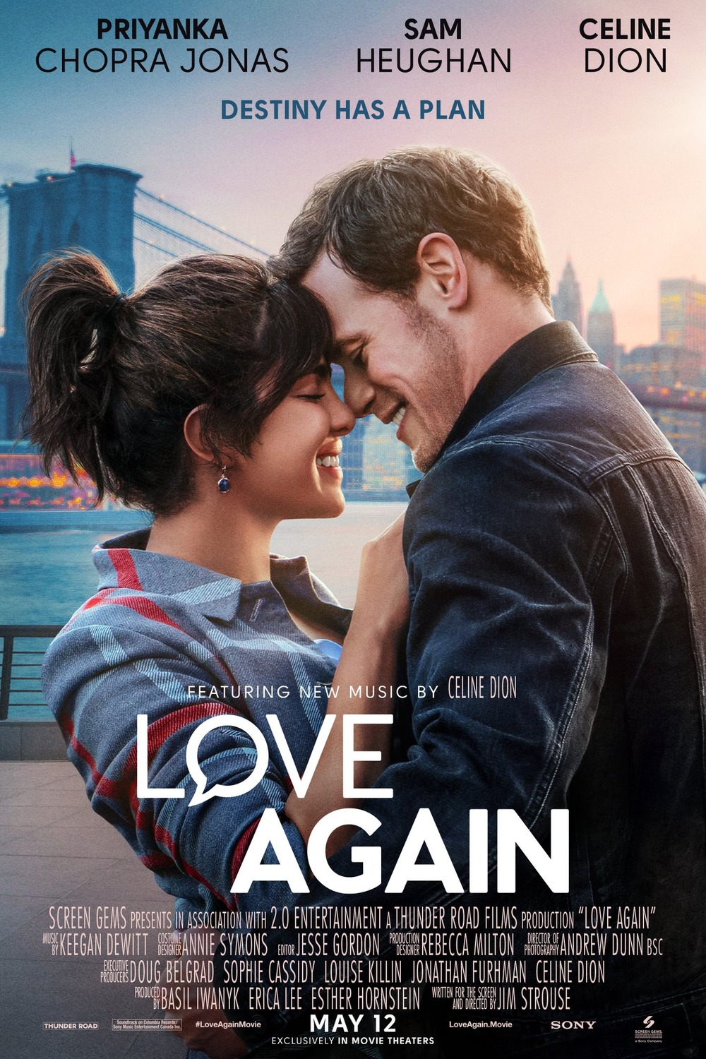
FONT IN USE: Audacious
CLIENT: Netflix
DESIGN CREDIT: Not Known
This romcom for Netflix uses Audacious Medium for its title in posters and on their website. I think they could’ve taken a little bit more care with the spacing/kerning. Anyway… nice to see my fonts in use on another big budget production.
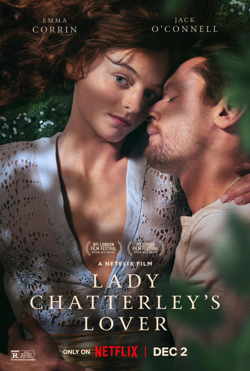
FONT IN USE: Carrig Pro
CLIENT: Netflix
DESIGN CREDIT: Not Known
Netflix’s interpretation of Lady Chatterley’s Lover (released December 2022) uses Carrig Pro Regular for its title.
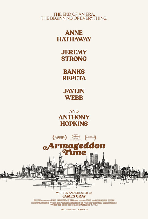
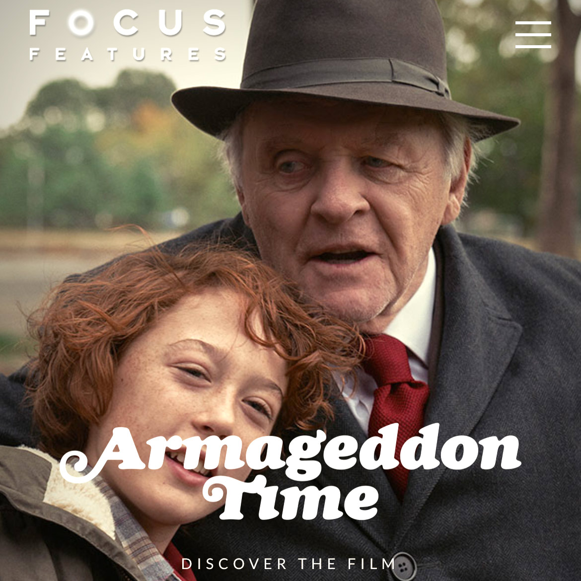

FONT IN USE: Cream
CLIENT: Focus Features
DESIGN CREDIT: GrandSon
Cream Black Italic utilising alternate caps was chosen to represent the 2022 James Gray film Armageddon Time.
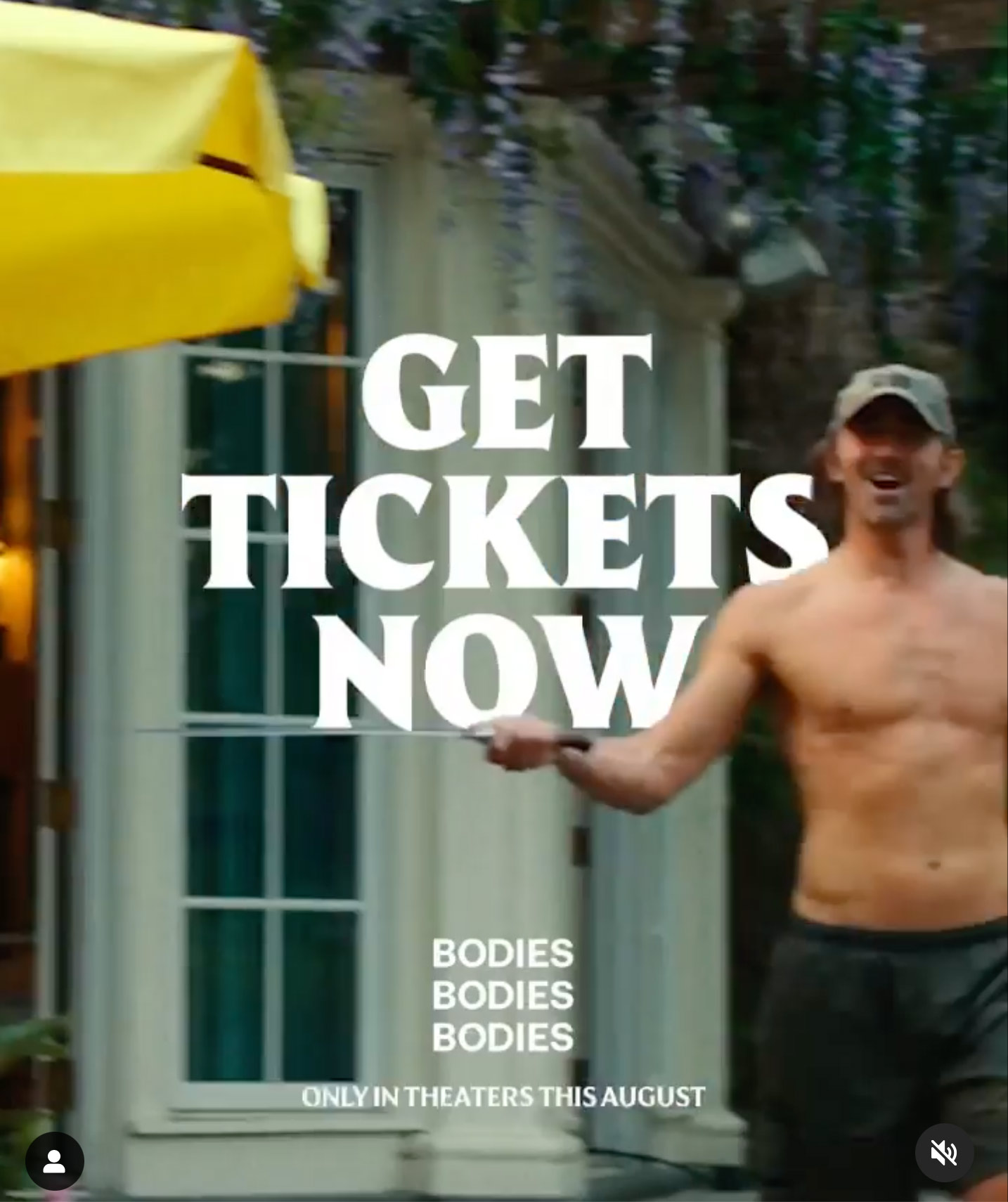

FONT IN USE: Harmonique
CLIENT: A24
DESIGN CREDIT: GrandSon
Further use here of Harmonique for the promotion of the movie Bodies Bodies Bodies by GrandSon for A24. This time Harmonique Display Black has been used for the main call to action and then SemiBold used for the final line.
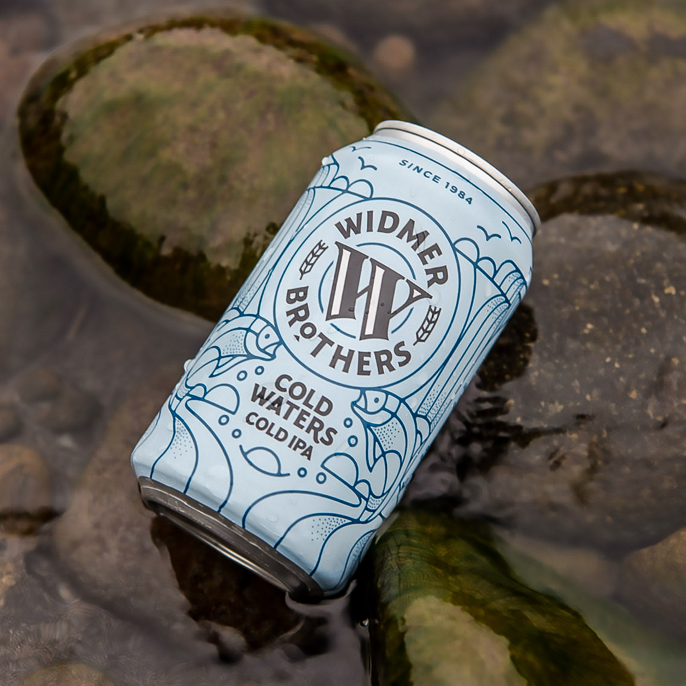

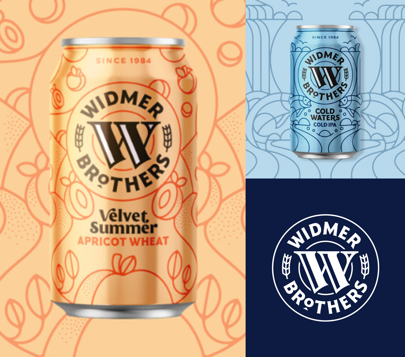
FONT IN USE: Harmonique
CLIENT: Widmer Brothers
DESIGN CREDIT: Not known
I am rather partial to an IPA every now and then (not too often!), so it was great to discover the Widmer Brothers brewery using Harmonique to great effect for their branding and labelling.
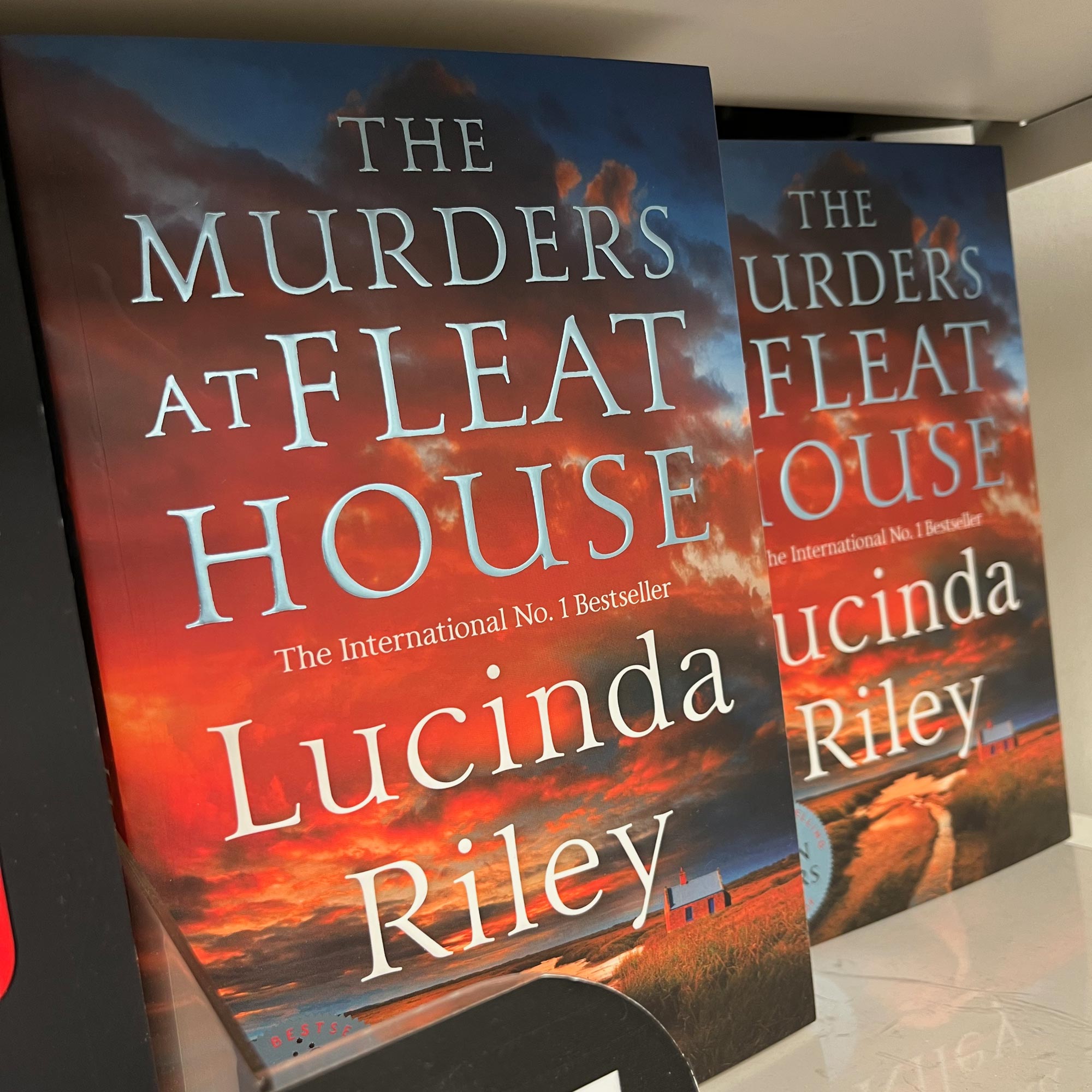
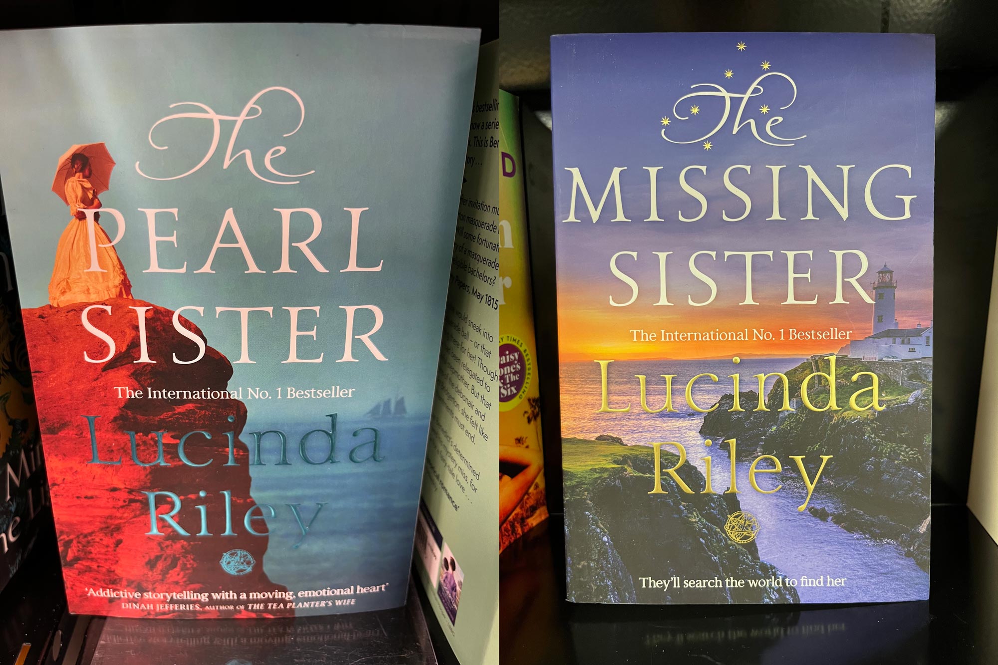
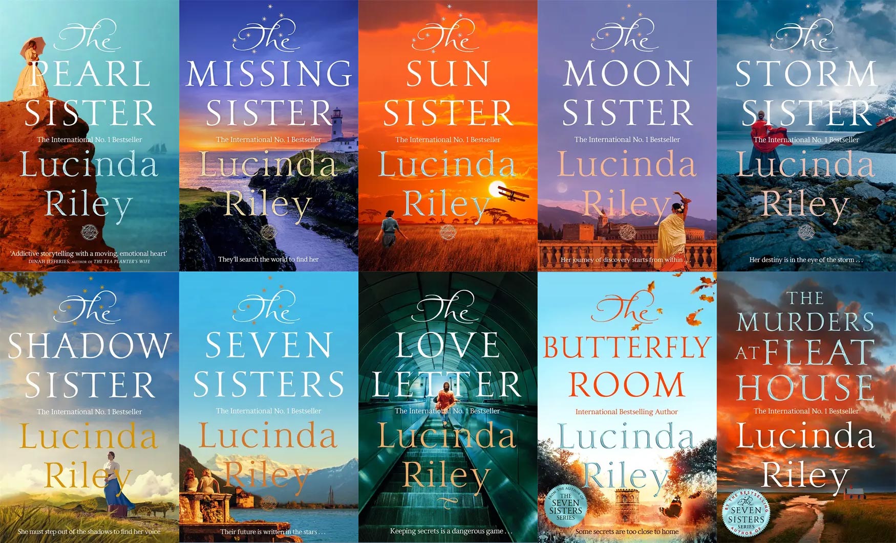
FONT IN USE: Carrig Pro
CLIENT: Pan Macmillan
DESIGN CREDIT: Pan Macmillan
It’s such a good feeling to walk into a bookshop and be faced with your own work in the bestsellers section. Here I discovered that Lucinda Riley’s The Murders at Fleat House was using Carrig Pro, I looked around more and found that a whole series of her books uses my fonts.
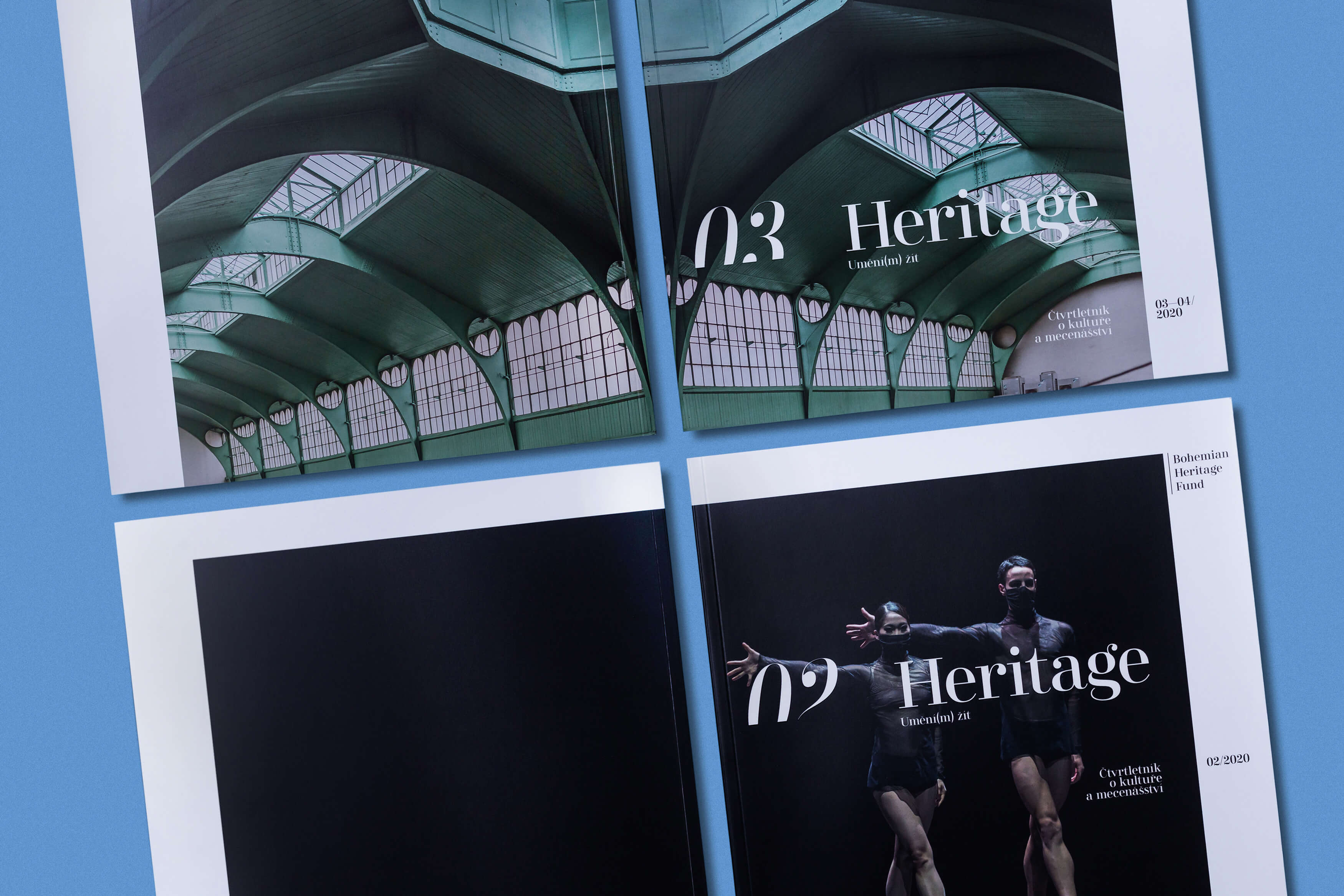
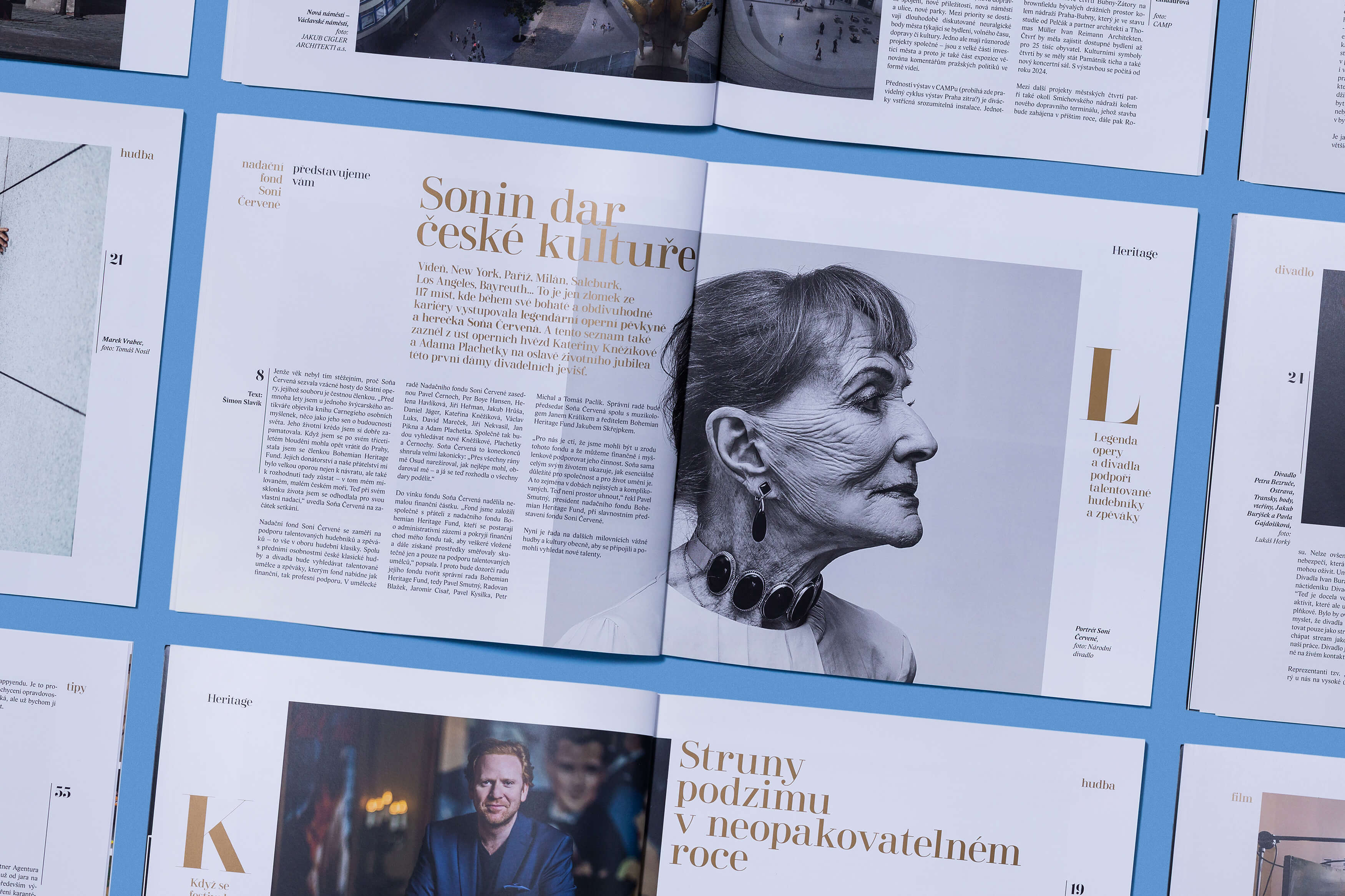
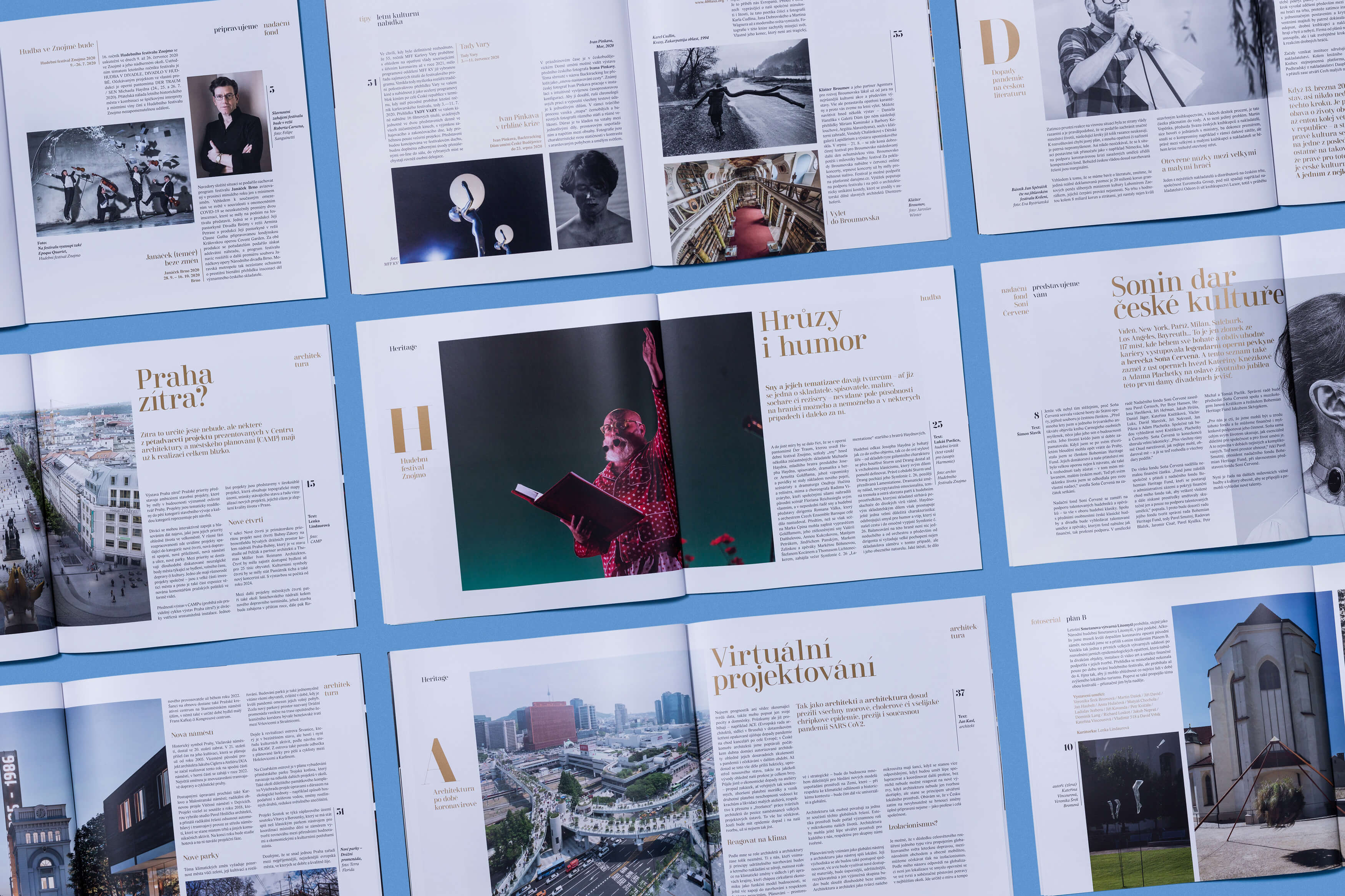
FONT IN USE: Didonesque
CLIENT: Heritage
DESIGN CREDIT: Studio Divize
This magazine for the Bohemian Heritage Fund in the Czech Republic uses Didonesque to good effect. As does their corresponding website. Fair play to all at Studio Divize, nice job!
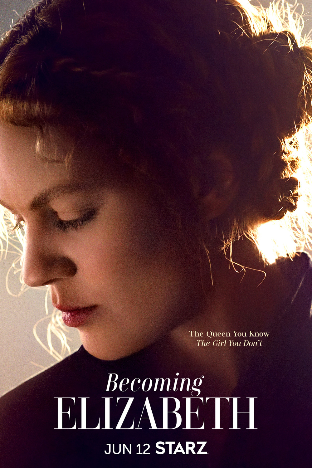
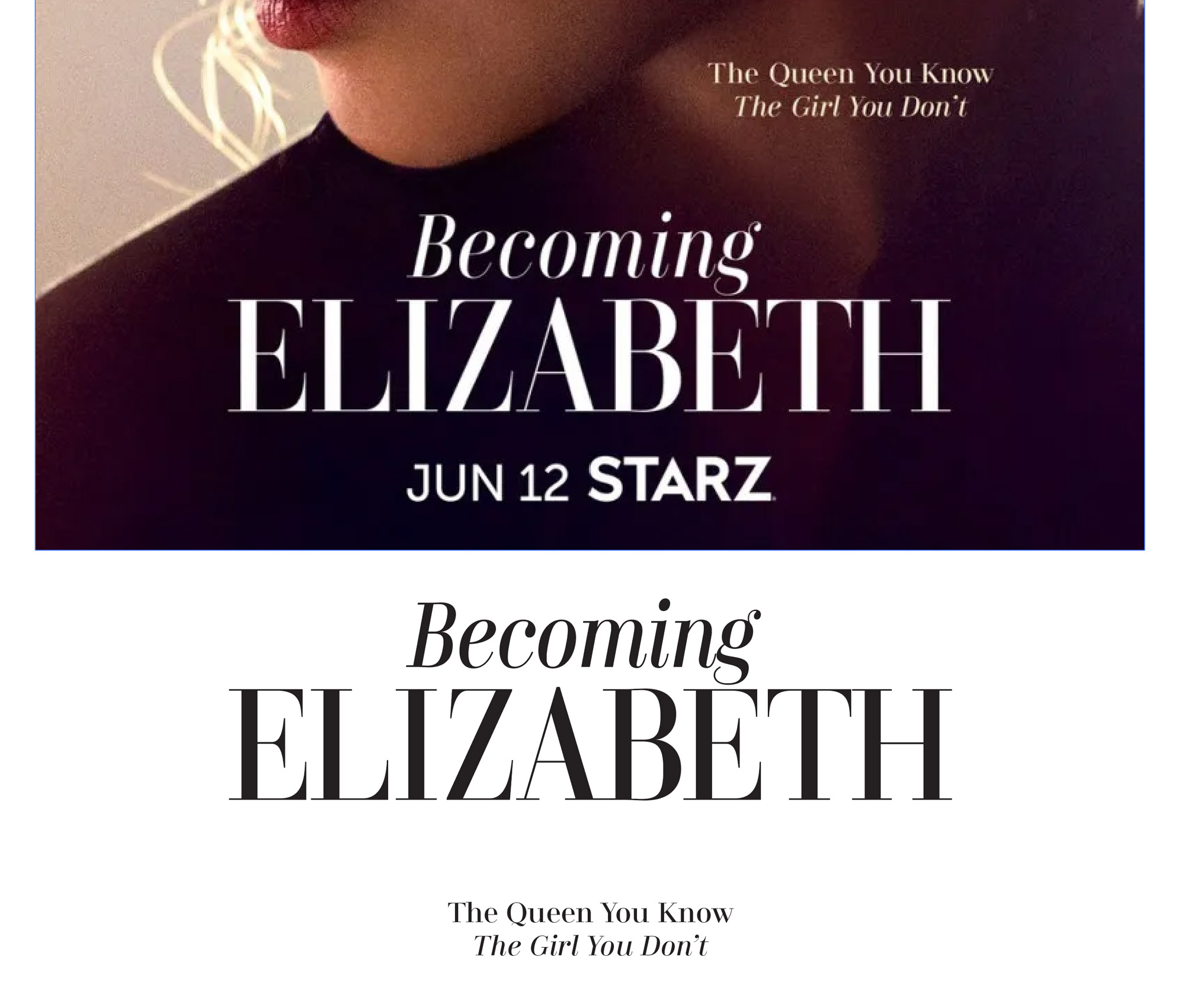
FONT IN USE: Didonesque
CLIENT: STARZ
DESIGN CREDIT: Possibly in-house
Didonesque Roman and Italic in use here for a TV series on the STARZ network, first shown in 2022. The word Becoming has some artificial condensing applied, but the other type is straight Didonesque.

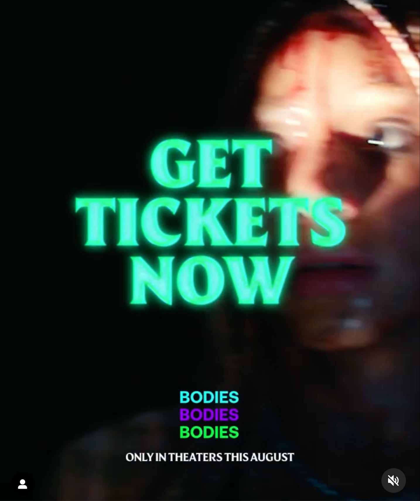
FONT IN USE: Harmonique
CLIENT: A24
DESIGN CREDIT: GrandSon
Harmonique Black has been used to good effect here to promote the film Bodies Bodies Bodies. As this is a slasher genre film, I imagine that the blade-like /N/ glyph played some part in GrandSon’s choosing of Harmonique for this project.
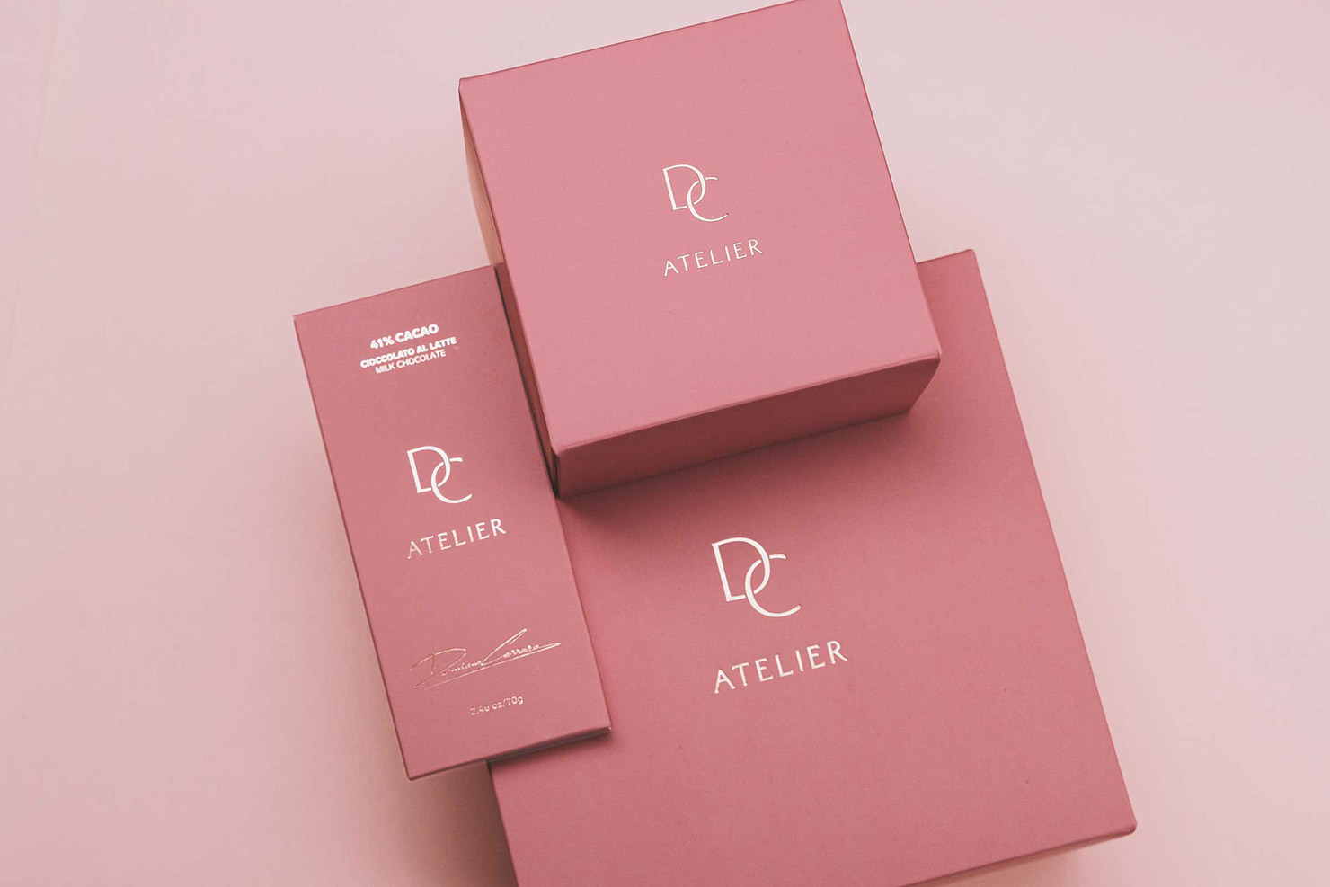
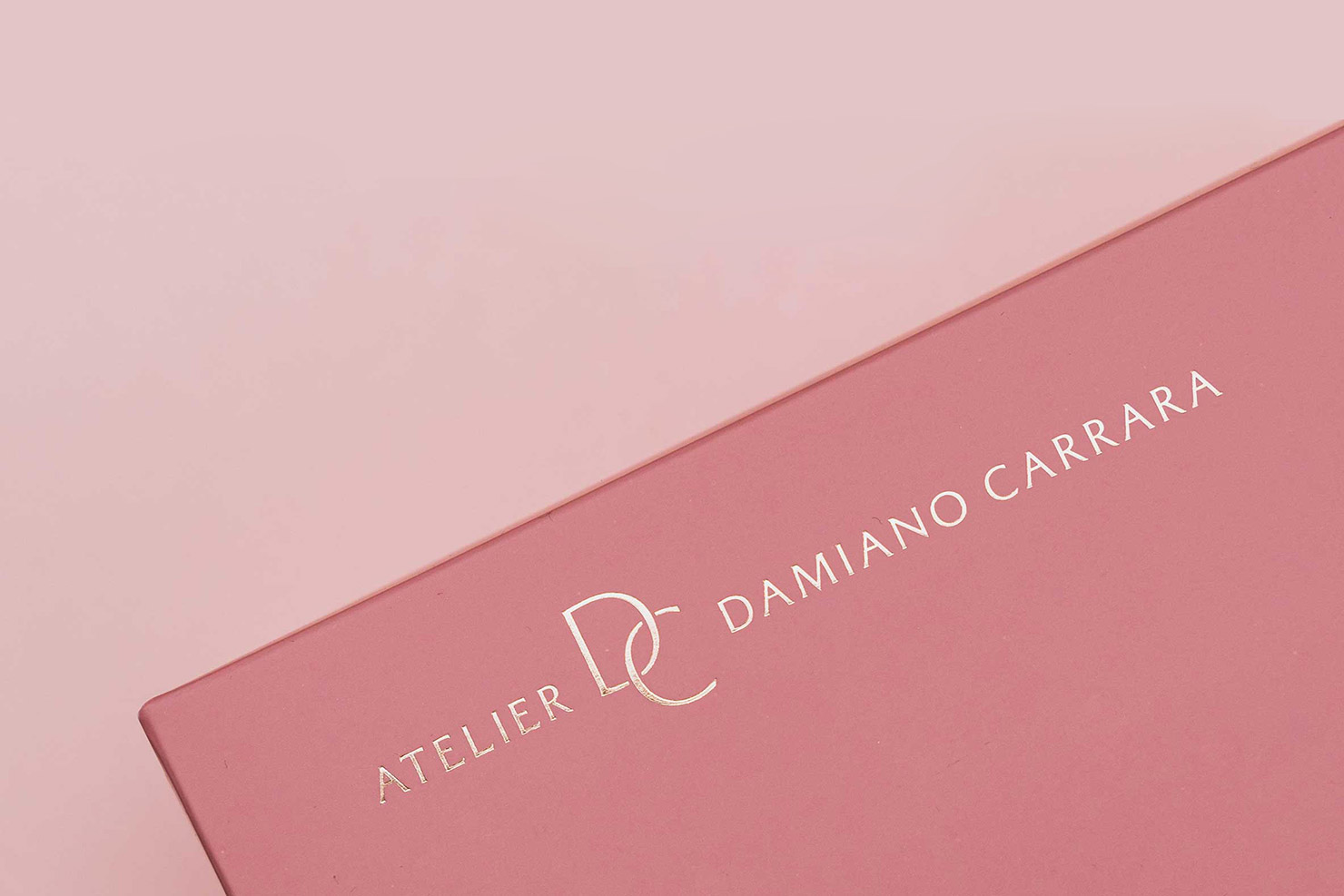
FONT IN USE: Majesty
CLIENT: Damiano Carrara
DESIGN CREDIT: Kid Studio
A classy branding project by Kid Studio (Italy) for Damiano Carrara – putting Majesty to good use.
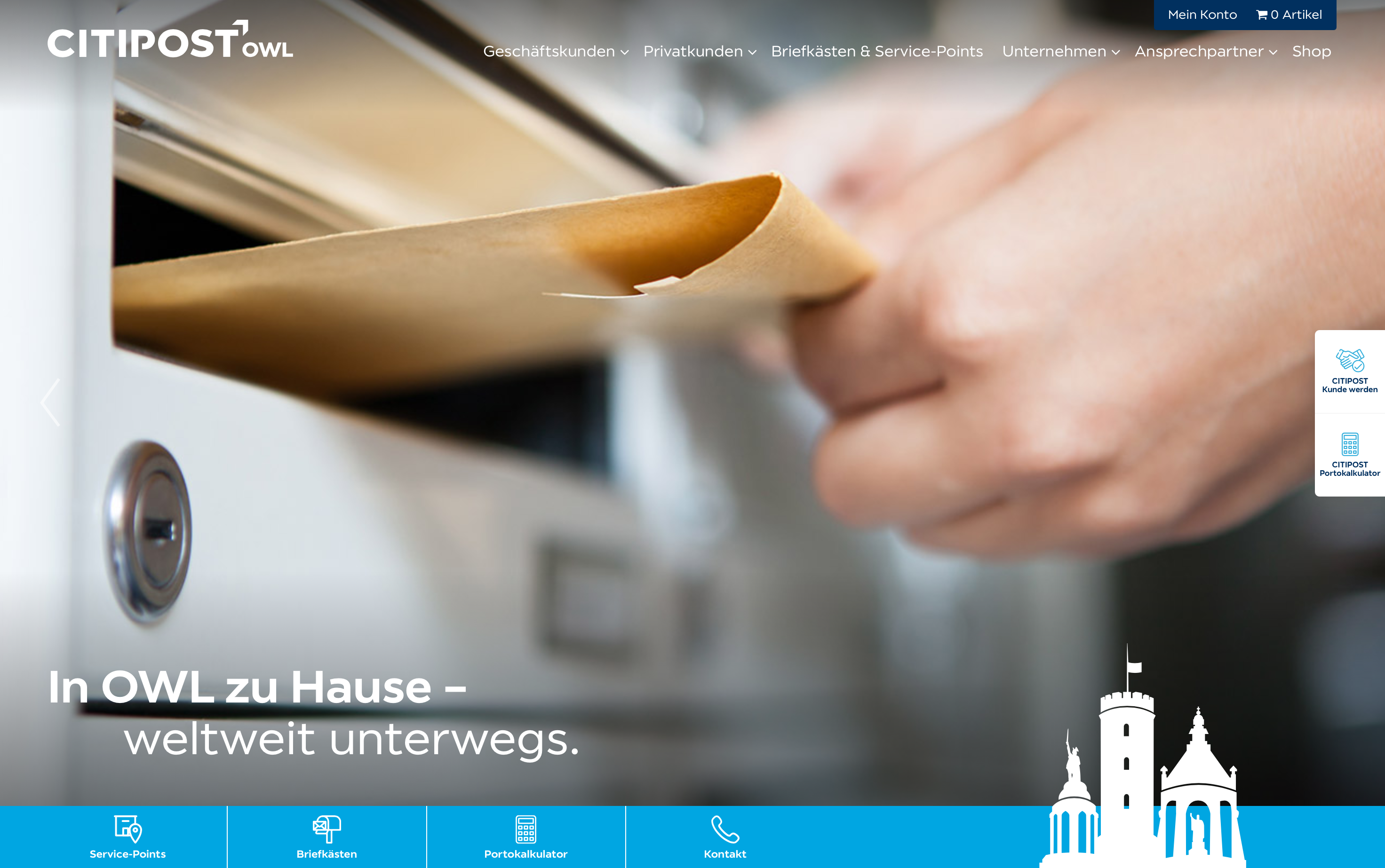
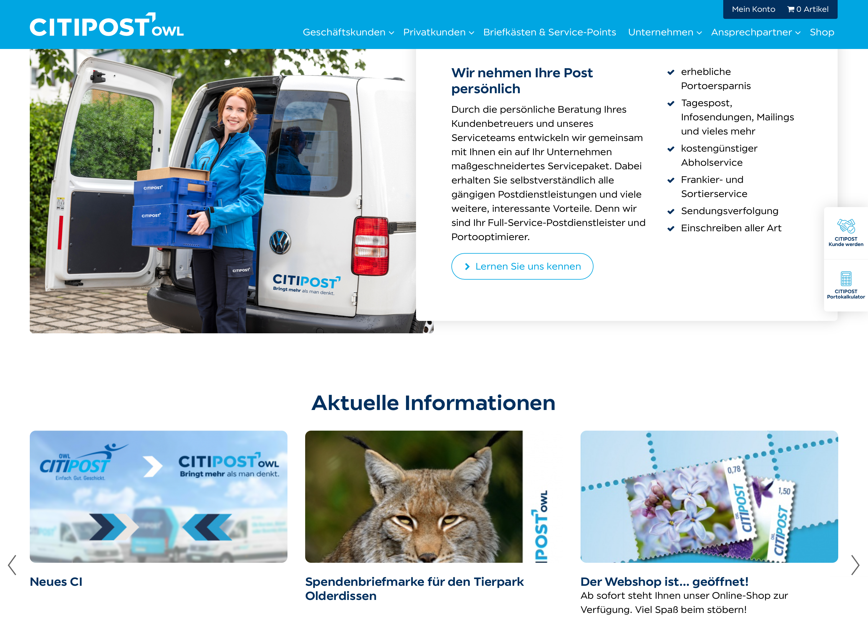
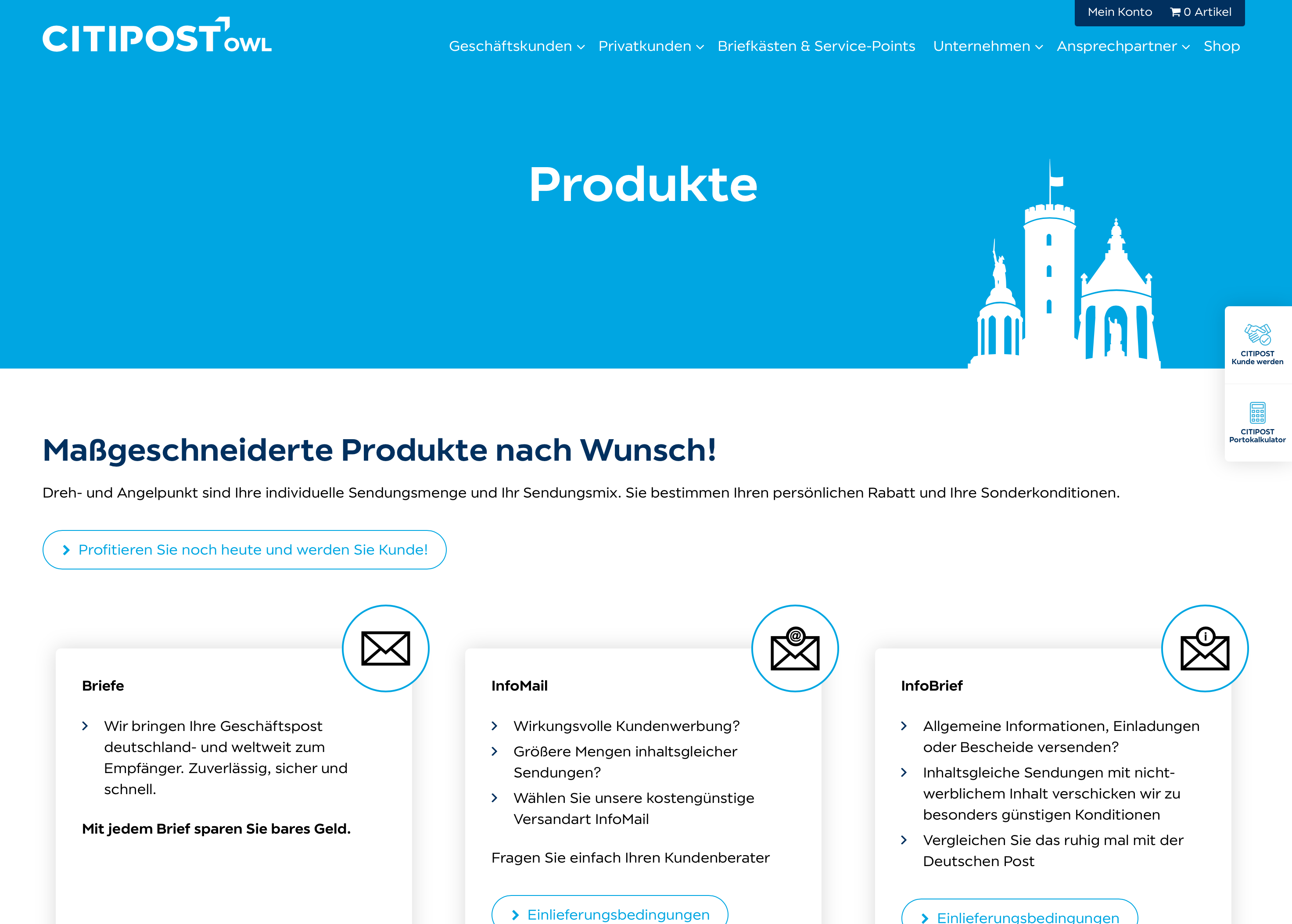
FONT IN USE: Modica
CLIENT: CitiPost
DESIGN CREDIT: Not known
CitiPost rebranded during 2020 and this website for their CitiPost OWL service uses Modica extensively. It is nice to see Modica being put to task and performing admirably throughout the site.
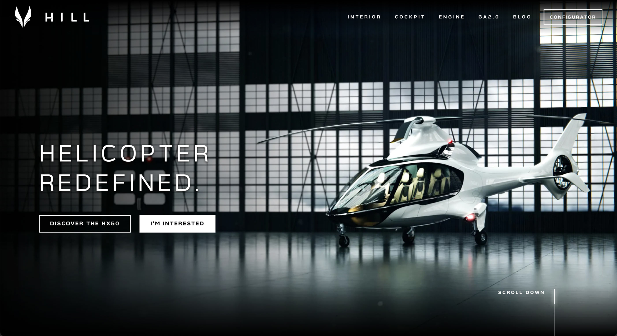
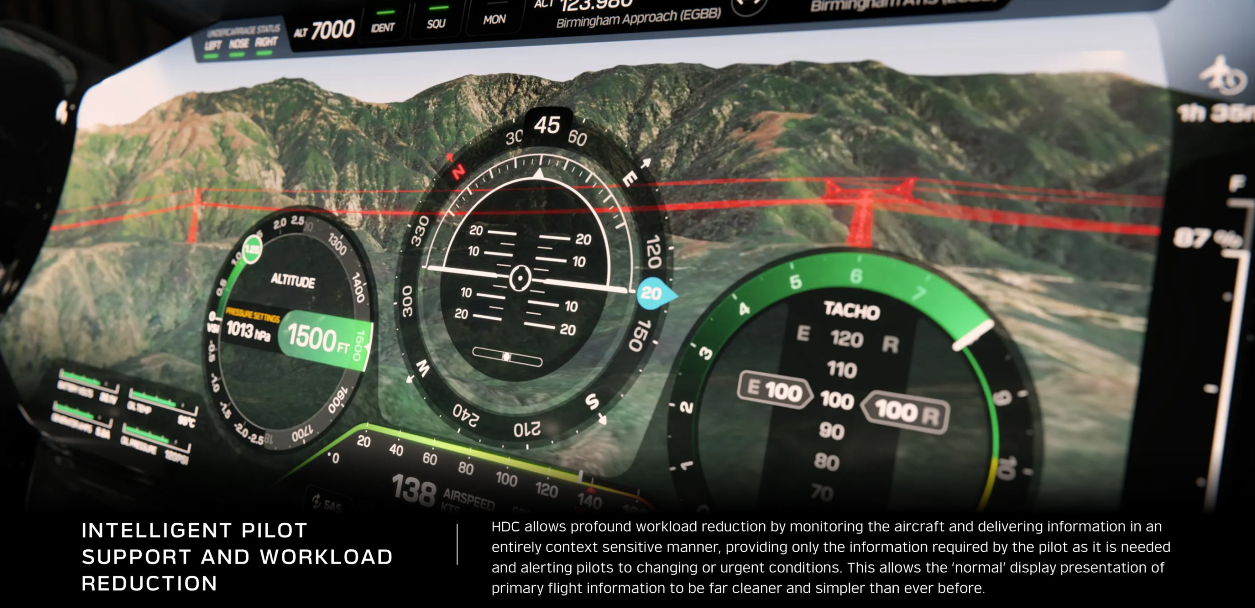
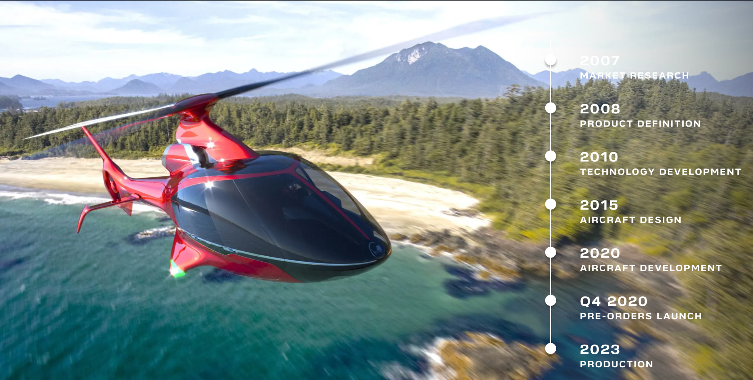
FONT IN USE: Verbatim
CLIENT: Hill Helicopters
DESIGN CREDIT: Not known
This was a nice discovery, Hill Helicopters are using Verbatim exactly as I had envisaged – Verbatim’s clean and futuristic lines perfectly matching their stunning helicopters. The cockpit UI is particularly impressive.
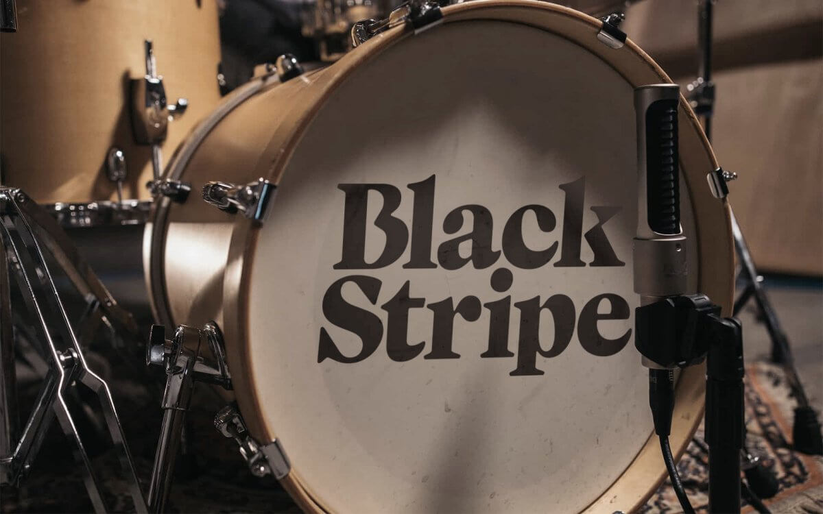
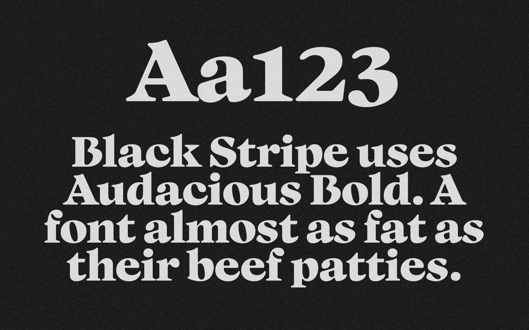

FONT IN USE: Audacious
CLIENT: Black Stripe
DESIGN CREDIT: Unisono Agency
Audacious Bold is at the heart of this rebranding of a burger restaurant. It’s nice to see that the designers at Unisono Agency seemingly enjoyed putting the font through its paces with an array of design concepts (as seen on their website).
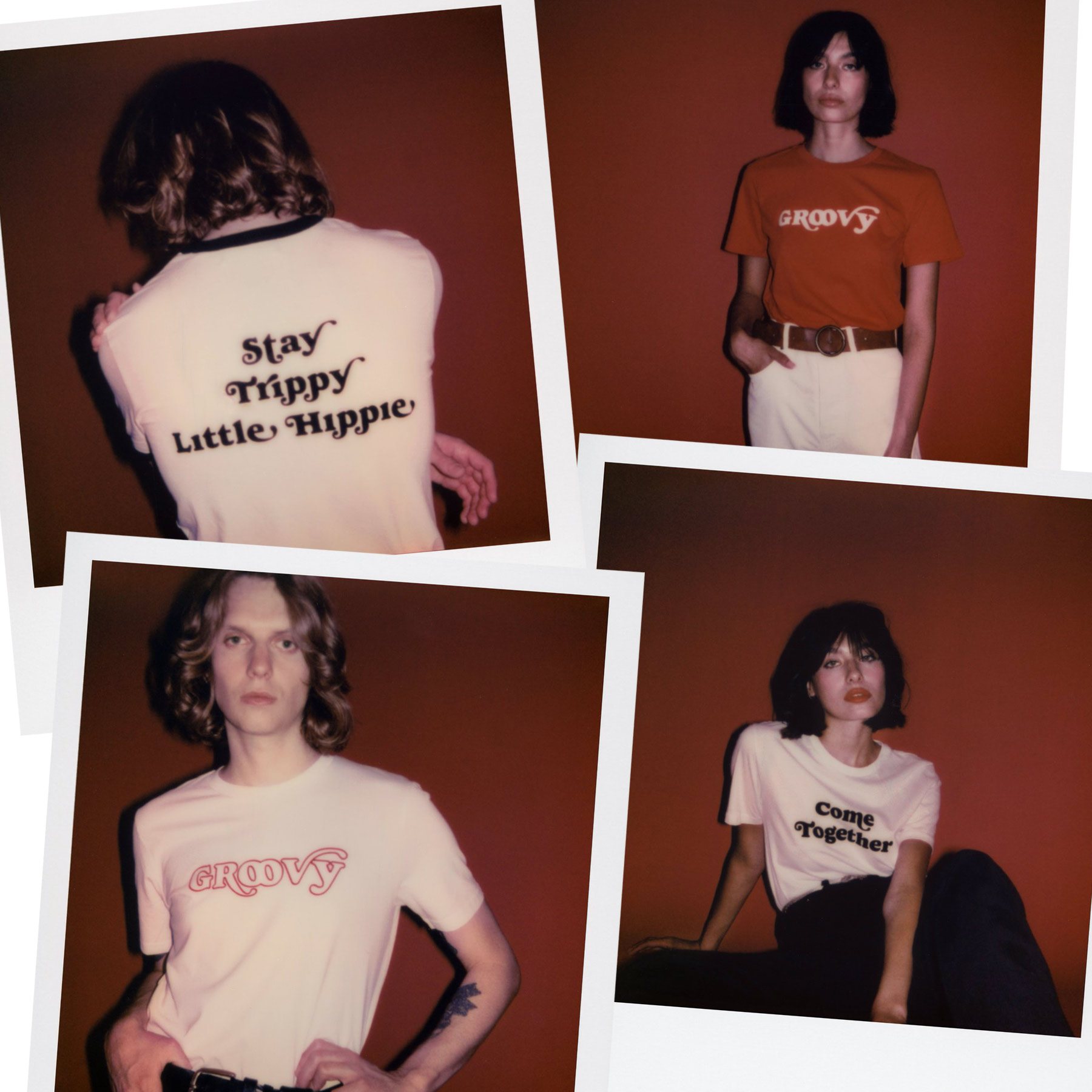
FONT IN USE: Cream
CLIENT: Good Morning Keith
DESIGN CREDIT: In-house
The fashion house Good Morning Keith are using Cream on many of their Sixties Collection T-shirt range released in 2020.

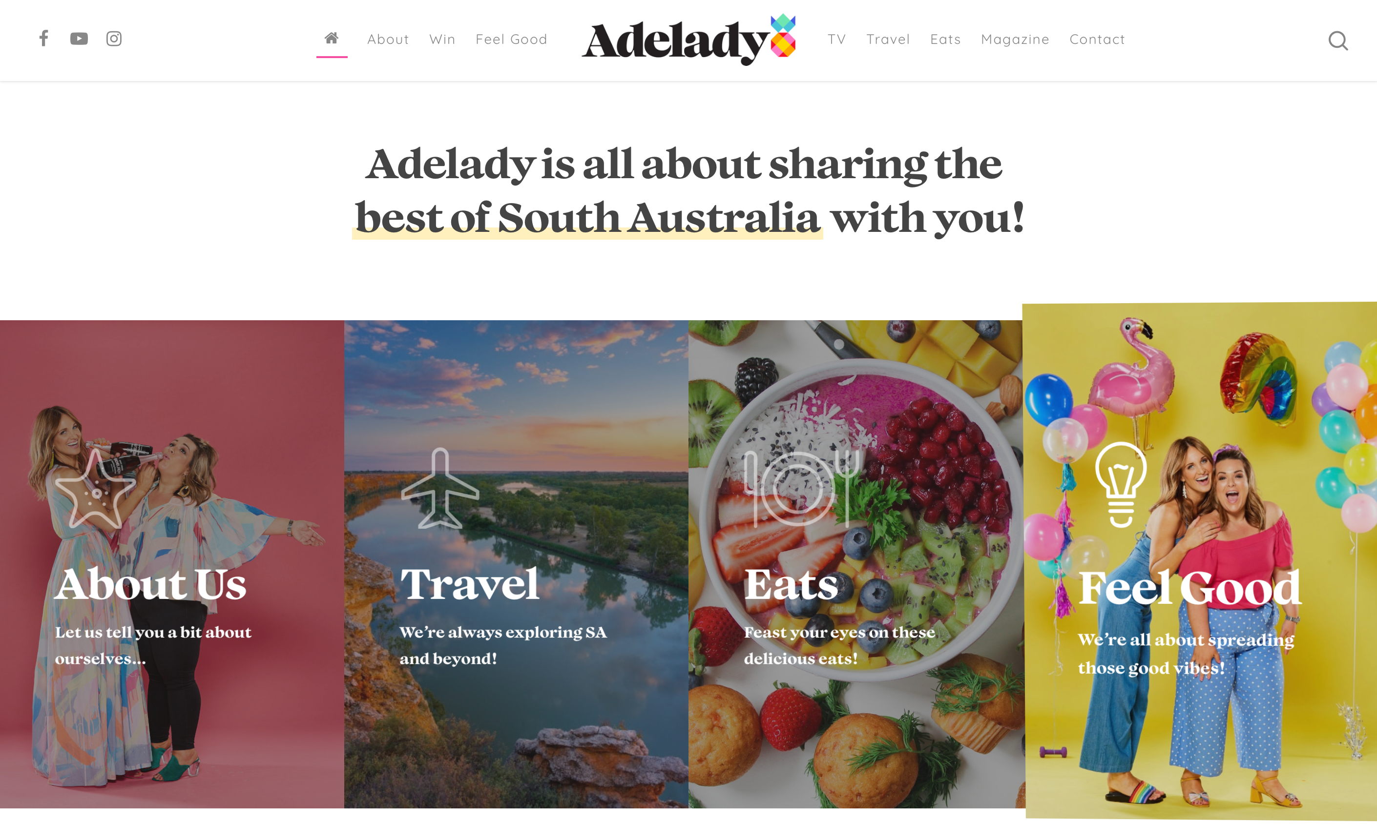
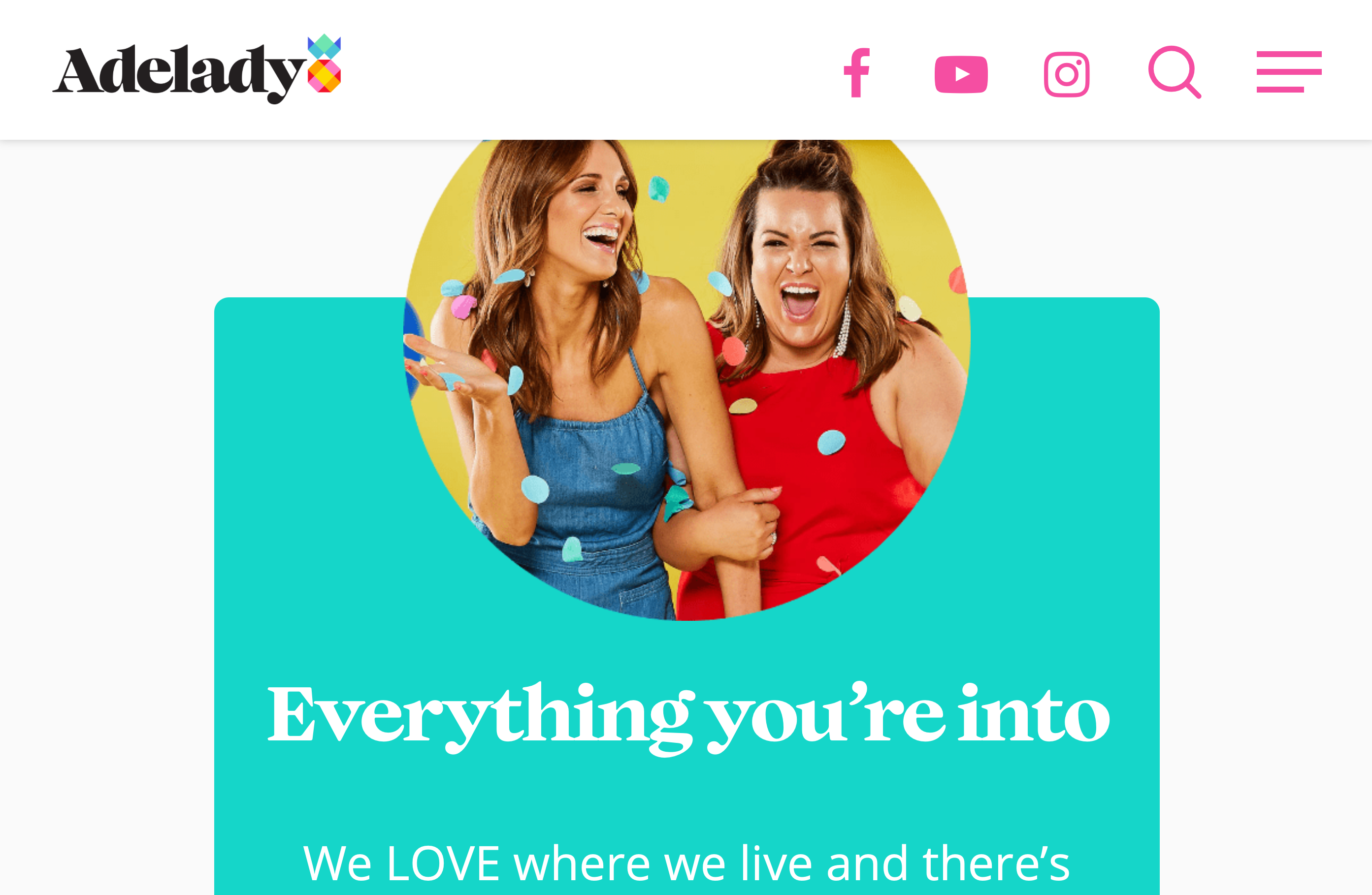
FONT IN USE: Audacious
CLIENT: Adelady
DESIGN CREDIT: TMD
Audacious is prominent here for the Adelady brand identity (Display Bold) and for all titles on the website (SemiBold).
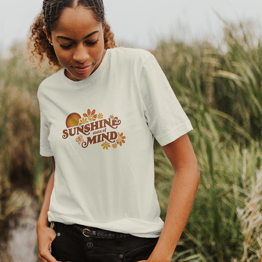

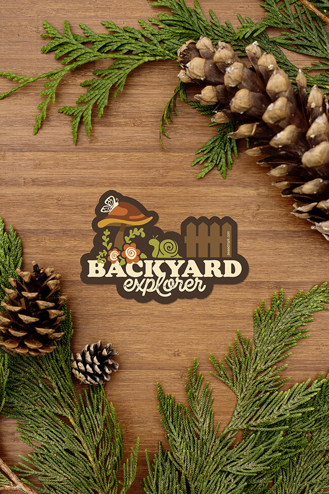
FONT IN USE: Cream
CLIENT: Amanda Weedmark
DESIGN CREDIT: Amanda Weedmark
Amanda Weedmark invested in Cream when it was first released and is now implementing it wonderfully in her illustrations and designs which are available on her online store.
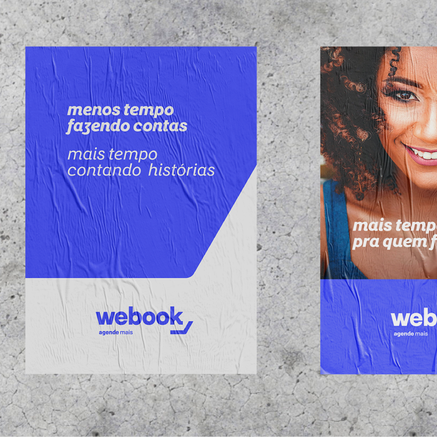

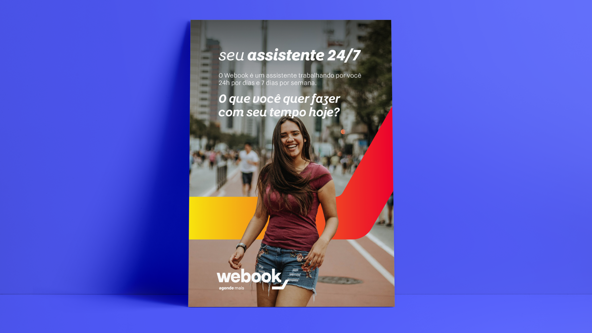
FONT IN USE: Yolk
CLIENT: We Book
DESIGN CREDIT: Chaminé
A first look at Yolk in use, seen here being implemented for main support copy for the Brazilian We Book service. Fine work by the Chaminé agency.
FONT IN USE: Polyphonic
CLIENT: ABC
DESIGN CREDIT: Eureka
Not sure what this is all about as I’ve no interest in golf, but it’s nice to discover Polyphonic Bold being put to use.
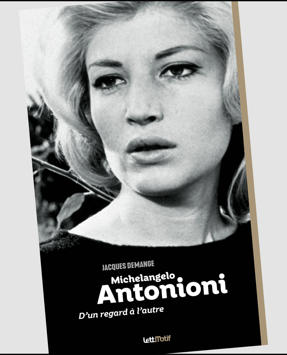
FONT IN USE: Rhetoric
CLIENT: LettMotif
DESIGN CREDIT: LettMotif
My first spotting of Rhetoric in the wild – in use for this book cover on the life and works of Michelangelo Antonioni.
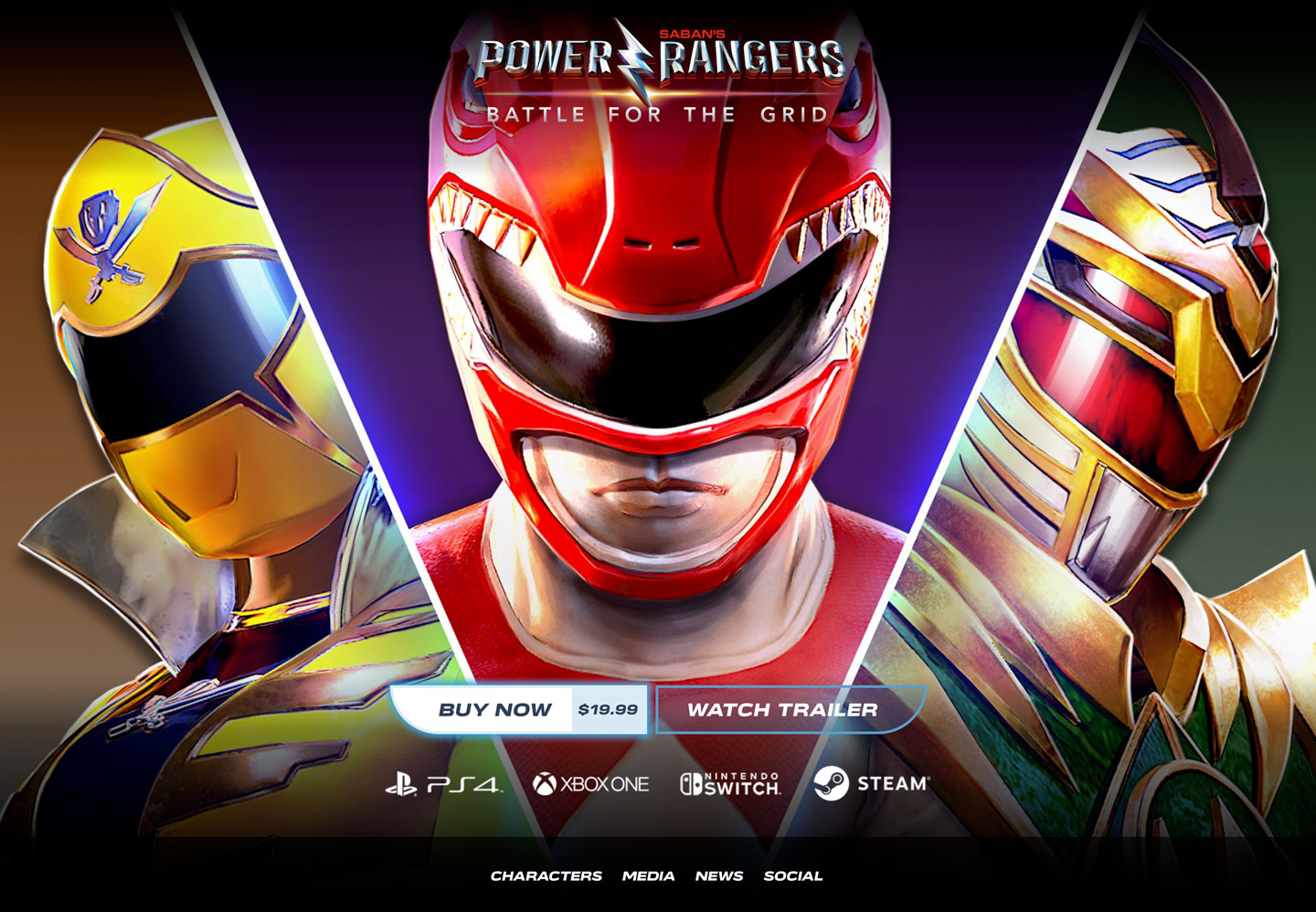
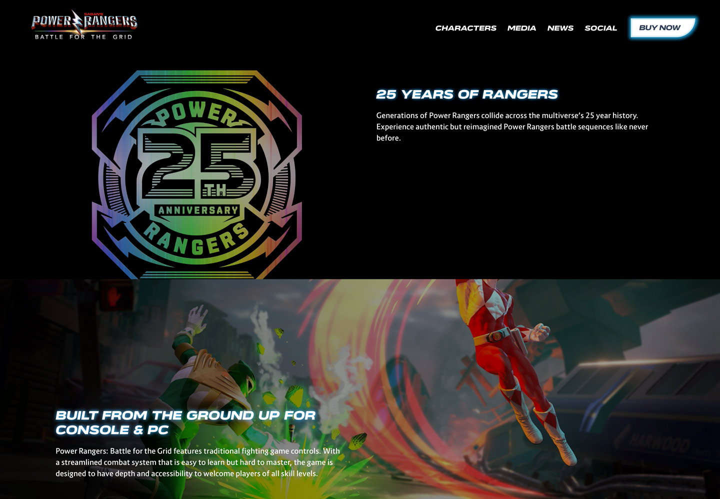

FONT IN USE: Verbatim
CLIENT: Power Rangers: Battle for the Grid
DESIGN CREDIT: Super Critical
Verbatim Wide Black Oblique has been used for titles and call-to-action elements in this single page website for the 2019 game release Battle for the Grid as part of the Power Rangers franchise.
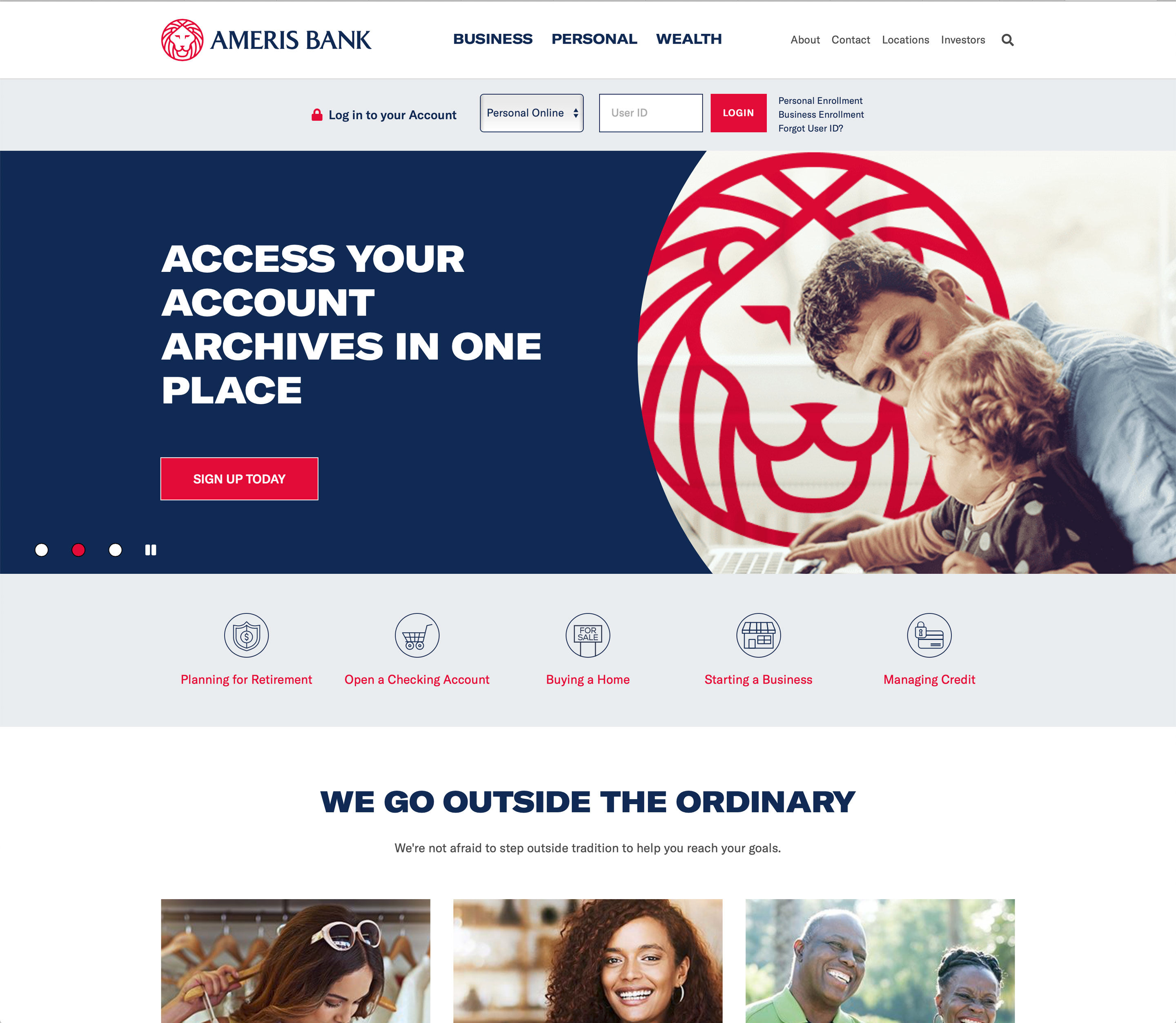
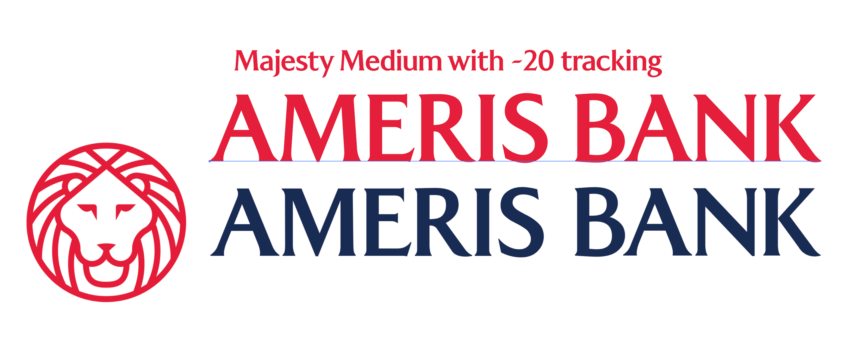
FONT IN USE: Majesty
CLIENT: Ameris Bank
DESIGN CREDIT: Matchstic
Ameris Bank launched its new brand on Hallowe’en 2019, with a new website by ZAG Interactive, with the new corporate identity devised by Matchstic. This is an example of Majesty Medium in use, albeit with a modified /M/ and some questionable kerning adjustments. Identity featured at Brand New.
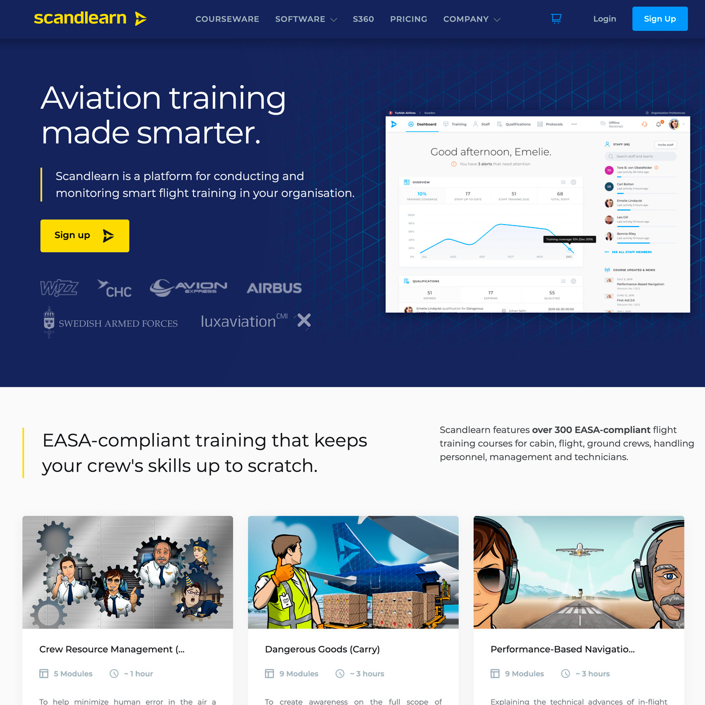
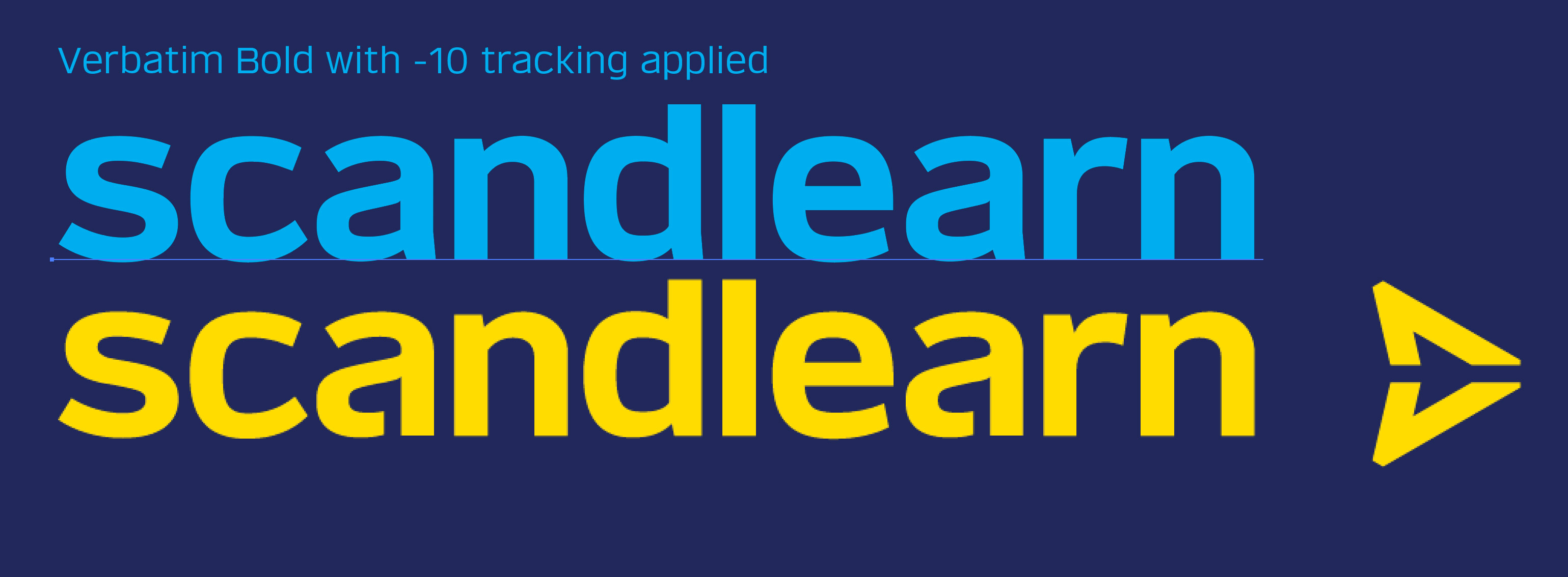
FONT IN USE: Verbatim
CLIENT: Scandlearn
DESIGN CREDIT: Scandlearn
Verbatim Bold has been used to create the identity for Scandlearn, a modified /a/ gives the logotype a little bit of distinction from the regular bold type. The website appears to be using a free Google typeface, Montserrat, for everything else.
FONT IN USE: Transcend
CLIENT: Henry Leroy
DESIGN CREDIT: Henry Leroy
The author of Sang de Fer got in touch to tell me that he had used Transcend for the titles and marketing of his vampire-themed novel. It’s great to see it put to good use so soon after its release, thank you, Henry Leroy.
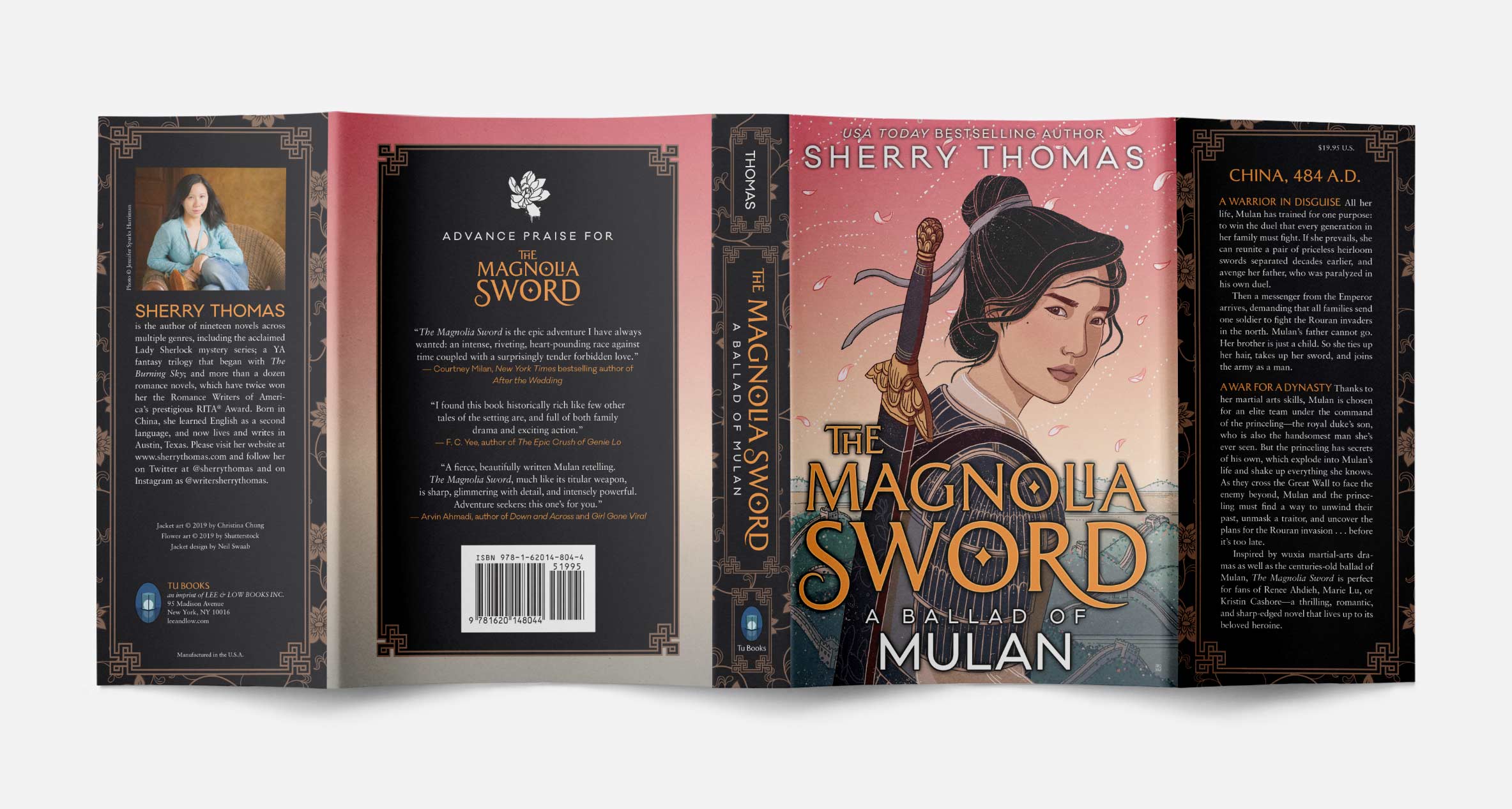
FONT IN USE: Majesty
CLIENT: Tu Books
DESIGN CREDIT: Neil Swaab
Here’s an example of exactly how I envisaged Majesty would be used. Making use of the font’s alternates without being over-the-top, a job well done!
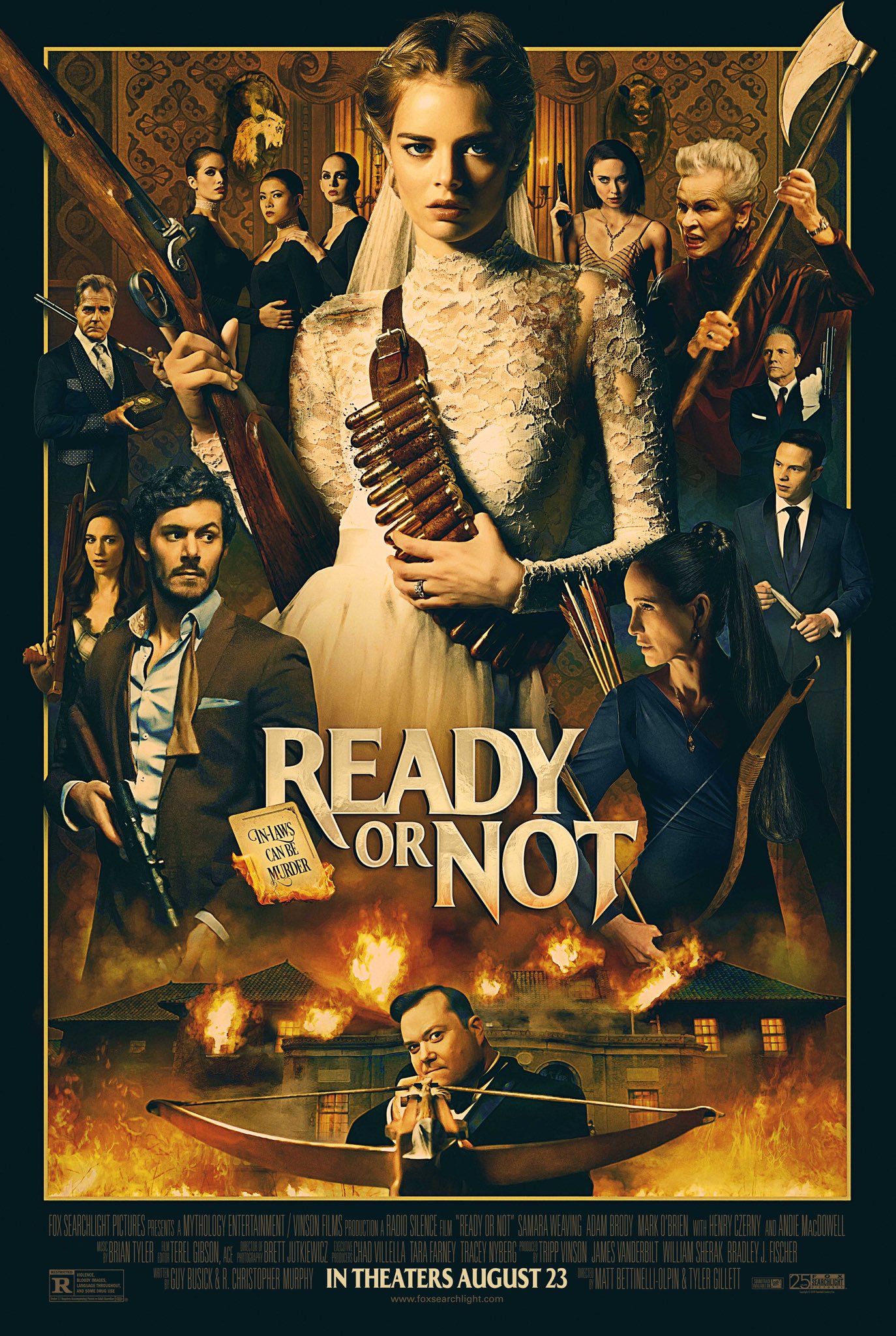
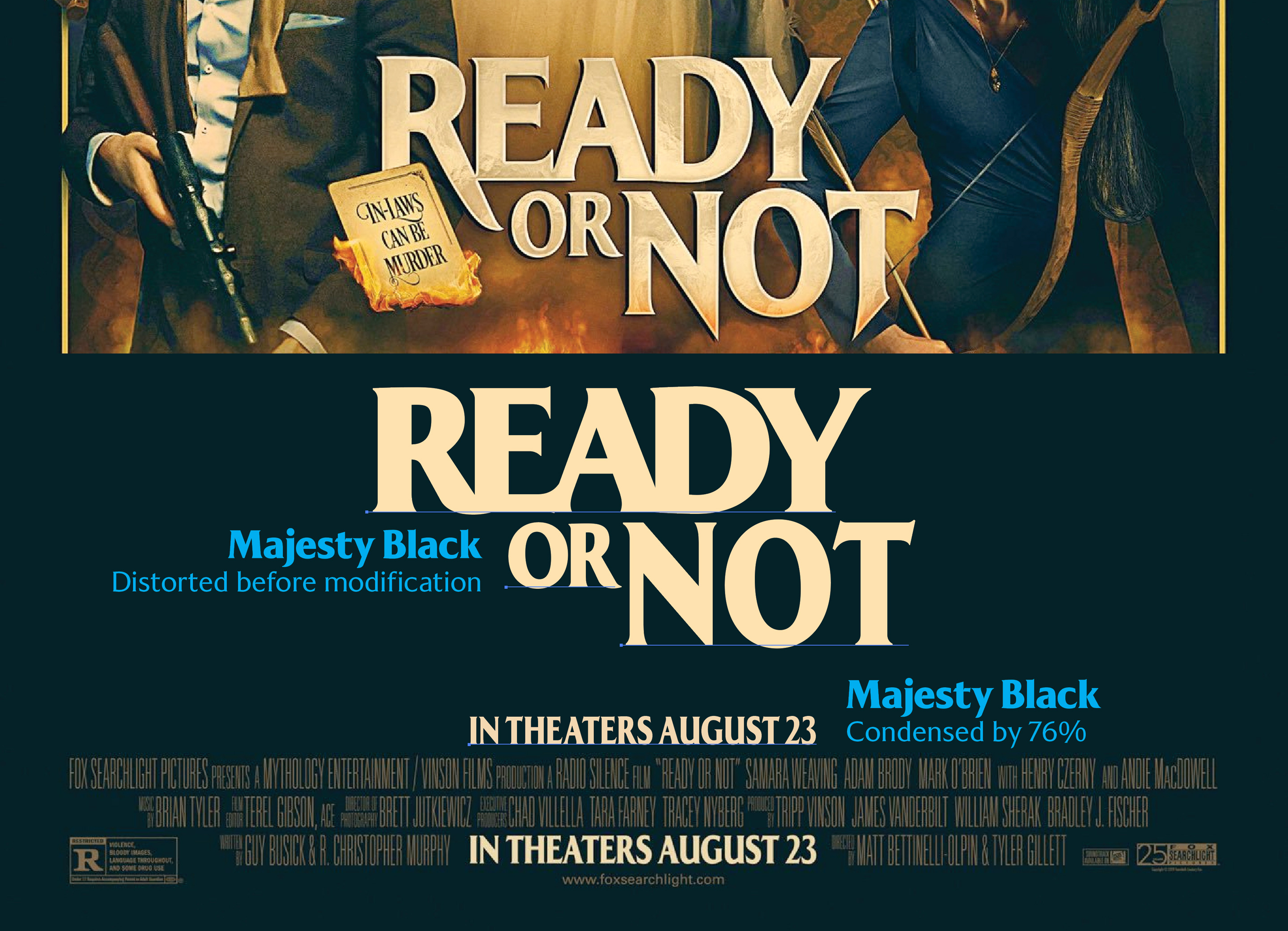
FONT IN USE: Majesty
CLIENT: Fox Searchlight
DESIGN CREDIT: Midnight Oil
When I first saw the title “Ready or Not” I thought the letterforms seemed familiar. After some research, I see that Majesty Black was a starting point for the custom title, which has received some radical modifications. Anyway, the use of Majesty is confirmed by “IN THEATERS AUGUST 23” in the credits – which is Majesty Black, albeit artificially condensed by 76%.
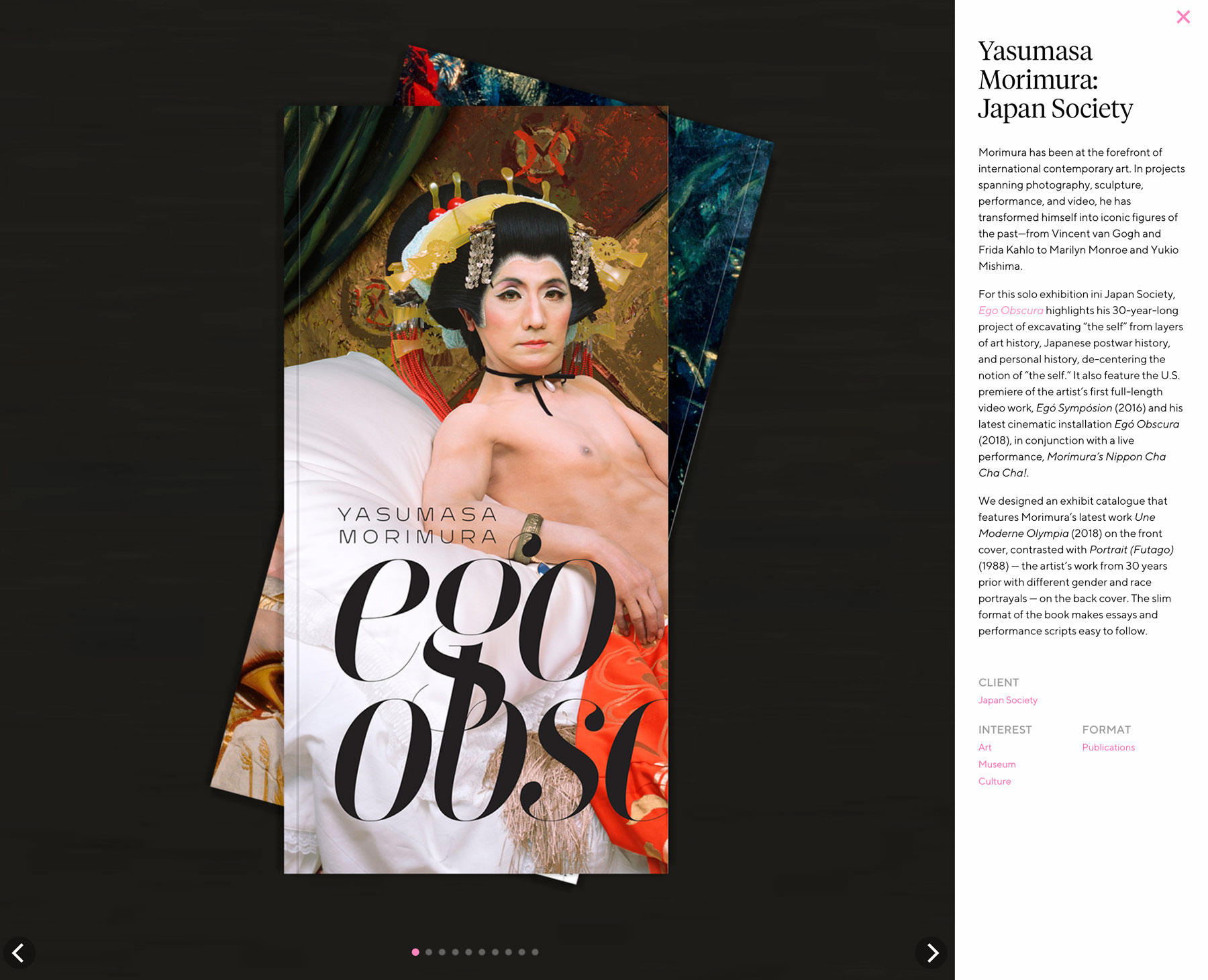
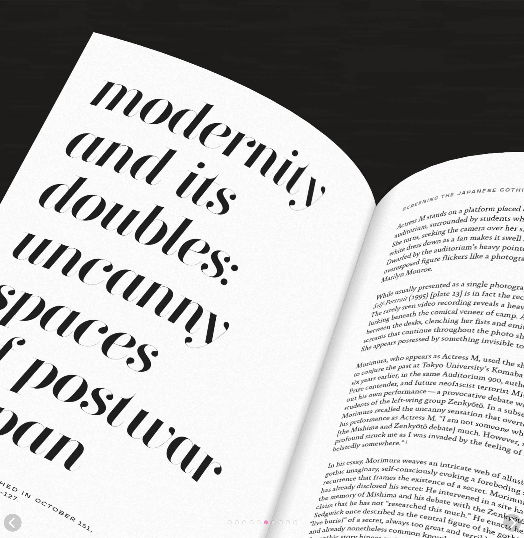
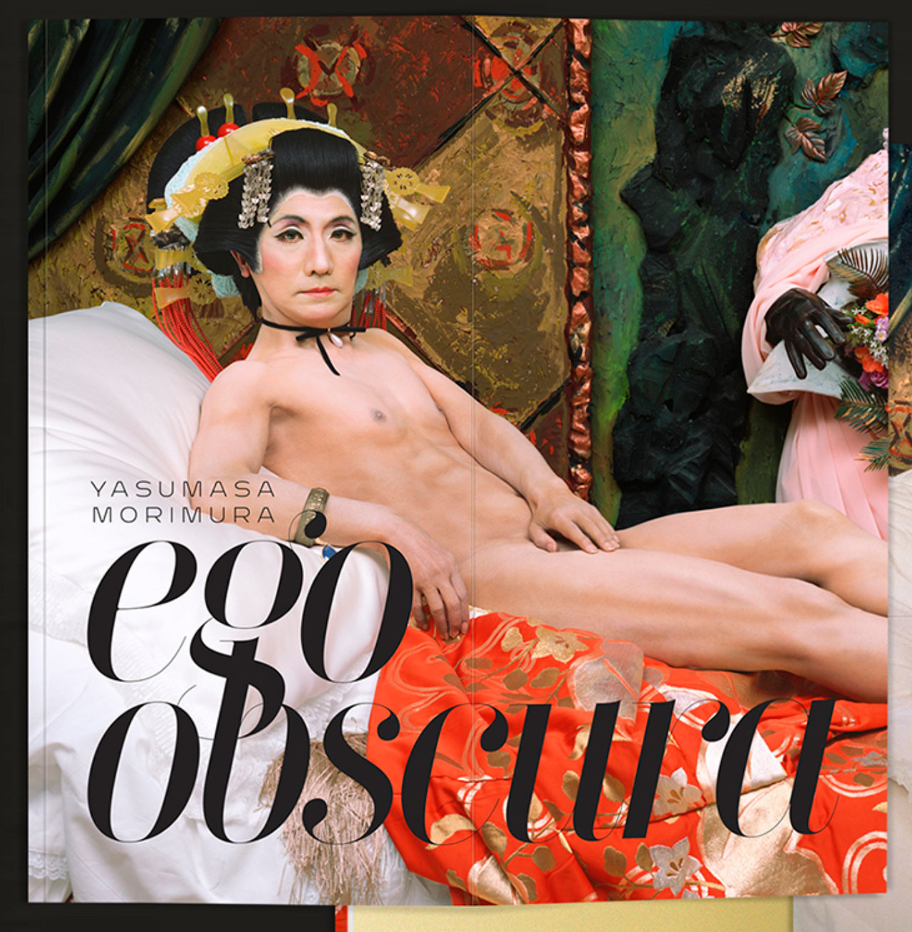
FONT IN USE: Didonesque Ghost
CLIENT: Yasumasa Morimura: Japan Society
DESIGN CREDIT: Kudos
My first discovery of Didonesque Ghost in the wild. This exhibit catalogue was created by Kudos NYC for Yasumasa Morimura: Japan Society in 2018.
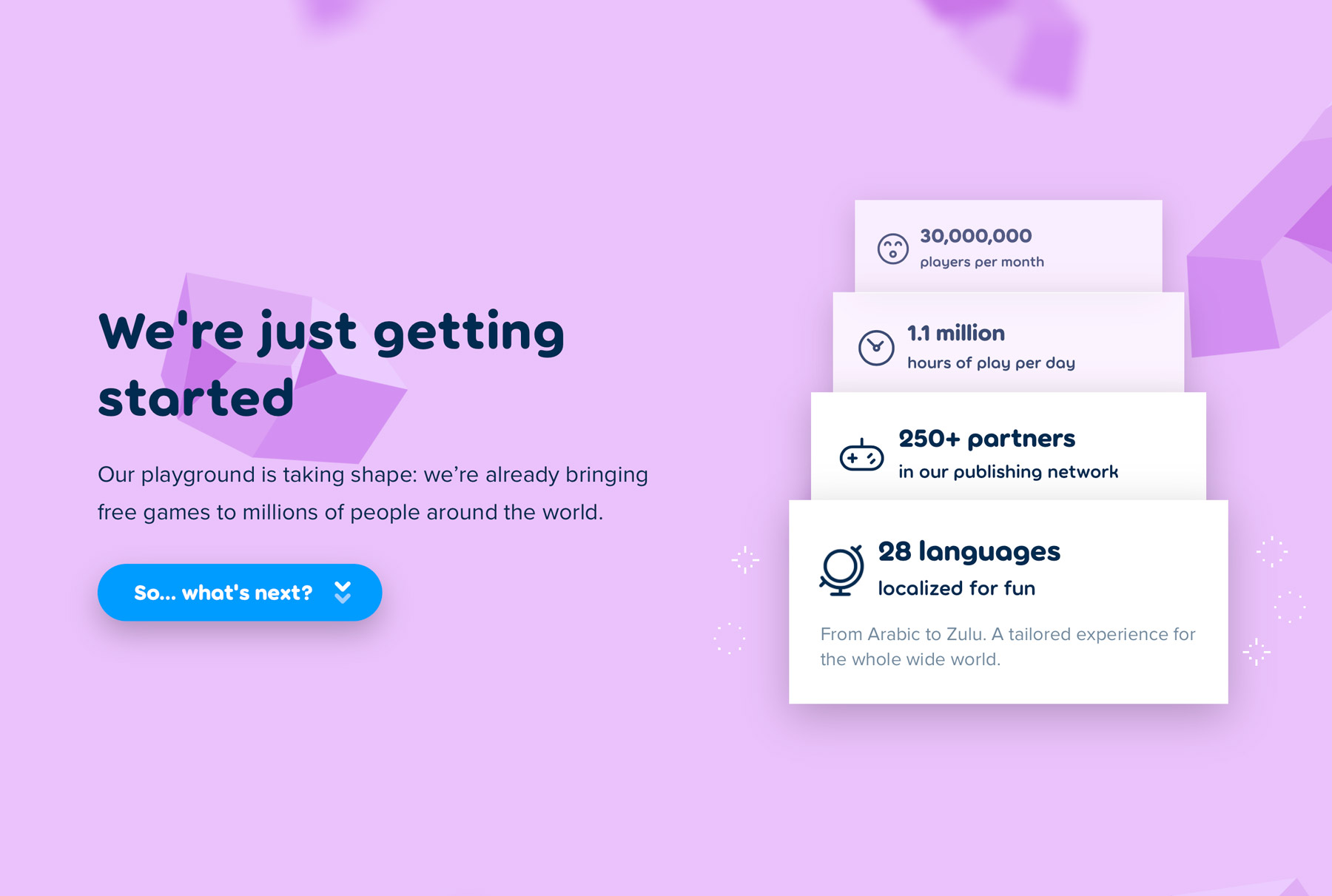
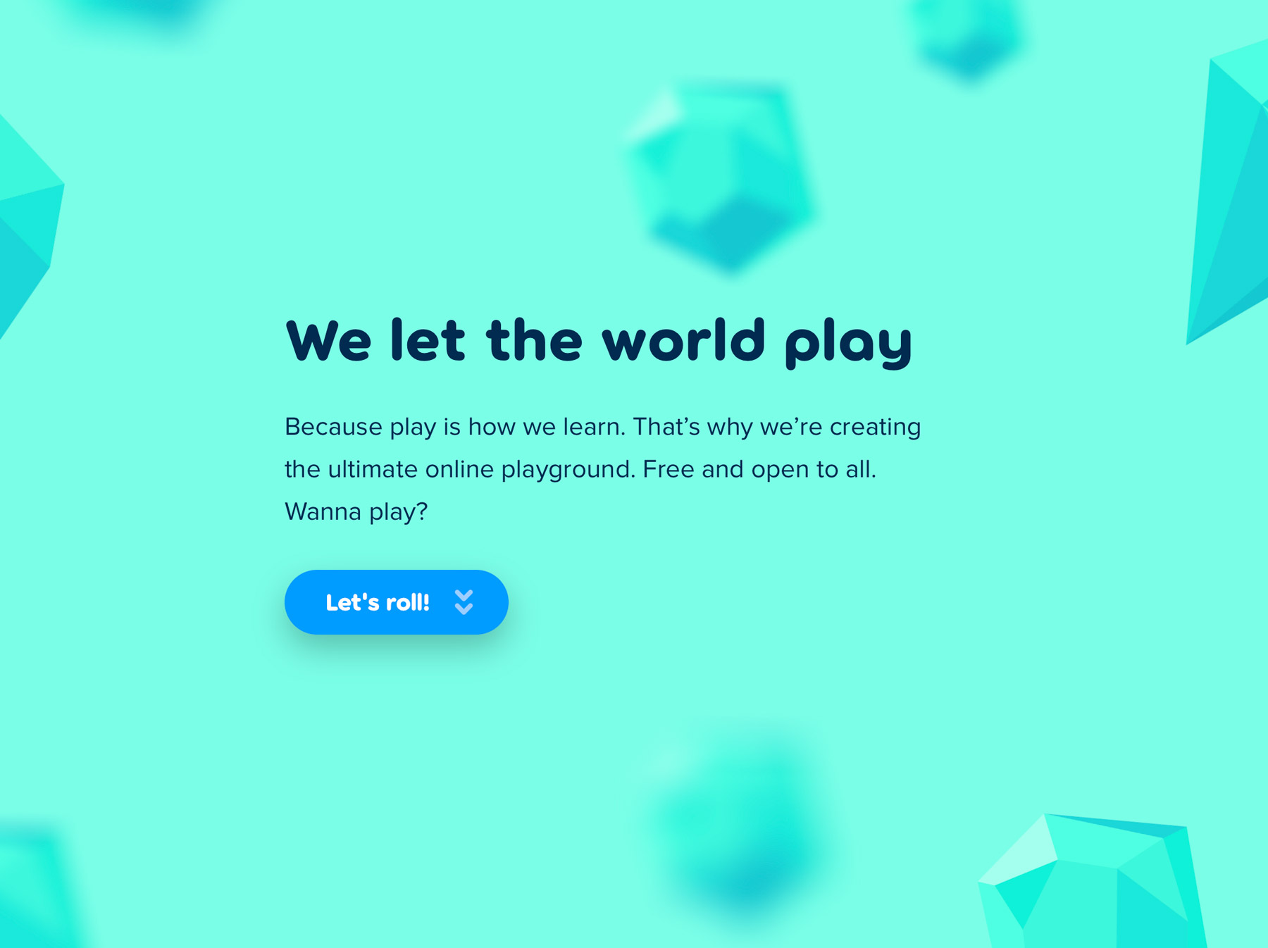
FONT IN USE: Torus
CLIENT: Poki
DESIGN CREDIT: Possibly In-house
If you want to play online games, then head to Poki. They have chosen Torus for their “Let the world play” tagline, and use the fonts throughout the website, and very nice it looks too. I just wish they had utilised some of Torus’ alternates rather than sticking with the base glyphs…
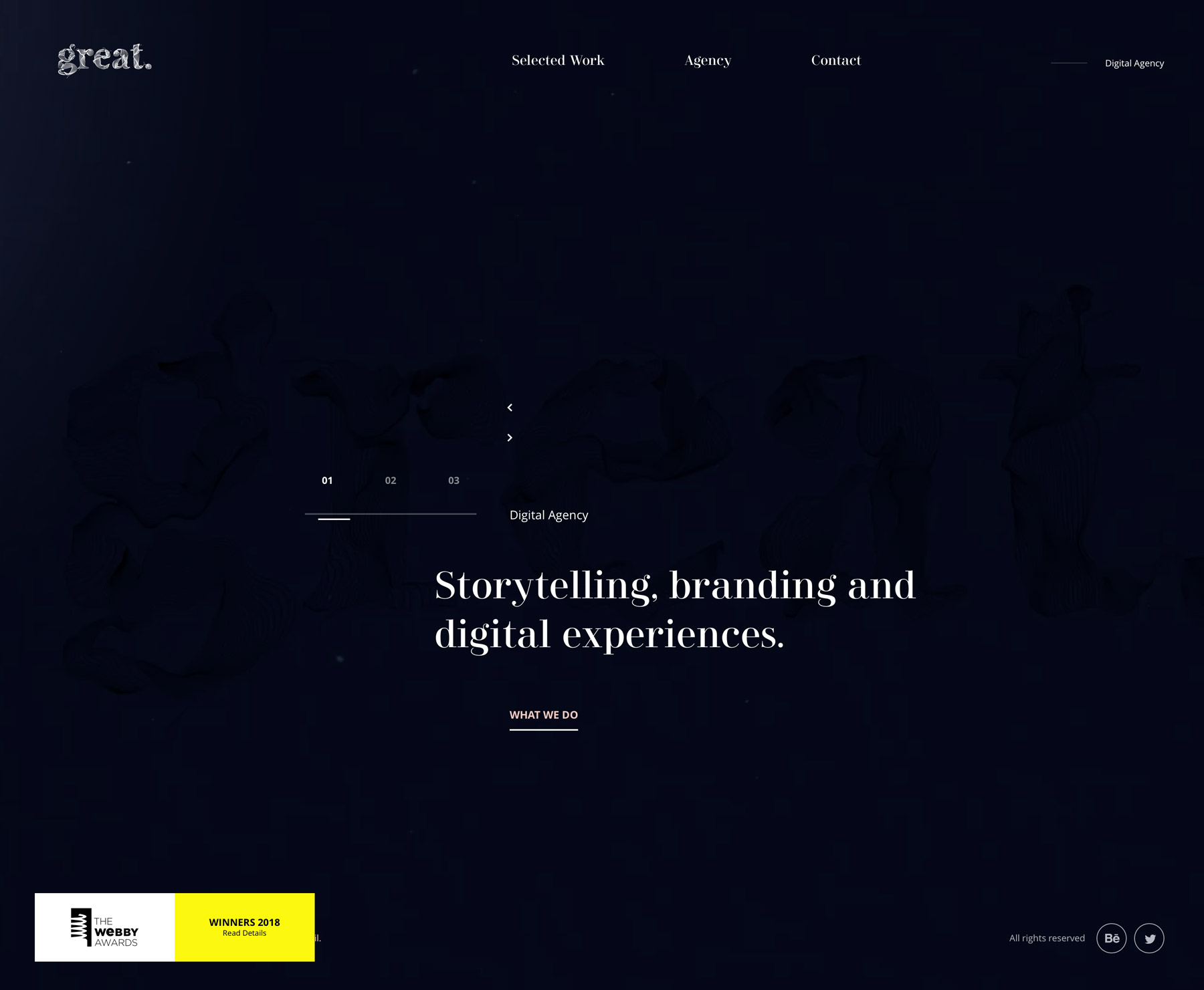

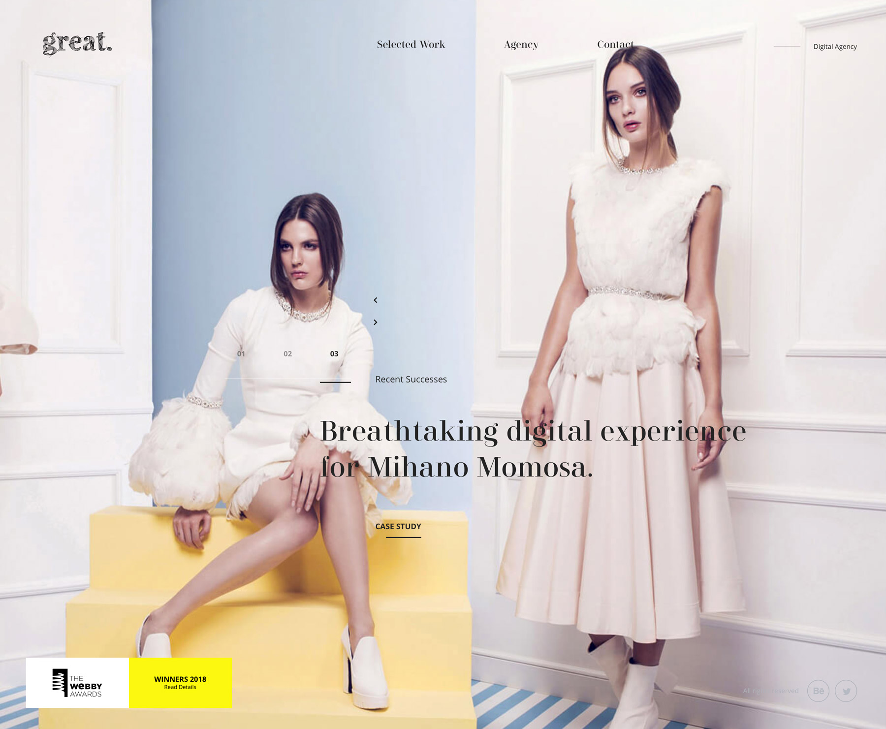
FONT IN USE: Didonesque Roman
CLIENT: great
DESIGN CREDIT: great
This French design agency won a Webby Award for their own website, which utilises Didonesque Roman throughout – the free desktop/webfont option available through Font Squirrel…

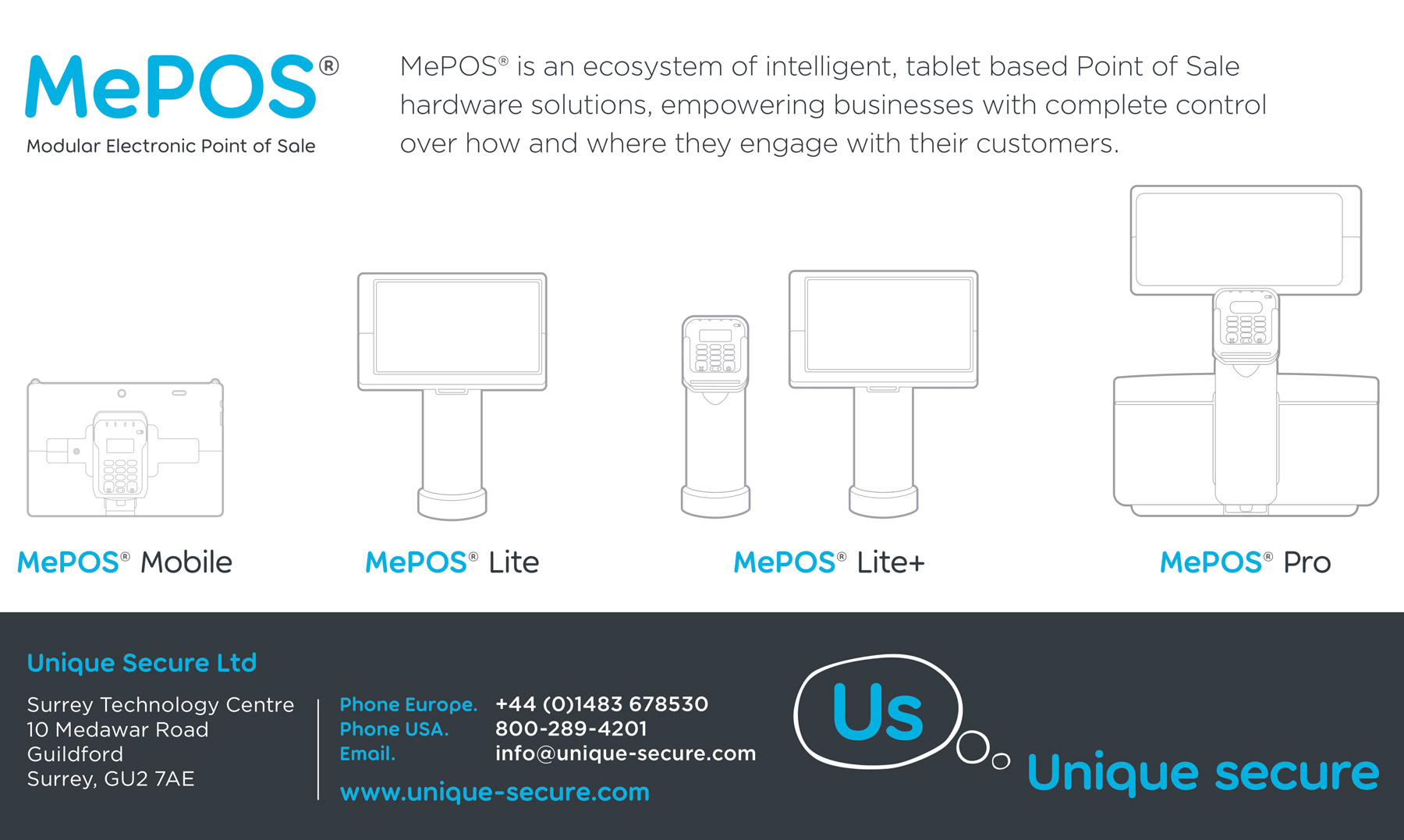
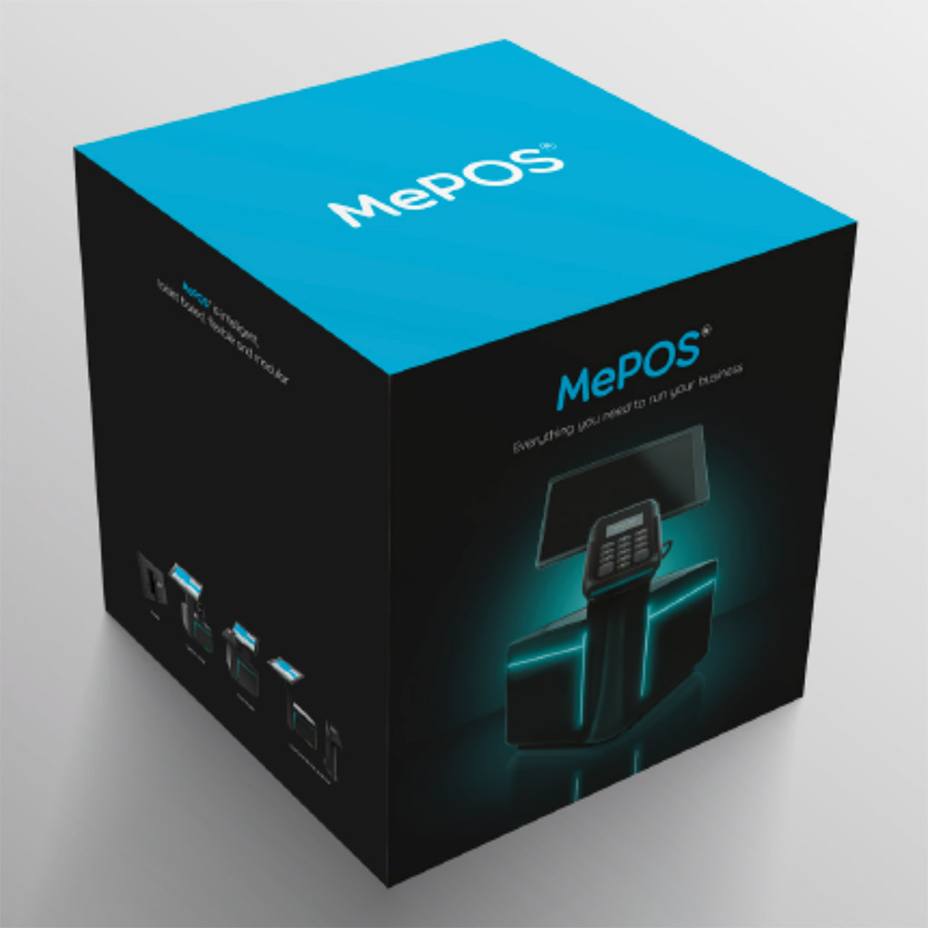
FONT IN USE: Torus
CLIENT: Unique Secure
DESIGN CREDIT: Not known
Unique Secure are using Torus for their own identity as well as for product branding and headline typography to establish a corporate style. I think it’s a shame they chose not to experiment with some of Torus’ alternates for the branding to make it even more distinctive.
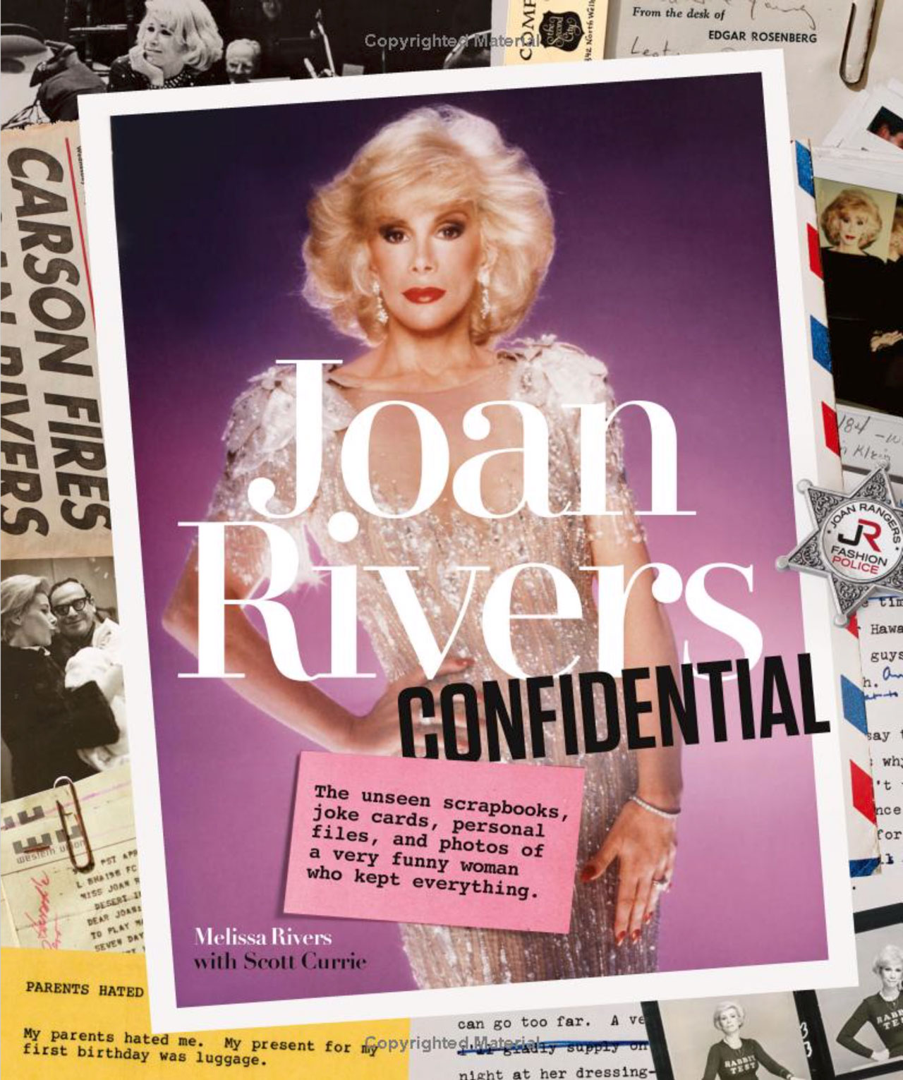
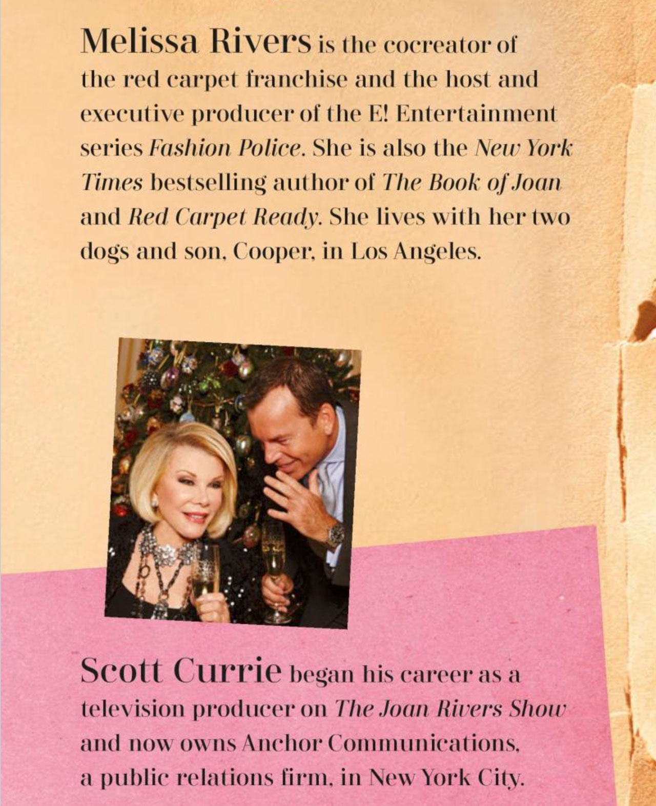
FONT IN USE: Didonesque
CLIENT: Abrams Books
DESIGN CREDIT: Abrams Books
Joan Rivers Confidential authored by Melissa Rivers with Scott Currie, was released in October 2017 – the book features my Didonesque family throughout.
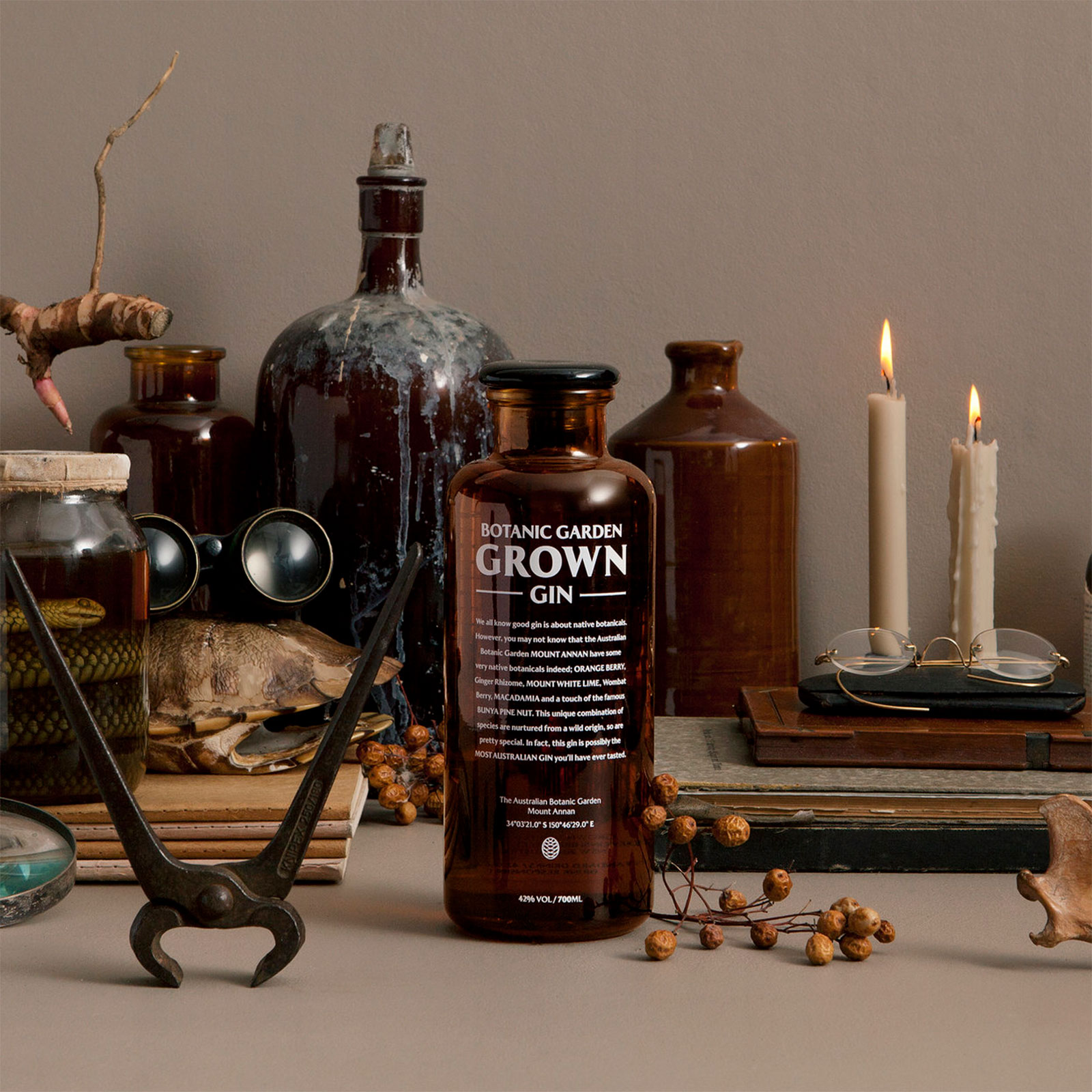
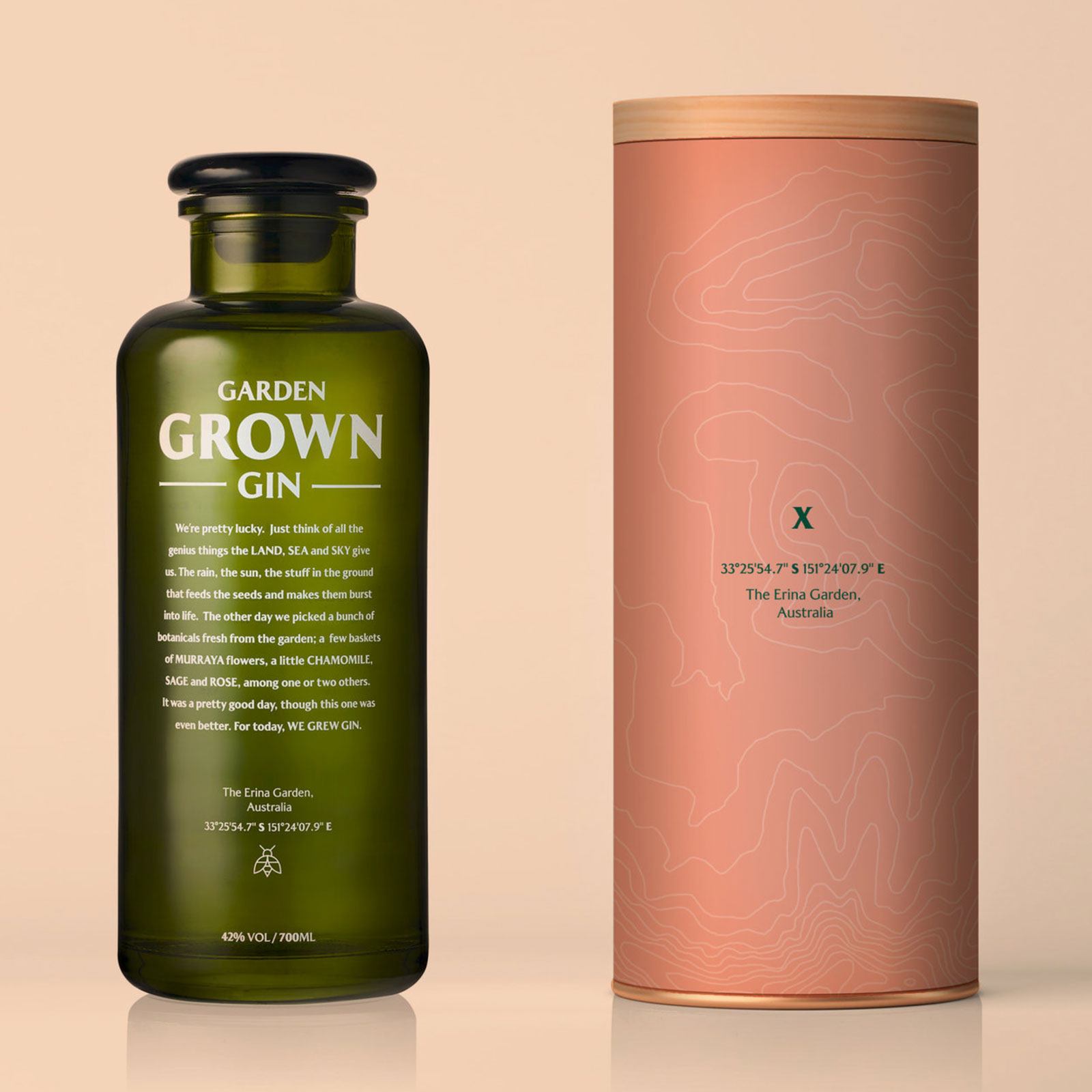
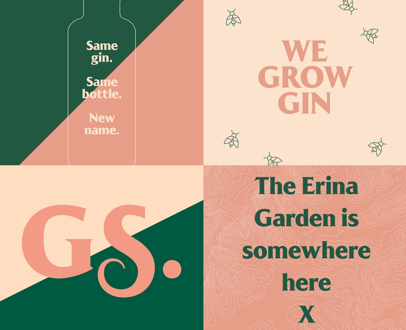
FONT IN USE: Majesty
CLIENT: Garden Grown Gin
DESIGN CREDIT: UNKL
Australian design duo, UNKL, have embraced my Majesty fonts for the rebranding of Garden Grown Gin, and rather smart it is too.
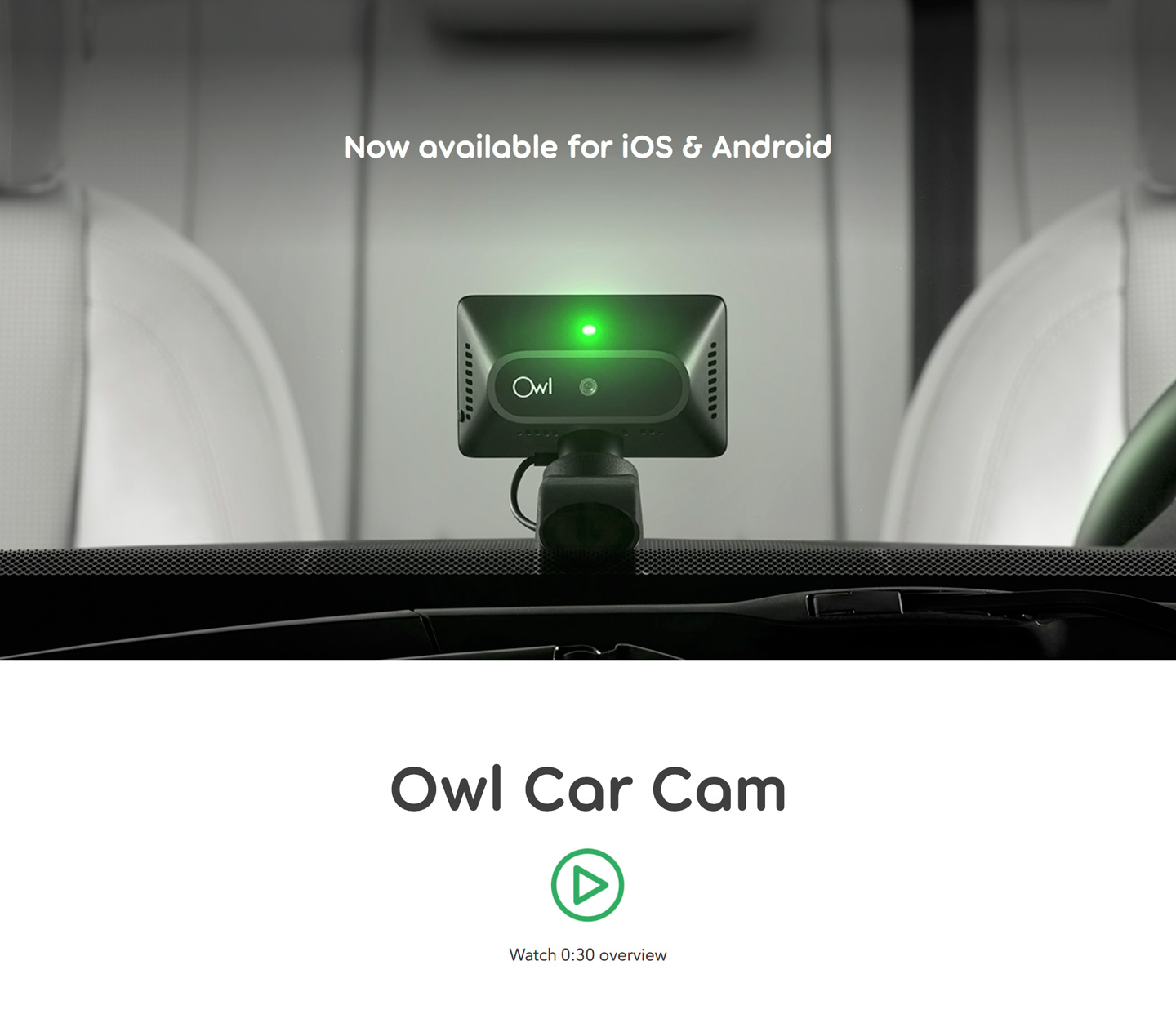

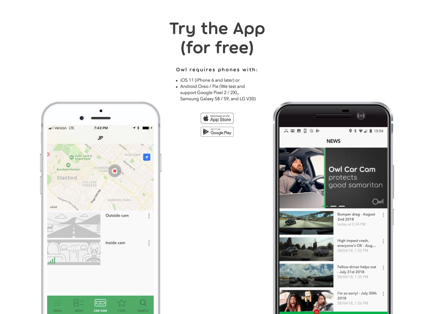
FONT IN USE: Torus
CLIENT: Owl Cam
DESIGN CREDIT: Possibly In-house
It’s great when a customer purchases desktop, web and app licences for your fonts, Owl Cam did exactly that in 2017 and in 2018 their brand launched fully resplendent with Torus in use for all titling. Bravo.
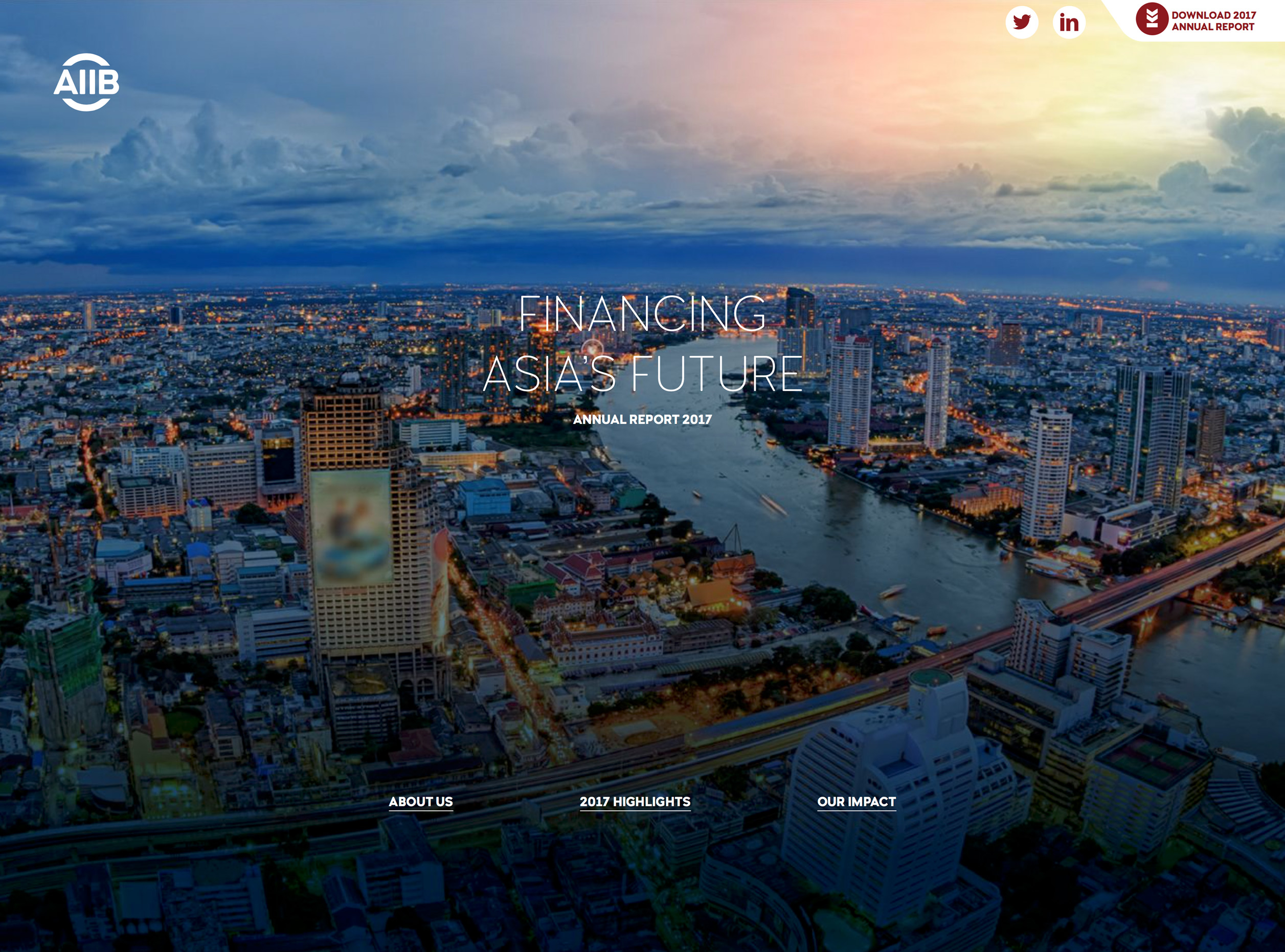
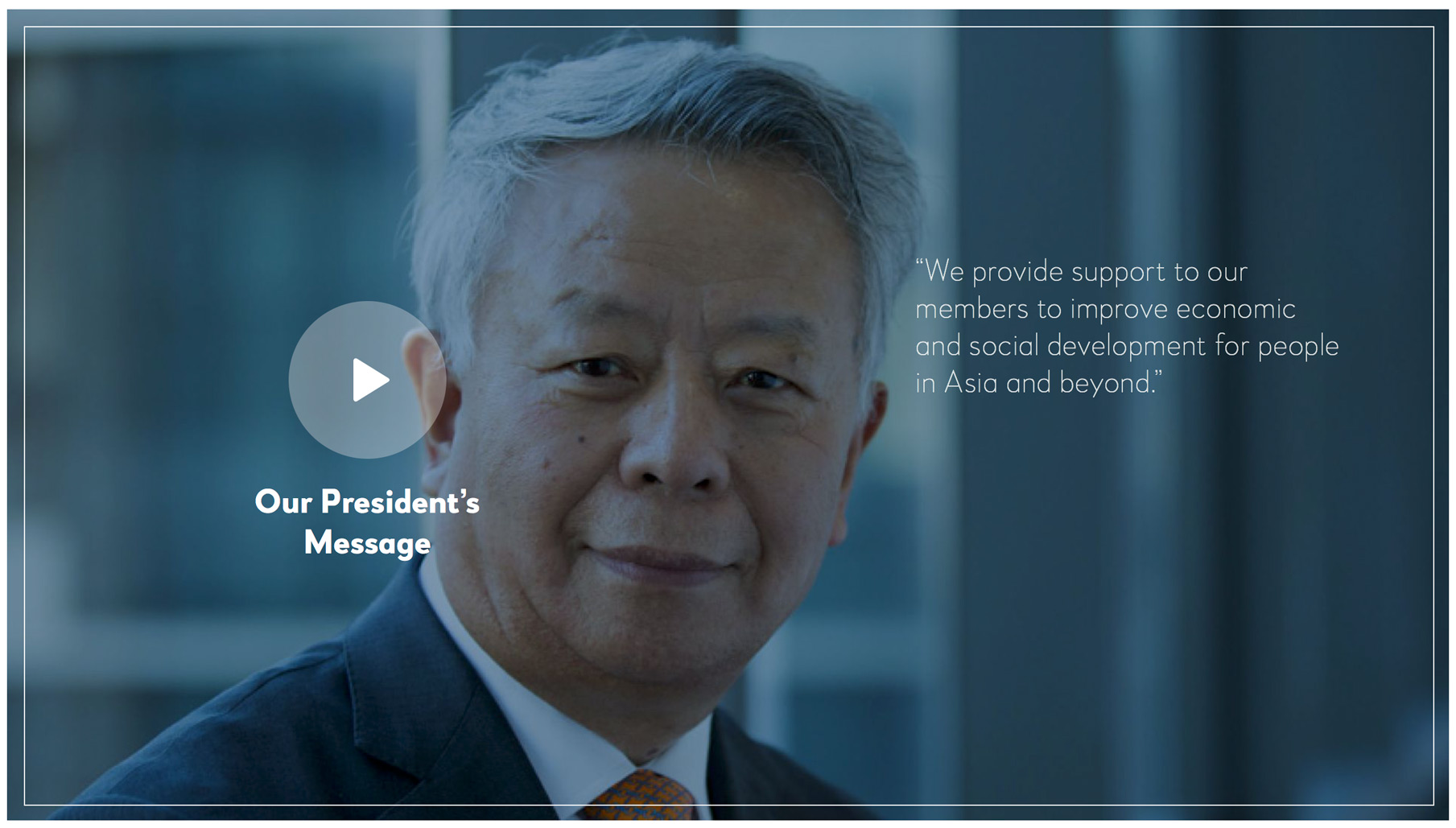
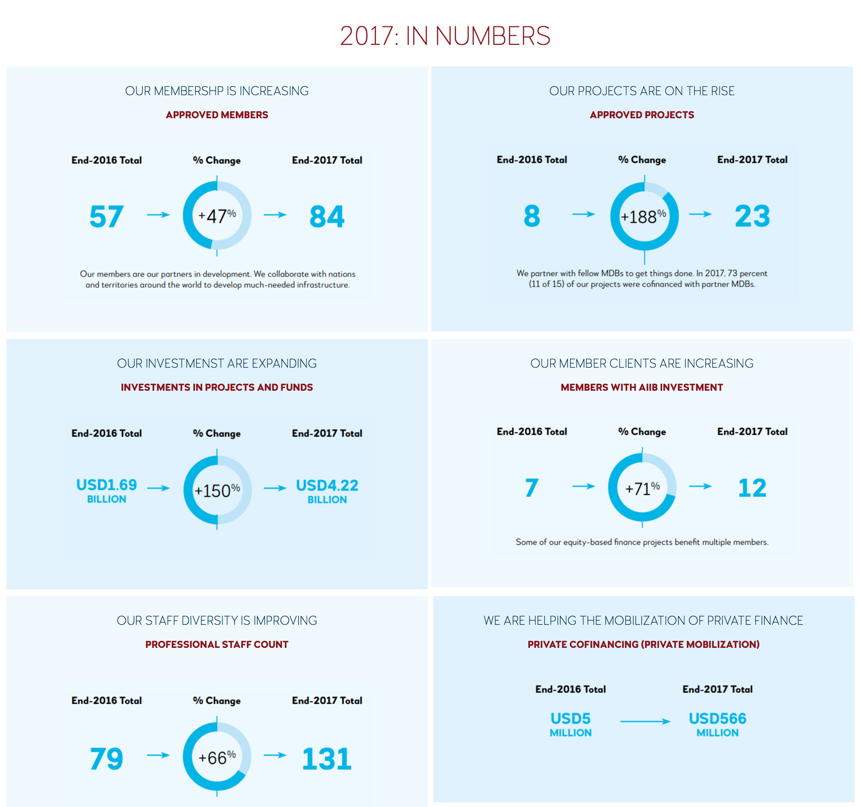
FONT IN USE: Woodford Bourne PRO
CLIENT: AIIB (Asian Infrastructure Investment Bank)
DESIGN CREDIT: M&C Saatchi
AIIB have recently adopted Woodford Bourne PRO for use in their logotype and as their corporate typeface. The new style is being rolled out across all their publications, starting with 2017’s Annual Report.

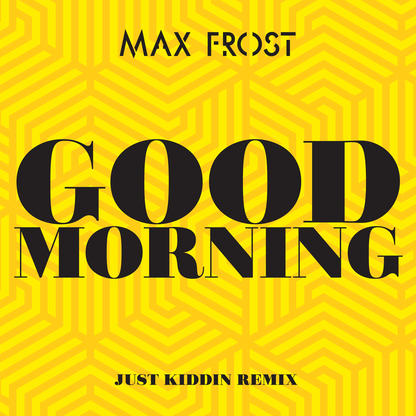

FONT IN USE: Didonesque Poster
CLIENT: Max Frost
DESIGN CREDIT: Atlantic Records
A no frills cover for Max Frost’s “Good Morning” single, released by Atlantic Records in February 2018 that utilises Didonesque Poster.
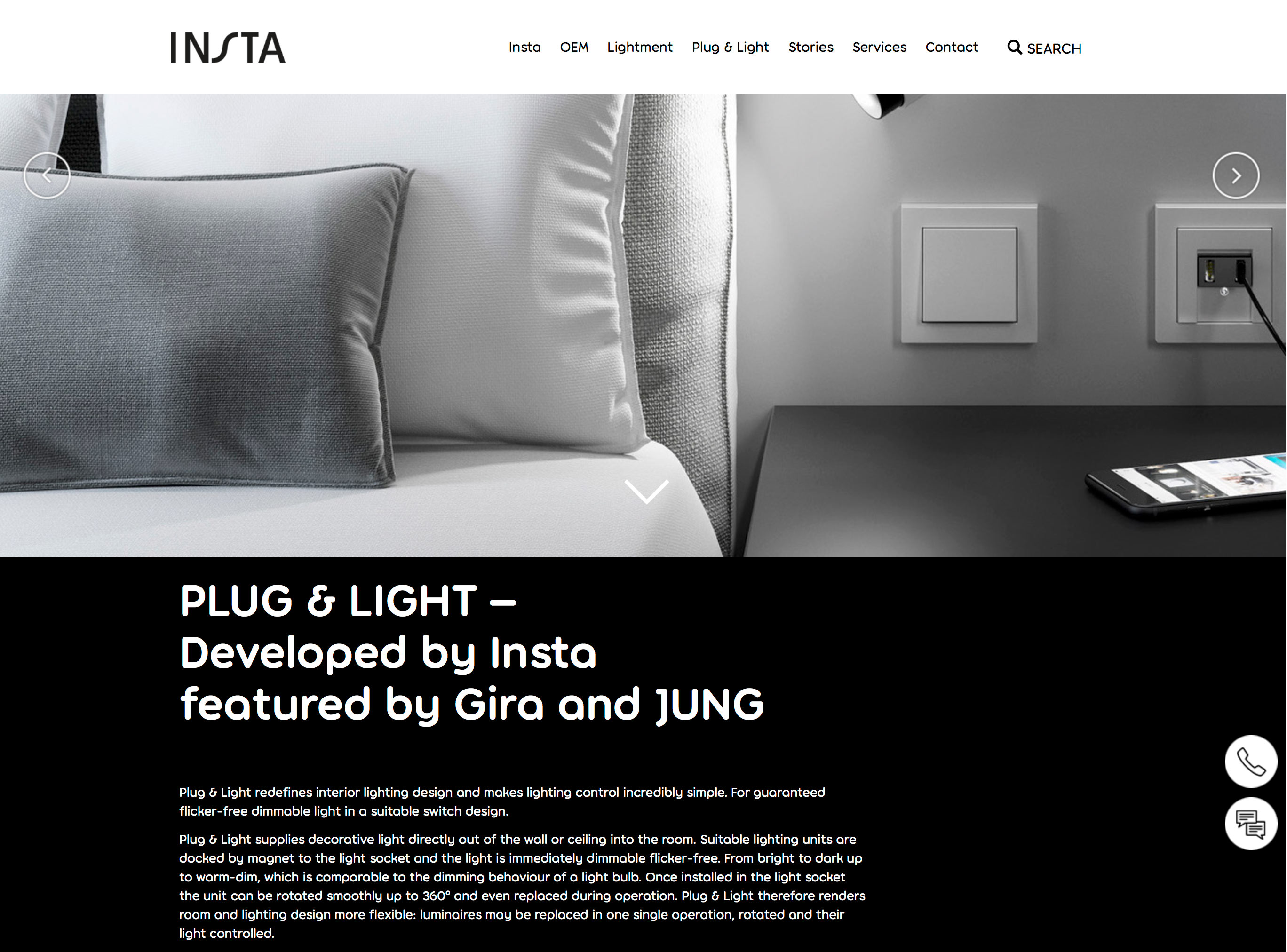


FONT IN USE: Torus
CLIENT: Insta
DESIGN CREDIT: Not known
Insta, a lighting specialist based in Lüdenscheid, Germany, have adopted Torus as their corporate typeface. Currently (2018) their brochures, website and apps use Torus everywhere, even in tables and at very small sizes. This is quite surprising as I never intended Torus to be used for body copy or mechanical data, but it works… sort of.
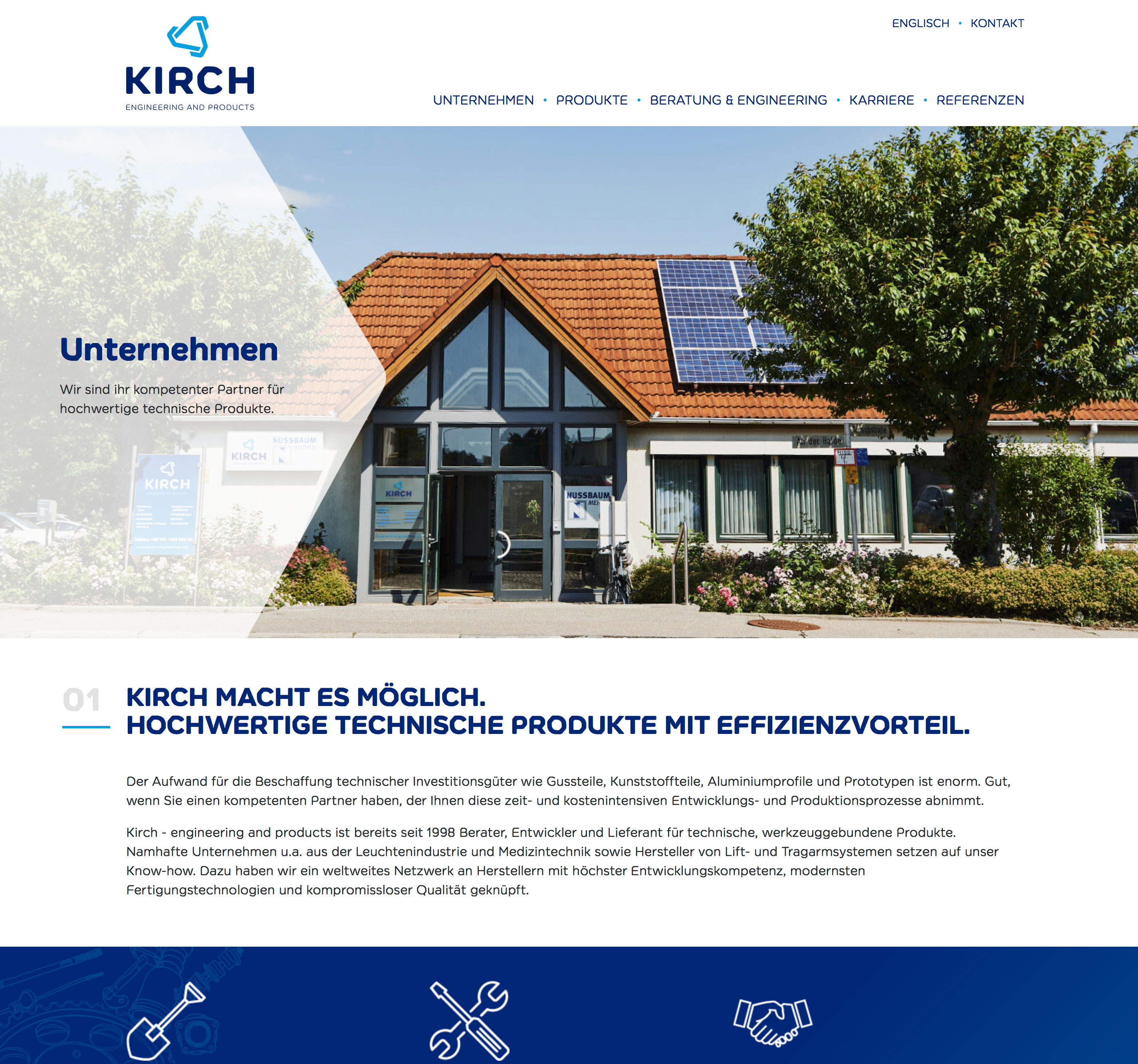
FONT IN USE: Meccanica
CLIENT: Kirch Engineering
DESIGN CREDIT: Teufels
Meccanica, plus engineering company, equals a marriage made in heaven? Maybe so, it seems to work well for Kirch Engineering.
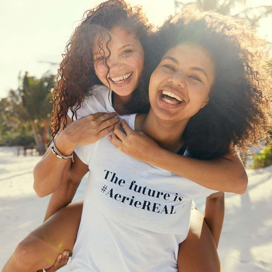
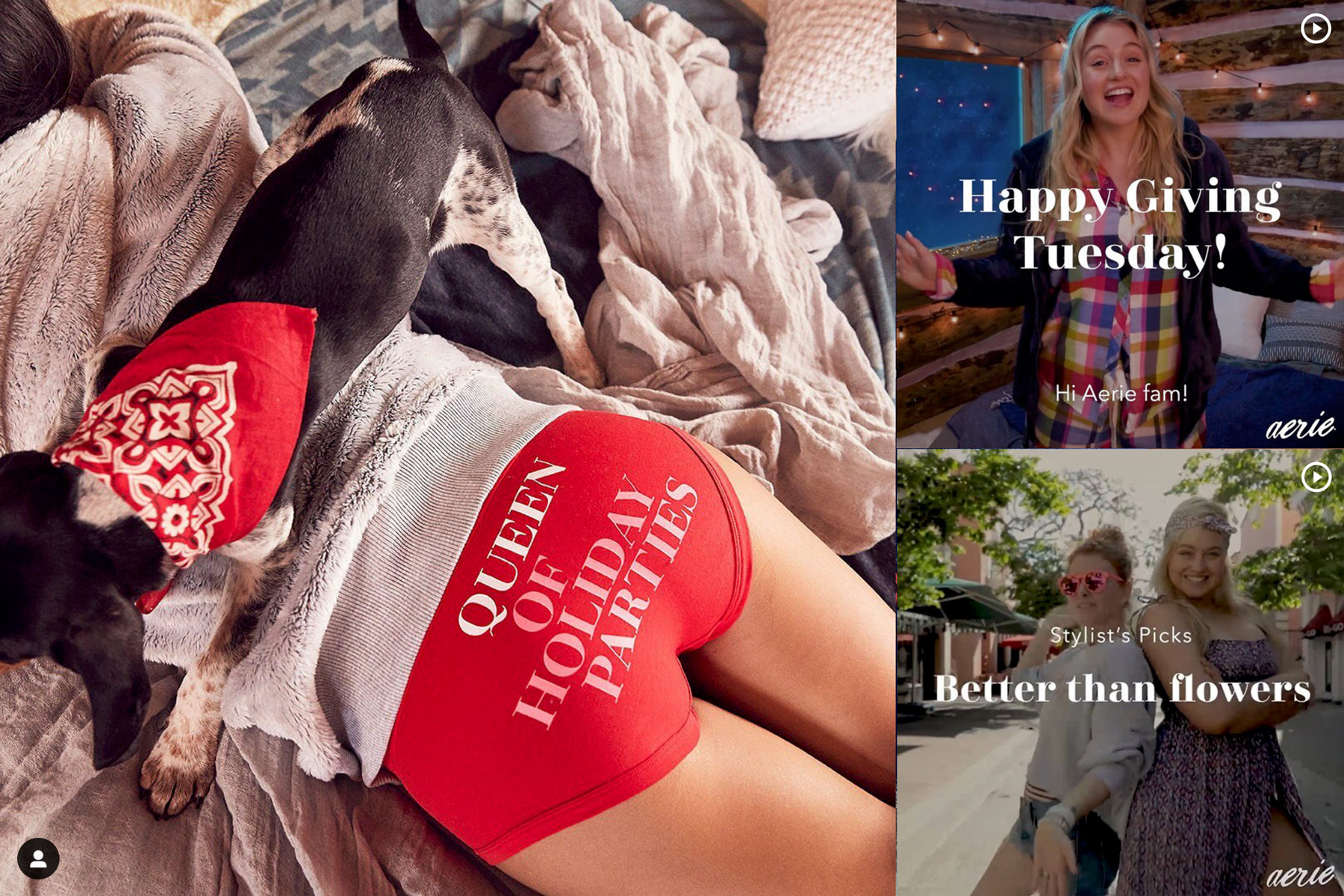
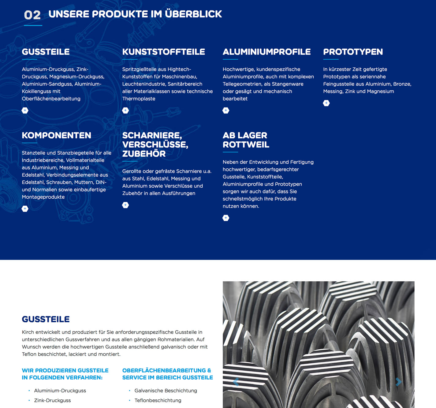
FONT IN USE: Didonesque
CLIENT: American Eagle Outfitters
DESIGN CREDIT: American Eagle Outfitters
Didonesque Bold & Bold Italic have been used for the #aerieREAL brand at American Eagle Outfitters since January 2018.
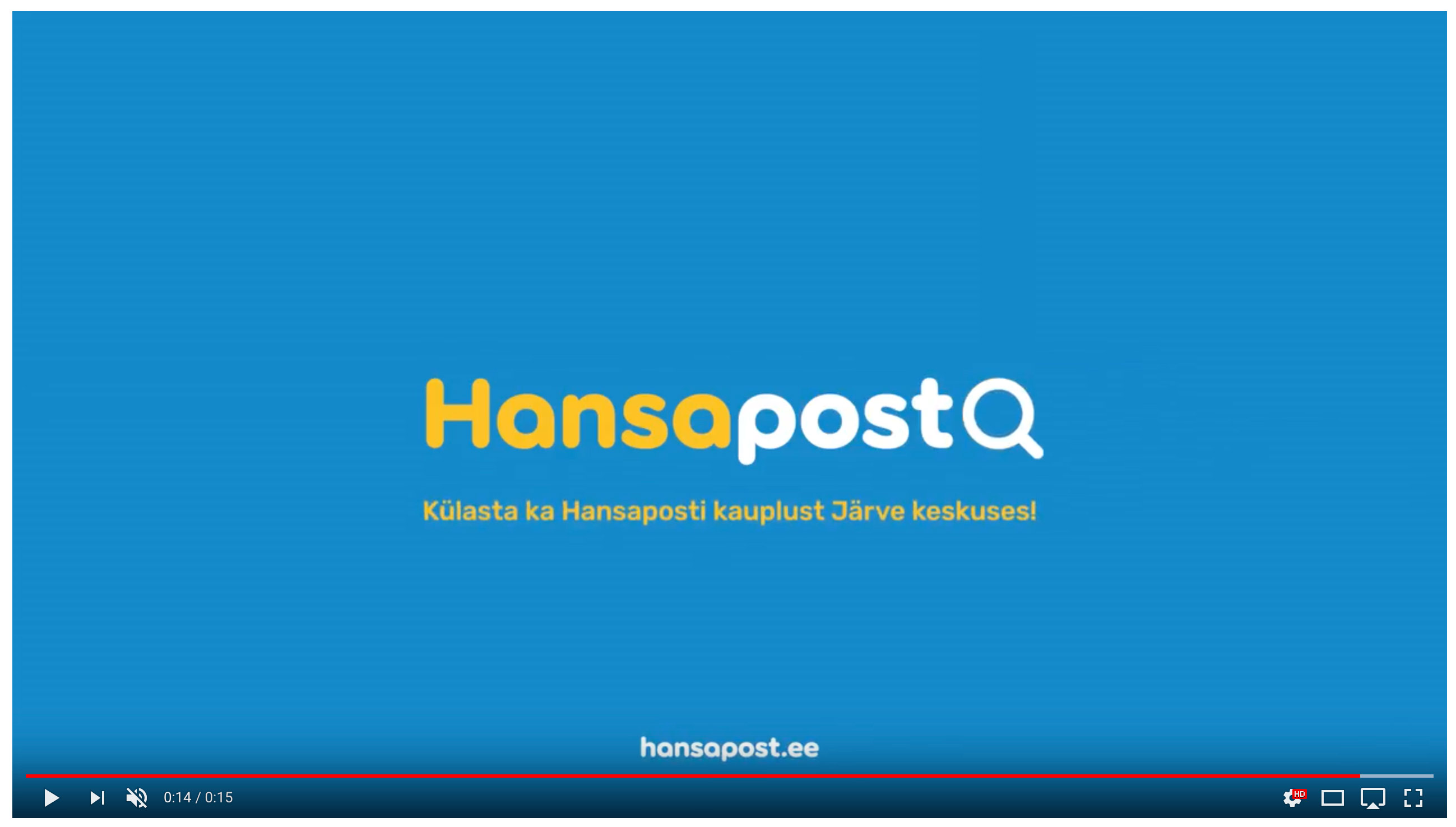

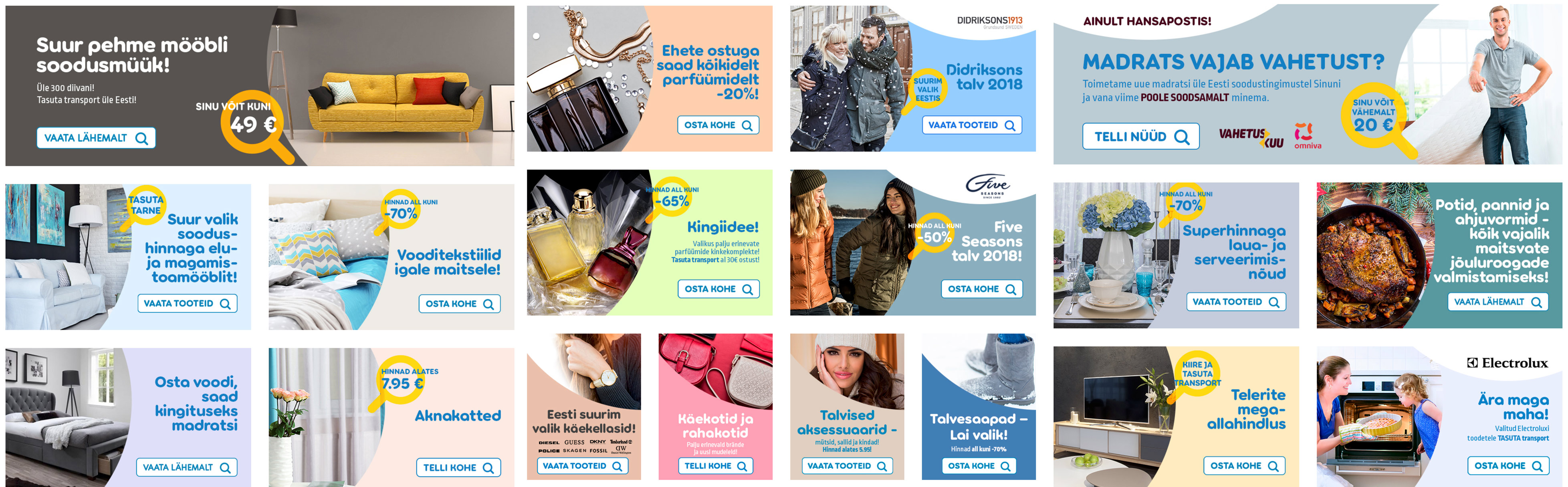
FONT IN USE: Torus
CLIENT: Hansapost
DESIGN CREDIT: Division
Estonian agency Division rebranded the country’s largest online retailer, Hansapost, by using Torus Bold during 2017. What great value for a $20 investment :)
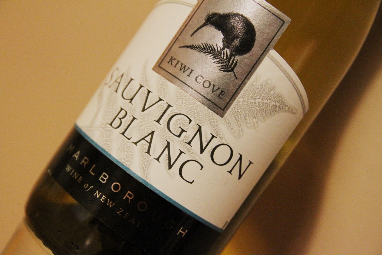
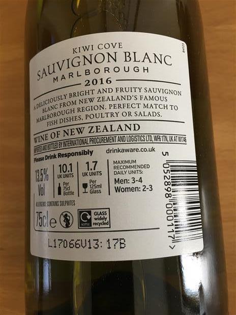
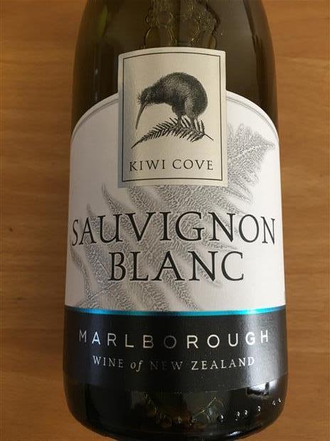
FONT IN USE: Carrig
CLIENT: ASDA
DESIGN CREDIT: Benjamin Green
Ben got in touch to show me the fine work he’d done for ASDA wines using Carrig.
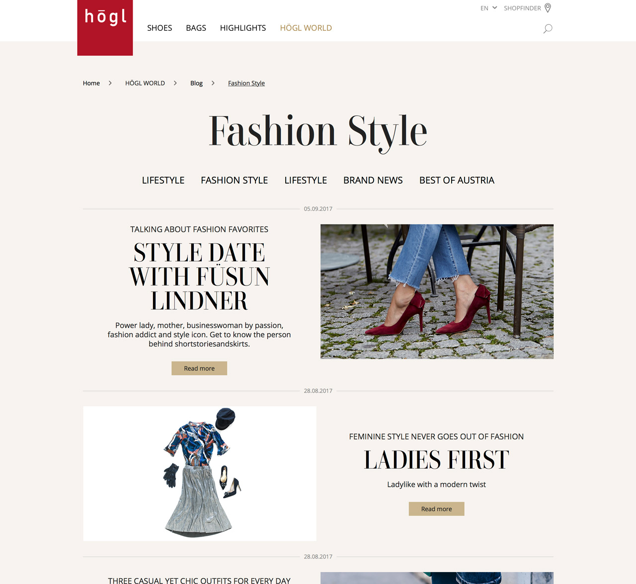
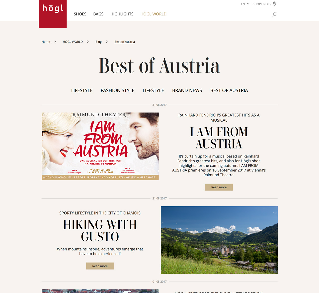
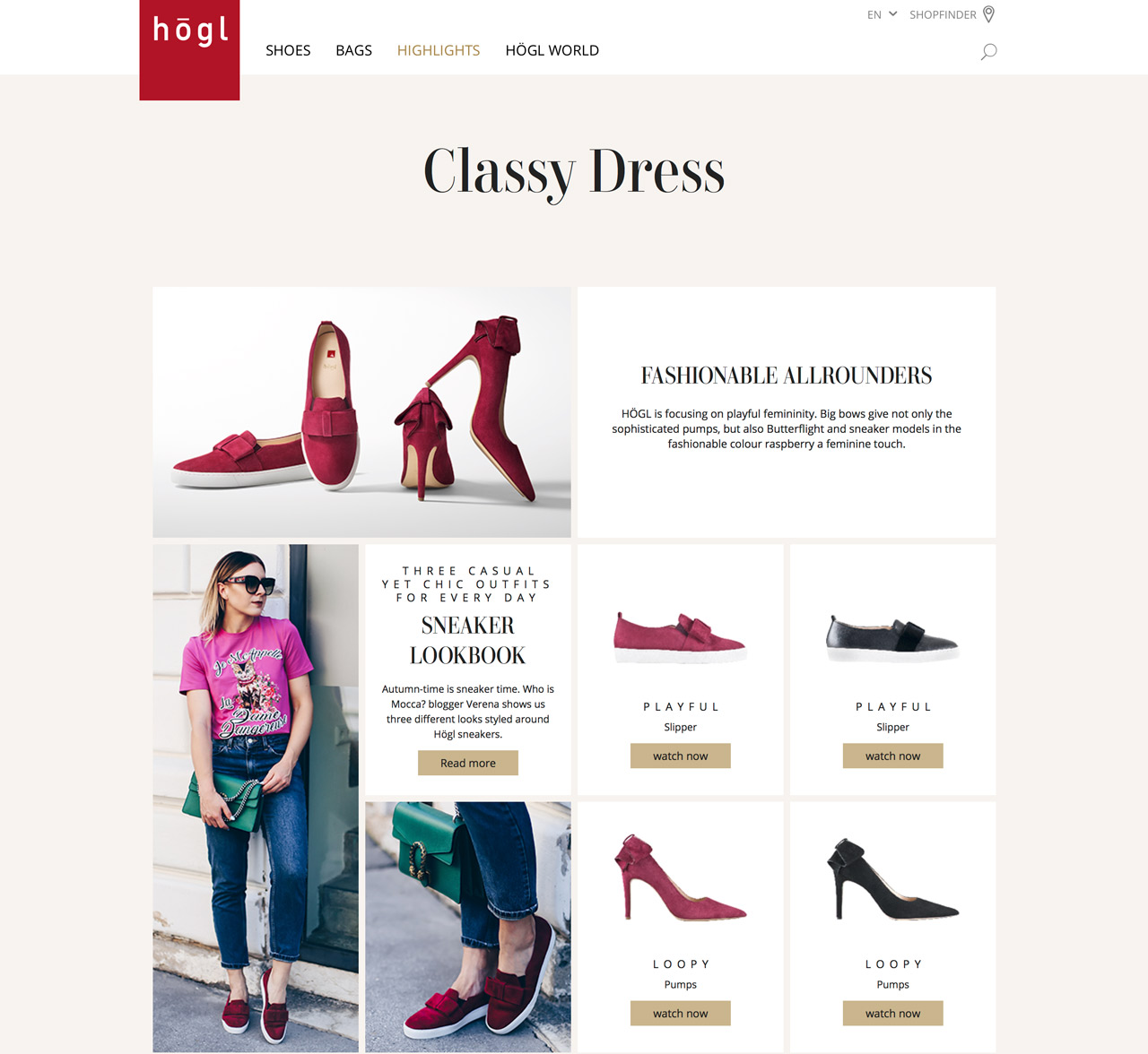
FONT IN USE: Didonesque
CLIENT: Hōgl
DESIGN CREDIT: Designer not known
I stumbled across Didonesque Display being used prominently on Hōgl’s website, they are a fashion brand based in Austria.
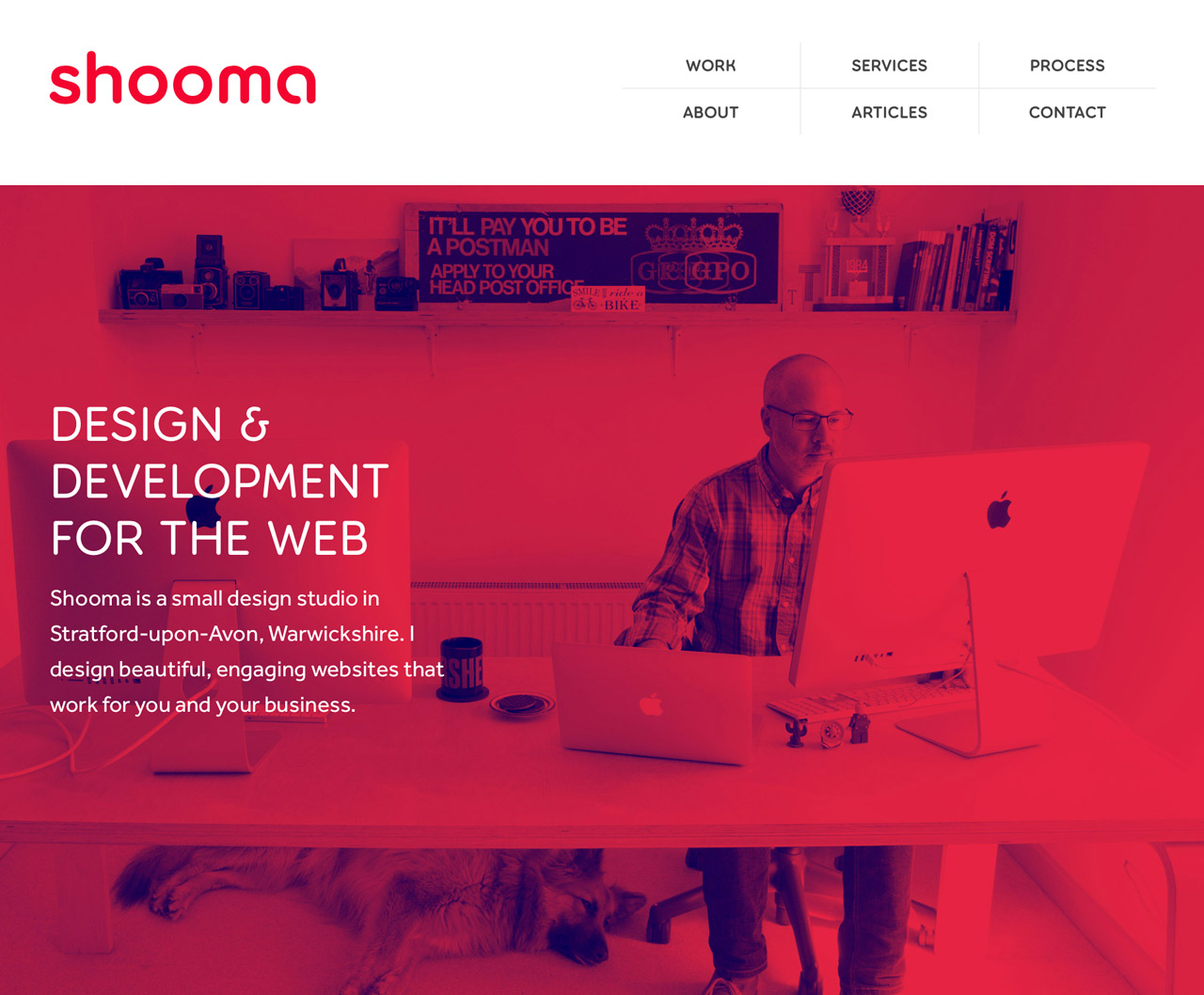
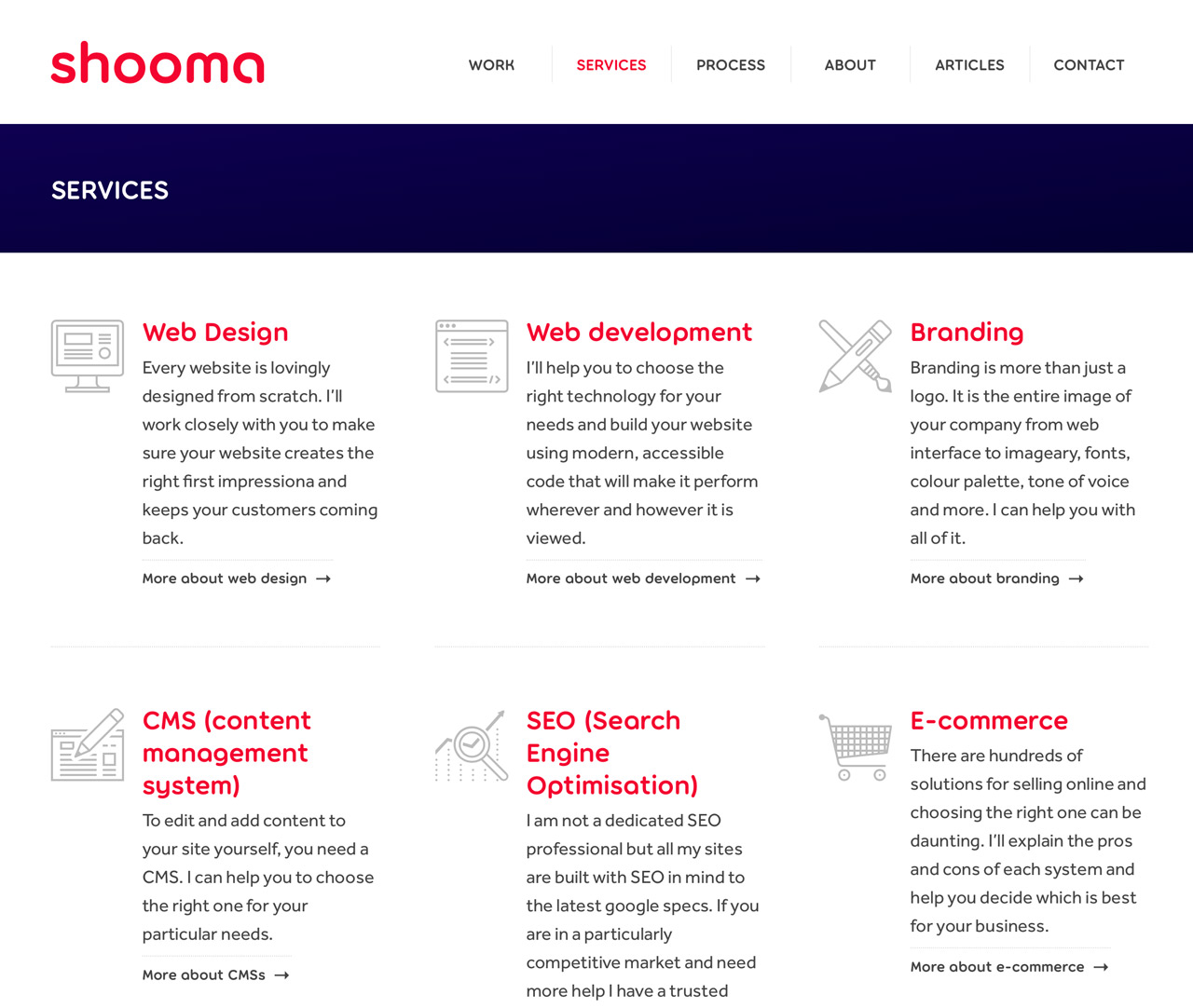

FONT IN USE: Torus
CLIENT: Shooma
DESIGN CREDIT: Tim Print
Tim and I were at school together and we also studied Technical Illustration (1985-87). I am very humbled that he has chosen to use Torus for his new website, and he’s made a lovely job of it too.

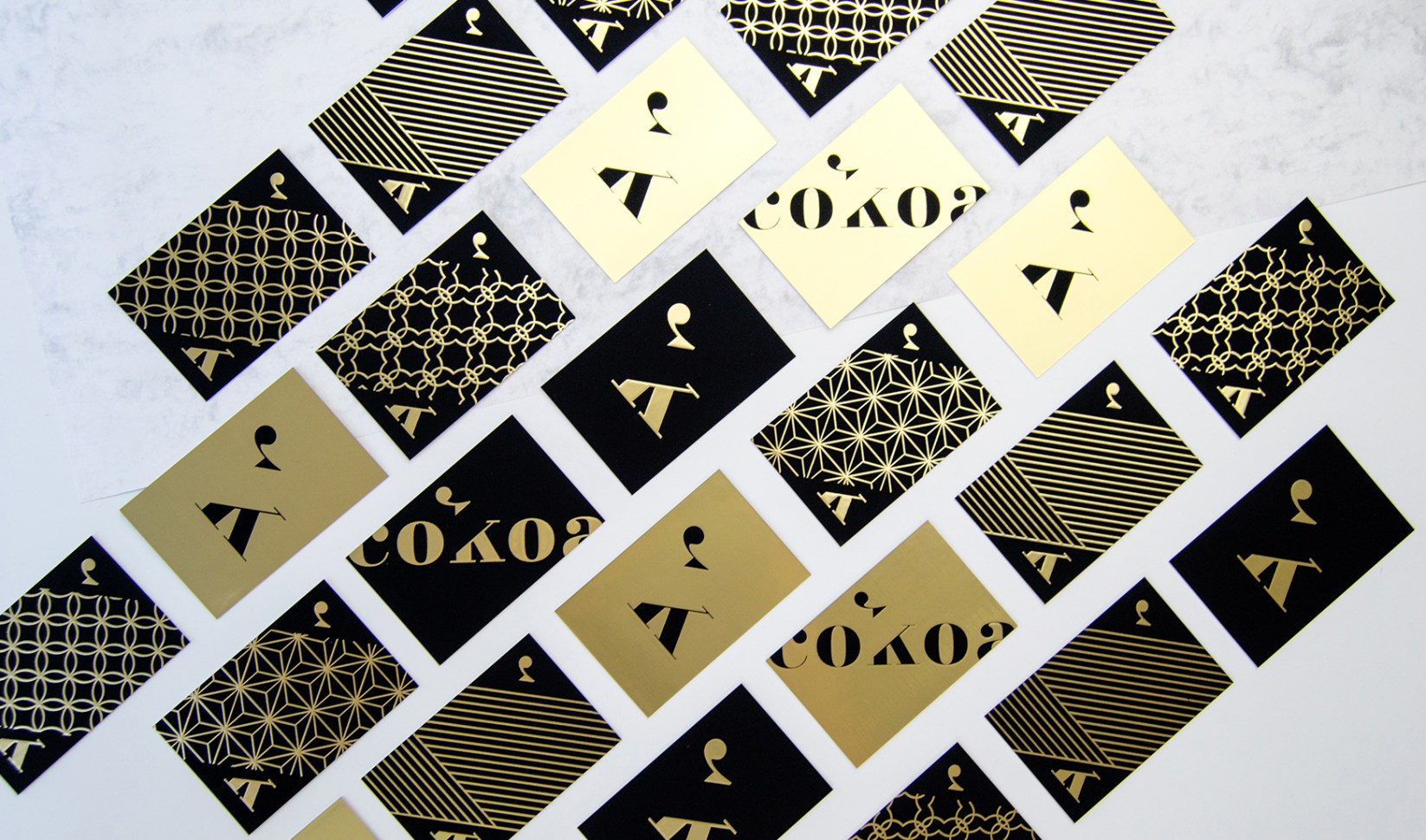
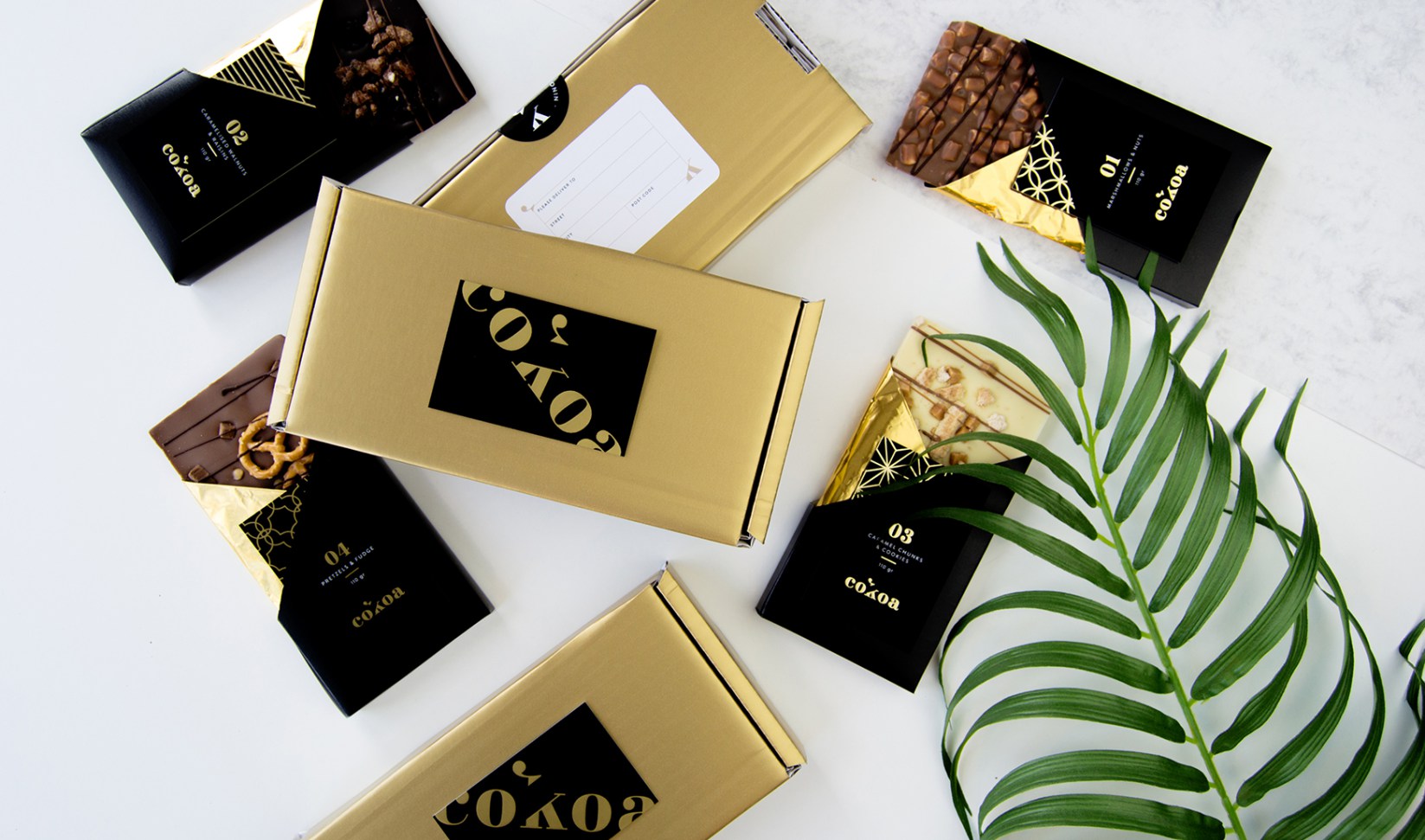
FONT IN USE: Didonesque
CLIENT: Cokoa
DESIGN CREDIT: Giada Tamborrino
It’s great when you discover your own work being put to such good use on Instagram. This is a concept using Didonesque by Giada Tamborrino, but I reckon it would make for a stunning chocolate brand. Well done, Giada!
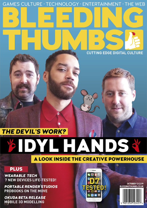
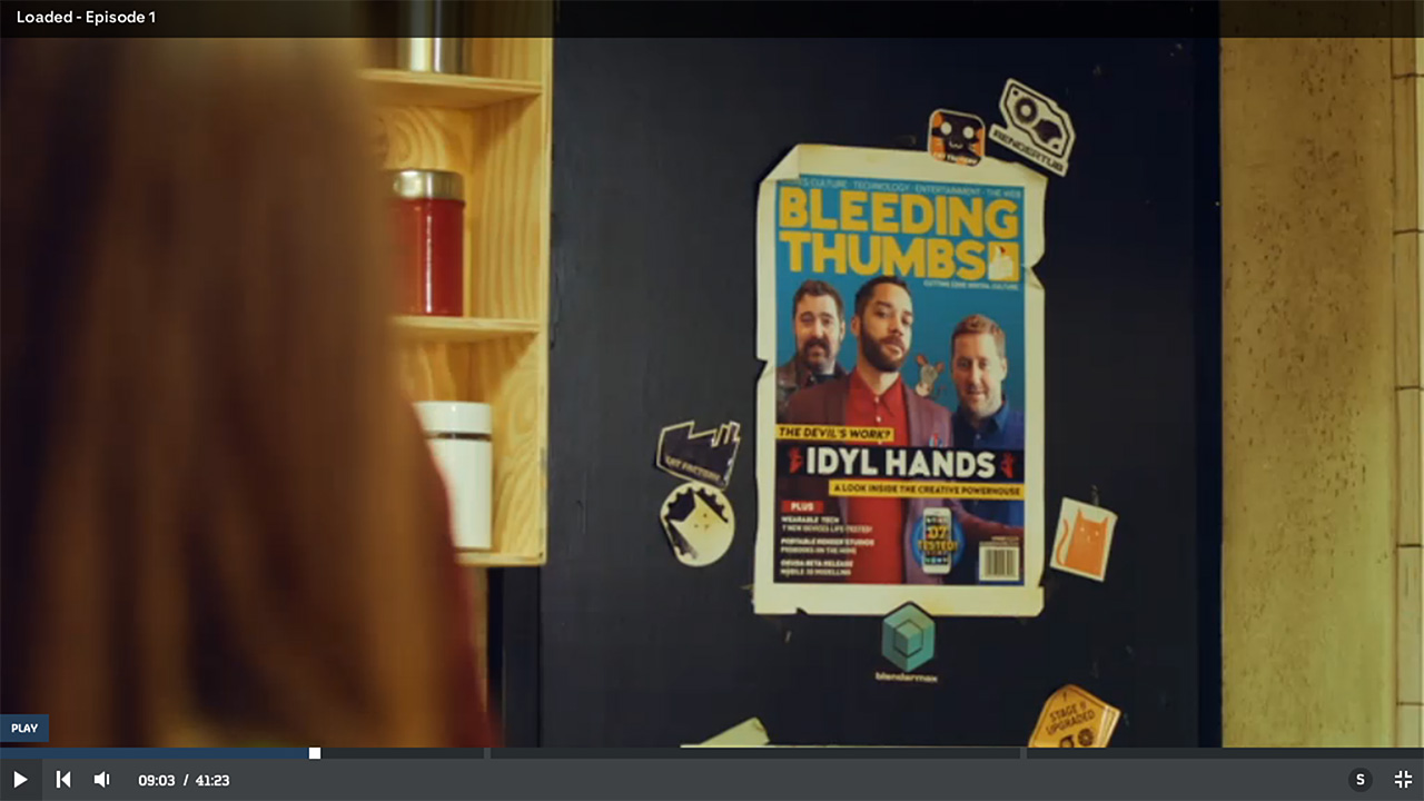
FONT IN USE: Woodford Bourne PRO
CLIENT: Channel 4
DESIGN CREDIT: Matthew Clark
Caught sight of a poster/magazine cover in the 2017 Channel 4 sitcom “Loaded” and discovered it was Woodford Bourne PRO Ultra weight predominantly in use.
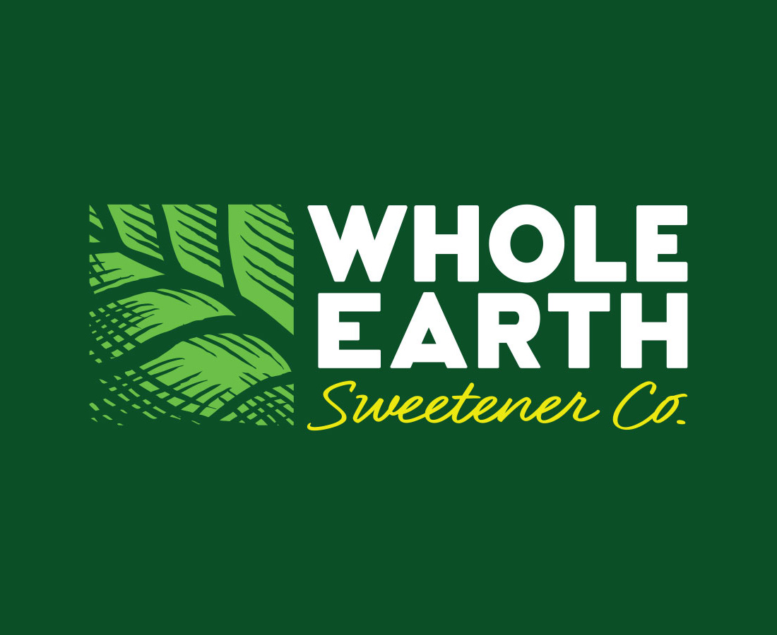
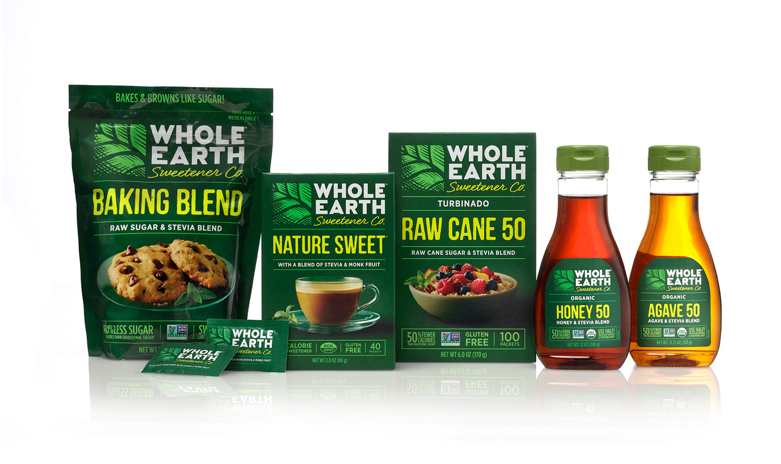
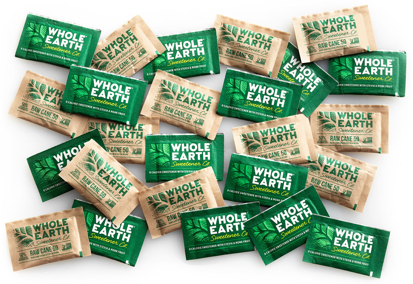
FONT IN USE: Woodford Bourne
CLIENT: Whole Earth
DESIGN CREDIT: Pavement
This US-based sweetener company were recently re-branded by the Pavement design agency who used Woodford Bourne for the new logo identity.
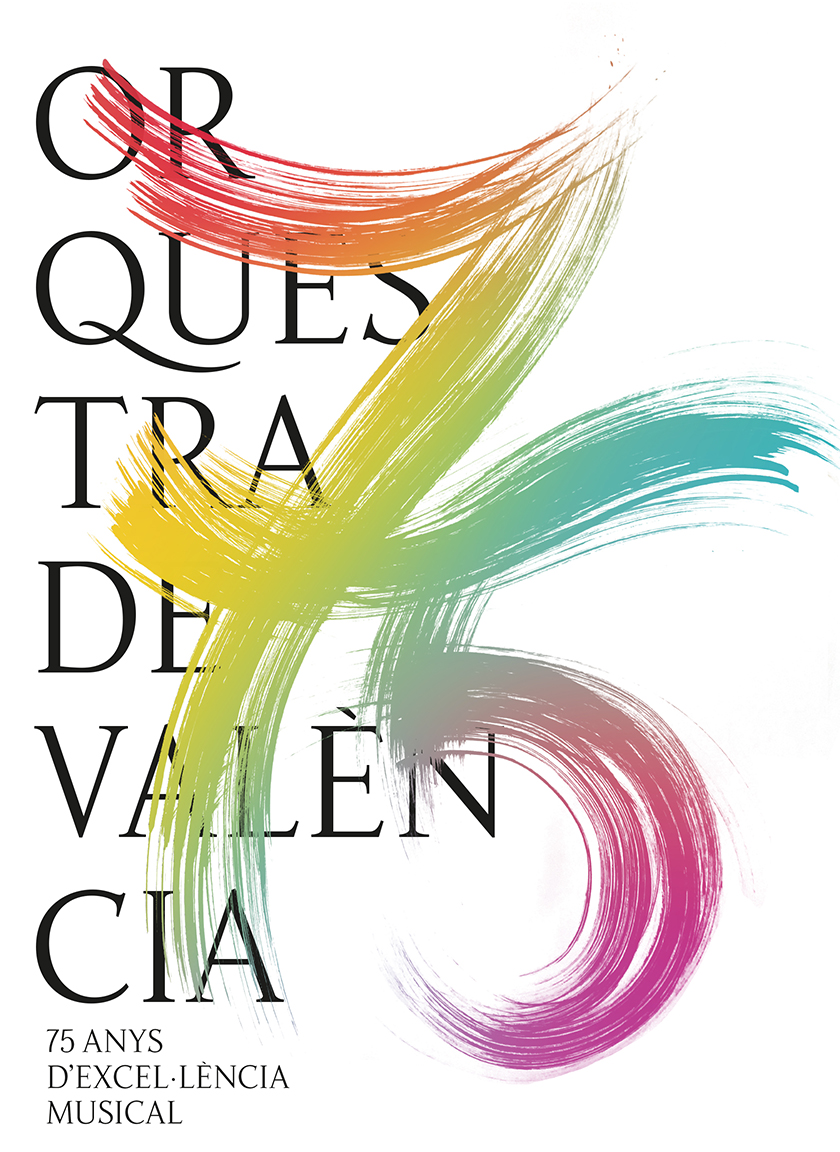
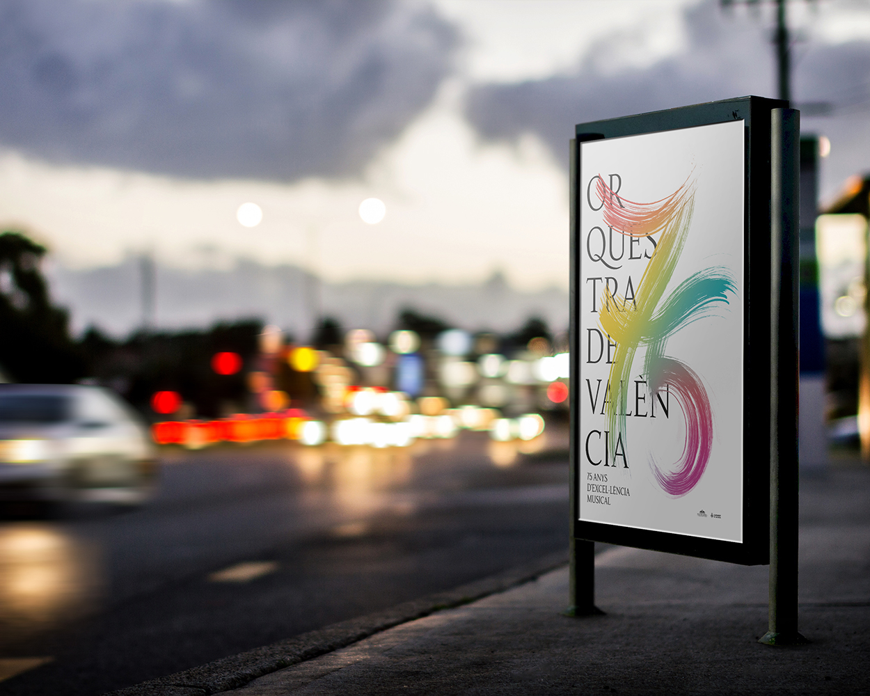
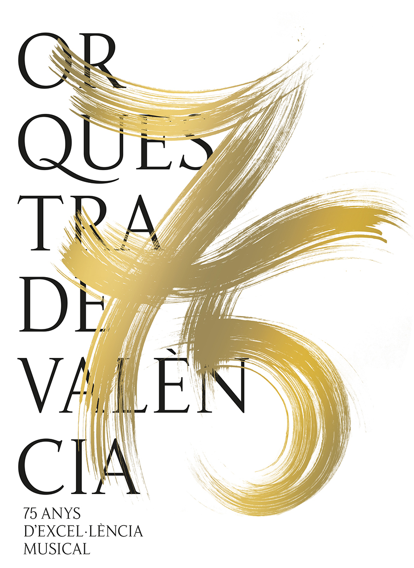
FONT IN USE: Fnord
CLIENT: Orquestra de València
DESIGN CREDIT: Nociones Unidas
I was delighted when Boke from Nociones Unidas contacted me to show me the beautiful work done for Orquestra de València – it is the first example I have found for Fnord. Thank you, Boke.

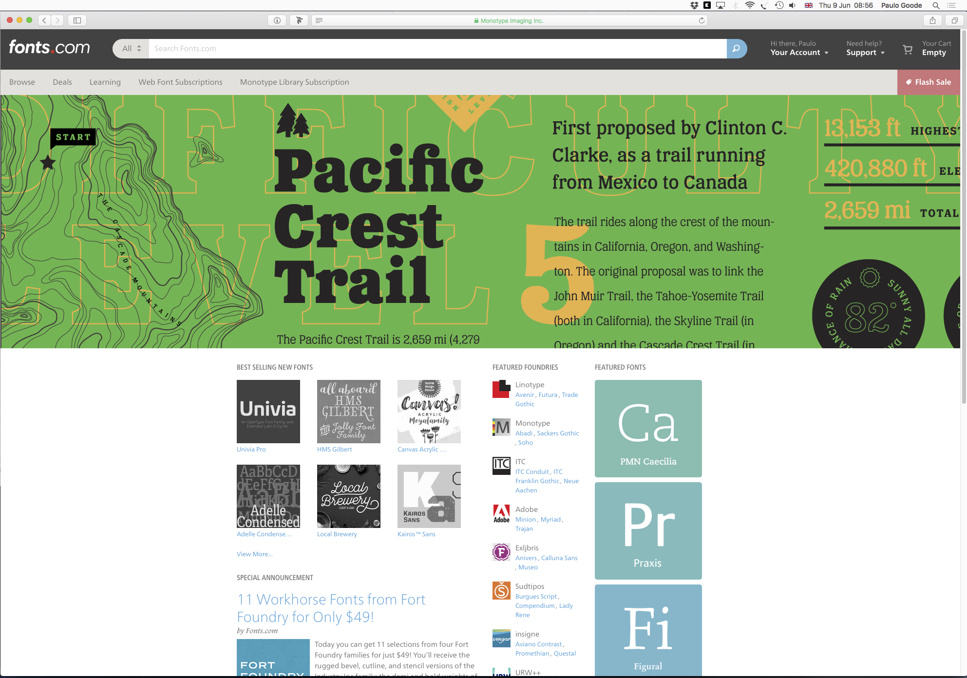
FONT IN USE: Eponymous
CLIENT: Fonts.com
DESIGN CREDIT: Dallas Barnes
I sprayed coffee everywhere this morning when seeing Eponymous implemented for one of the prestigious hero slots on the Fonts.com homepage… it was quite a shock, to say the least. Thank you to those commissioning the artwork at Fonts.com and, of course, to Dallas Barnes for creating the lovely graphic.
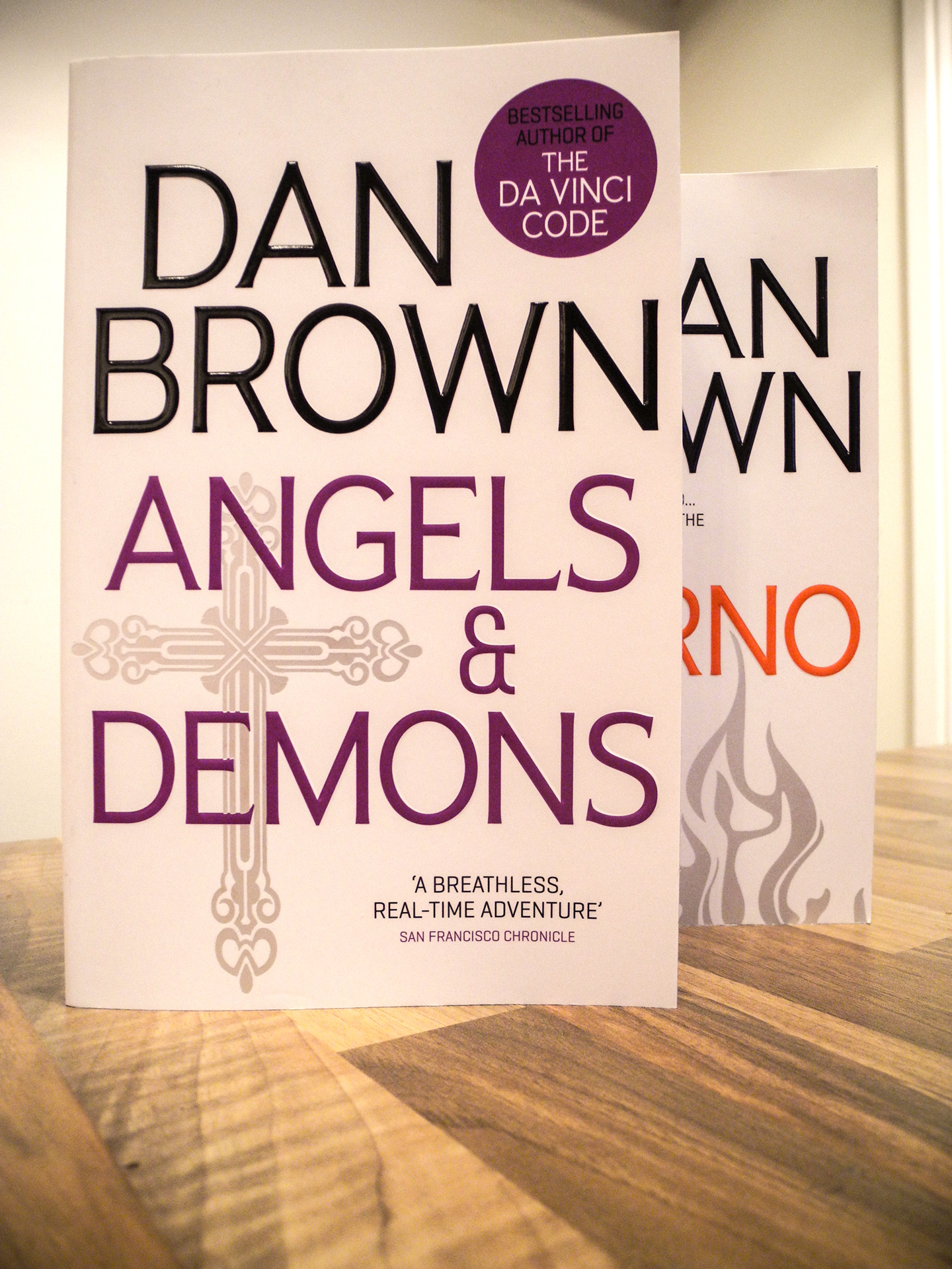

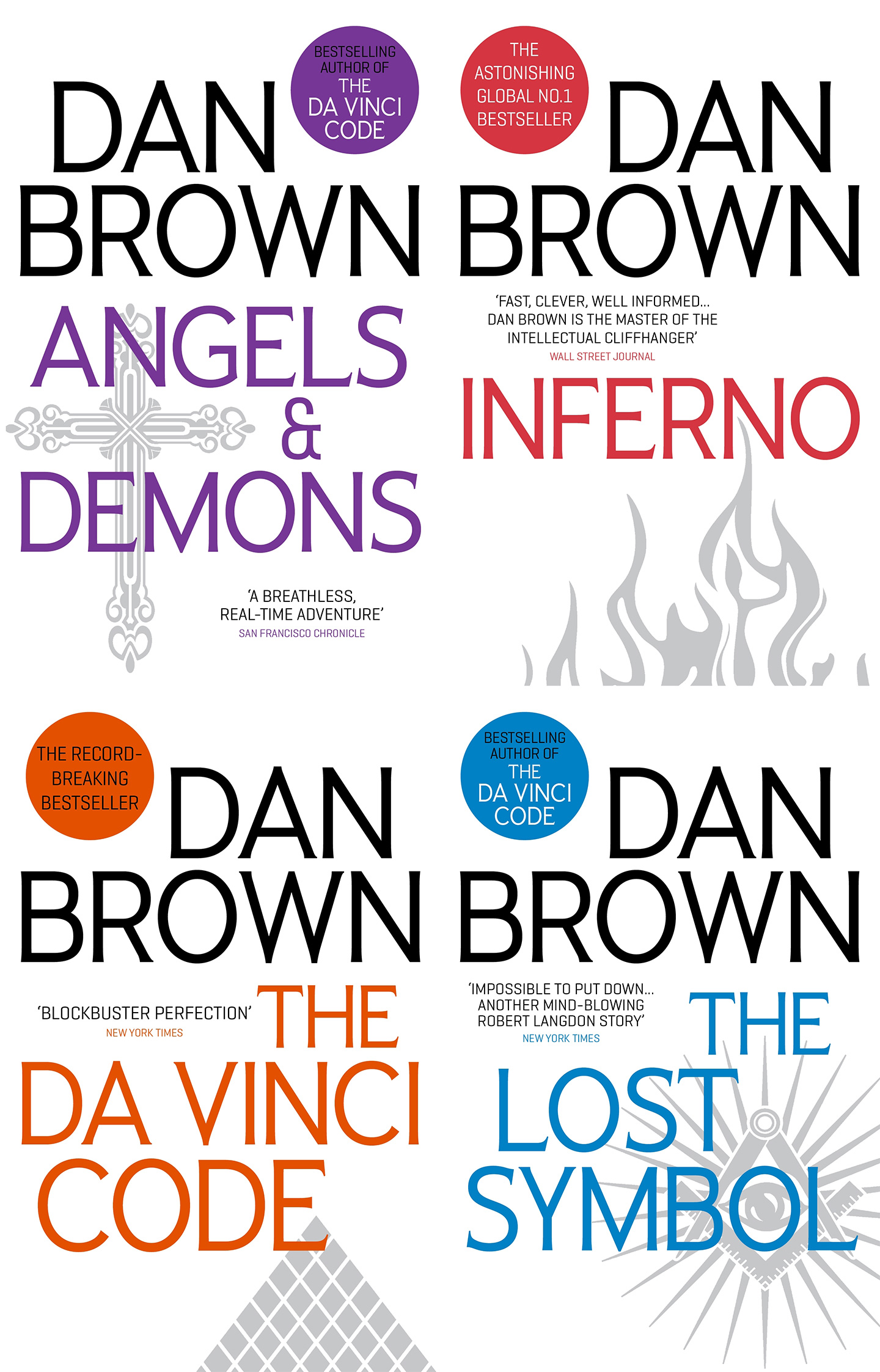
FONT IN USE: Pseudonym
CLIENT: Penguin Books
DESIGN CREDIT: Head Design
Pseudonym Regular was chosen as the title typeface for the 2016 editions of Dan Brown’s Robert Langdon series of books.

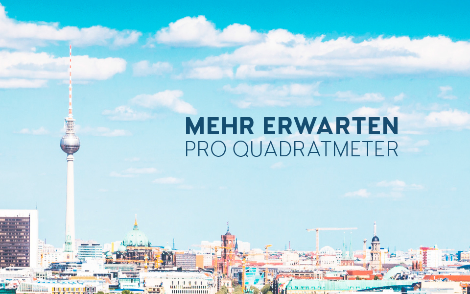
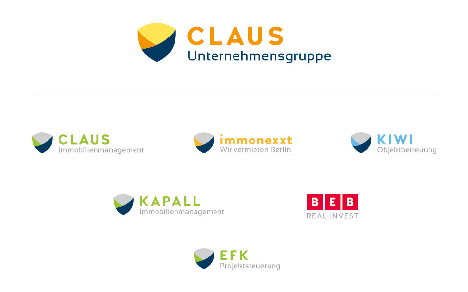
FONT IN USE: Woodford Bourne
CLIENT: CLAUS
DESIGN CREDIT: Schleuse 01
The logotype for “CLAUS” is set in Woodford Bourne Bold. The full family can also be seen in use for their sub-brand identities and promotional material.
FONT IN USE: Woodford Bourne
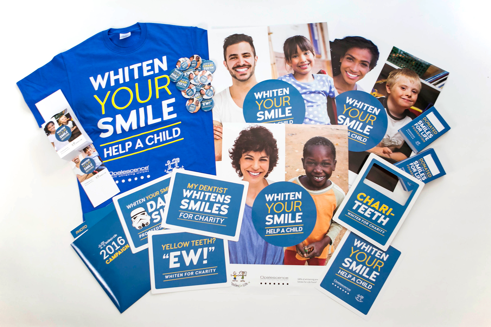
CLIENT: My Social Practice
DESIGN CREDIT: Not known - possibly in-house
My Social Practice create campaigns to promote better health around the U.S. Here’s a set making good use of Woodford Bourne’s contrasting weights.
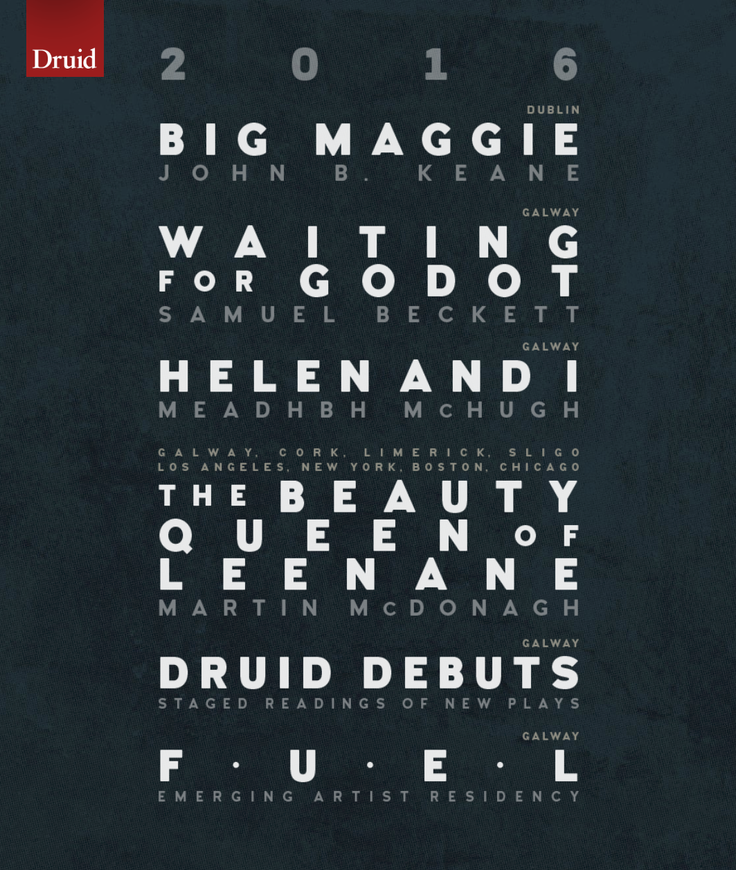
FONT IN USE: Woodford Bourne
CLIENT: Druid Theatre, Galway, Ireland
DESIGN CREDIT: Bite! Associates
The Druid Theatre company in Galway announced their programme for 2016 with this eye-catching interpretation of old tram rolls for listing their schedule. Set in Woodford Bourne.


FONT IN USE: Carrig
CLIENT: Raventide Books
DESIGN CREDIT: Write Dream Repeat
Raventide Books embraced Carrig in 2016 for use in their series of novels and short stories, so much so that literally every word in Six Celestial Swords is set in Carrig.