GALLERY
A Cast Iron Display Typeface
| Release Date | October 2015 |
| Classification | Blackletter |
| No. of Fonts | 1 |
| Alternates | None |
| Ligatures | None |
| Small Caps | None |
| Petite Caps | None |
| No. of Glyphs | 300 |
| European Language Support | Yes (no Cyrillic) |
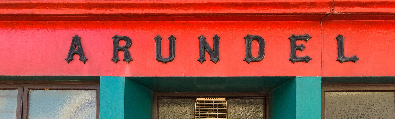
This is Arundel, inspired by cast iron lettering above the former Arundel store in my home village.
I had been walking past this iconic façade for over 2 years admiring their “heavy metal” style and could easily envisage a typeface that might be used for band logos, posters and even product branding. It is difficult to age the existing Arundel type, it is definitely blacksmith-made and forged in iron. Naturally, my promotional images play on that metallic feel…
Unlike my previous type designs, Arundel came together very quickly and my initial sketches expanded on the style of the real-life lettering—almost like playing a complementing riff to the backbone rhythm of the original motif.
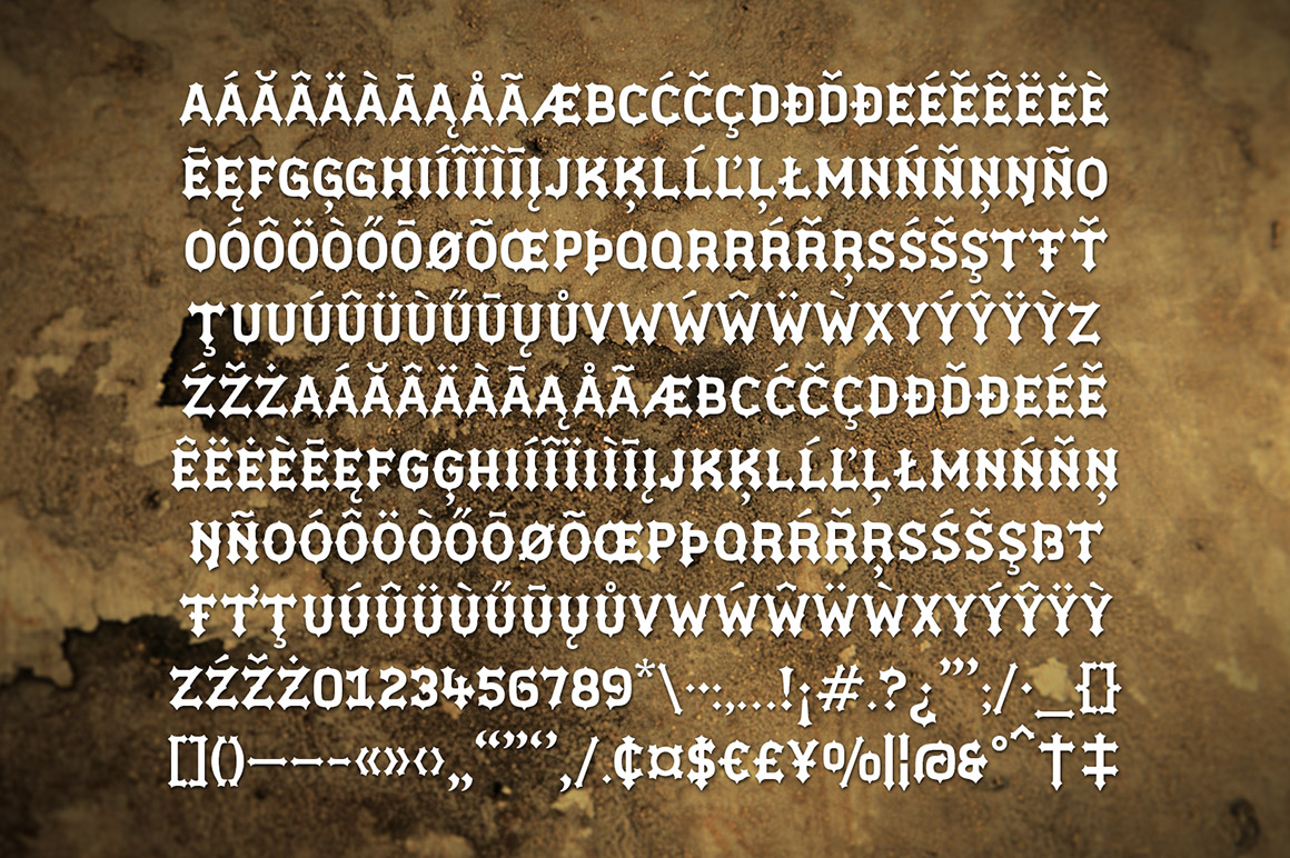
The influences for the origins of Arundel have been mentioned above. I do like to find “forgotten type” and use that as an influence to create something new. When drawing Arundel, I was influenced by the whole gothic and heavy metal design style, I see Arundel as being a typeface that feels immediately at home within those genres, but could also work equally as well for branding craft beers, engineering products and high fashion lingerie… okay, maybe not the lingerie…
I see Arundel as primarily a display typeface for titles/headlines in printed materials. I imagine designers will use Arundel for branding, packaging and promotional material and am keen to hear from anyone who uses it in their own work. Ideally, I’d love to compile a gallery for “Arundel in use”.